Visual Research Guides
A complete visual curriculum for causal inference and study design — from survival curves to directed acyclic graphs. Built for researchers, reviewers, and students who want methodology they can actually use.
Foundations
Before you analyze, you need to design. Before you design, you need to read survival curves. Start here.
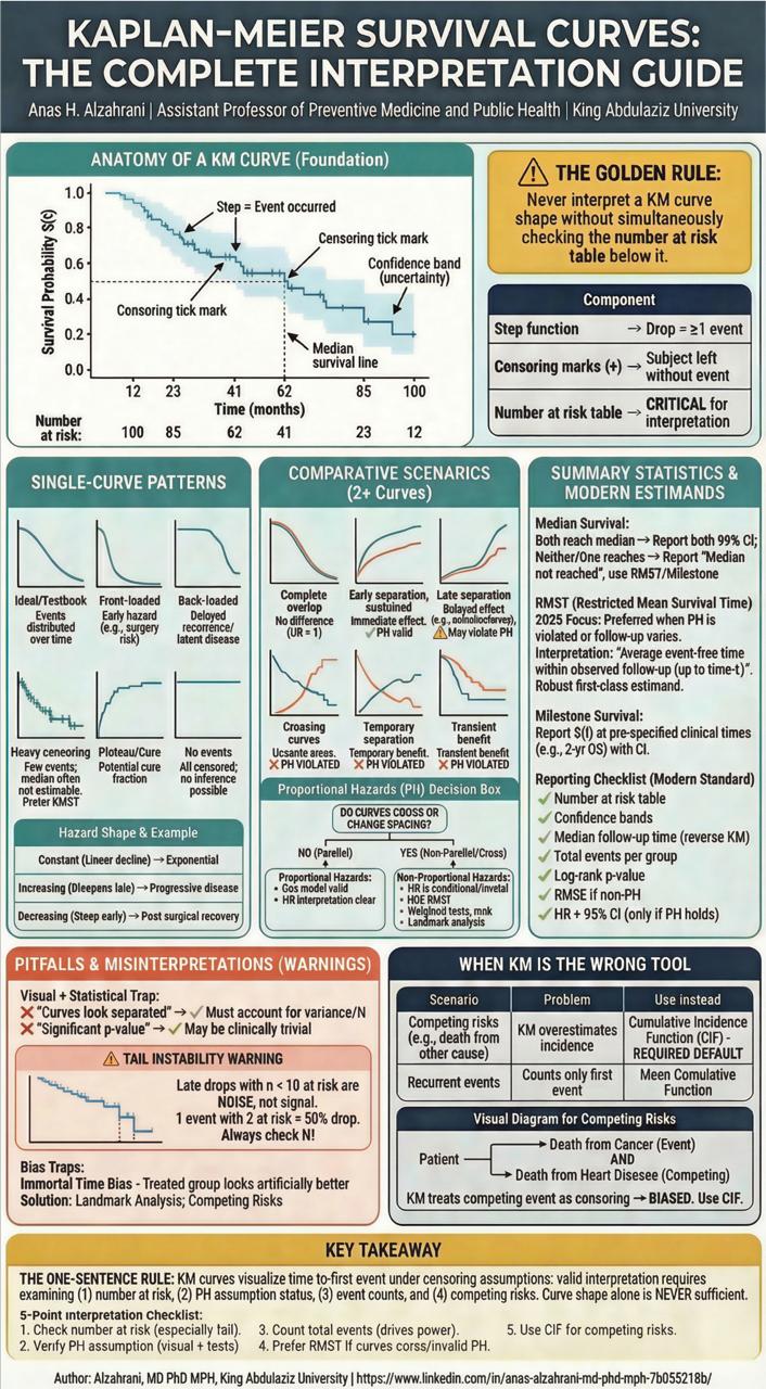
Kaplan-Meier Survival Analysis
Reading survival curves correctly — single-curve patterns, comparative scenarios, PH violations, competing risks, and the number-at-risk table you're probably ignoring.
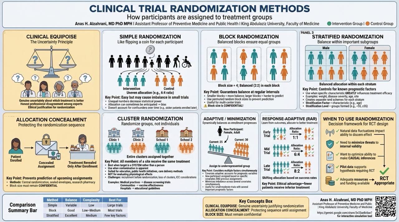
Clinical Trial Randomization
Simple, block, stratified, cluster, adaptive, and response-adaptive randomization — with allocation concealment, clinical equipoise, and the decision framework.
The Causal Inference Series
Six methods. Six visual guides. From matching and weighting through natural experiments and structural thinking. Each one covers the method, its assumptions, diagnostics, failure modes, and what reviewers expect in 2026.
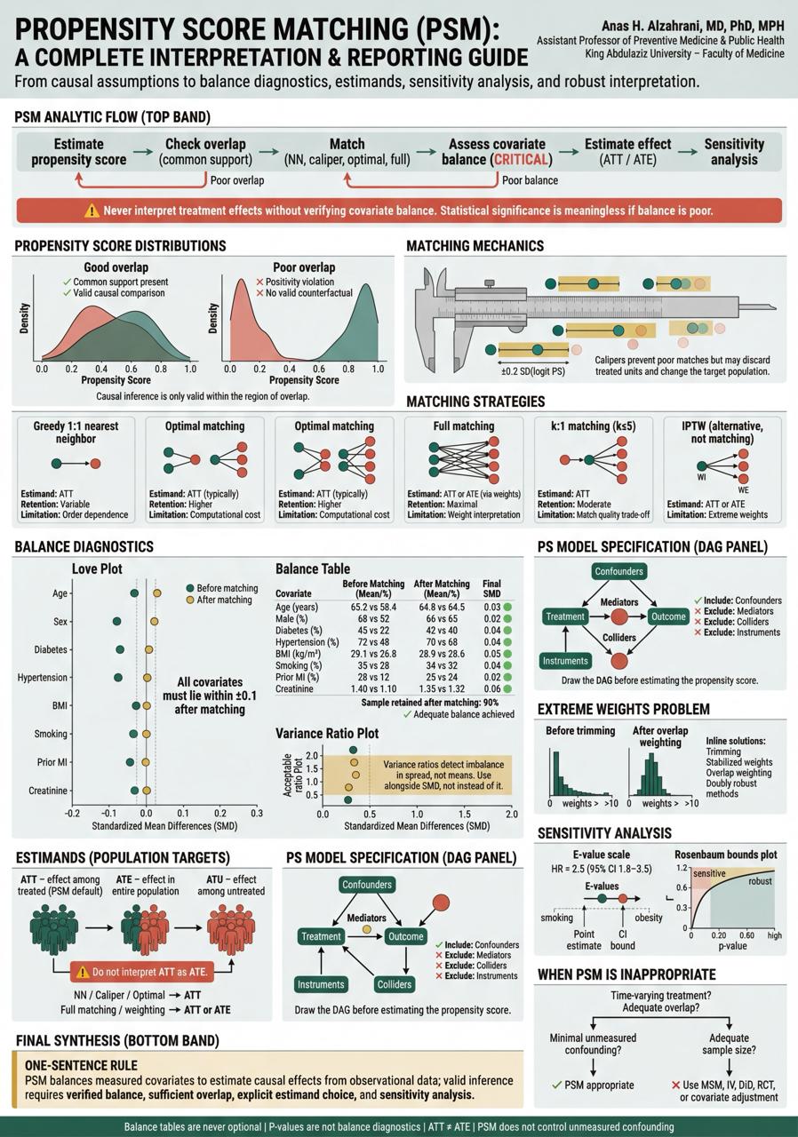
Propensity Score Matching
6 matching strategies, the diagnostic trinity (Love Plot, Balance Table, Variance Ratio), estimand clarity, and why p-values are not balance diagnostics.
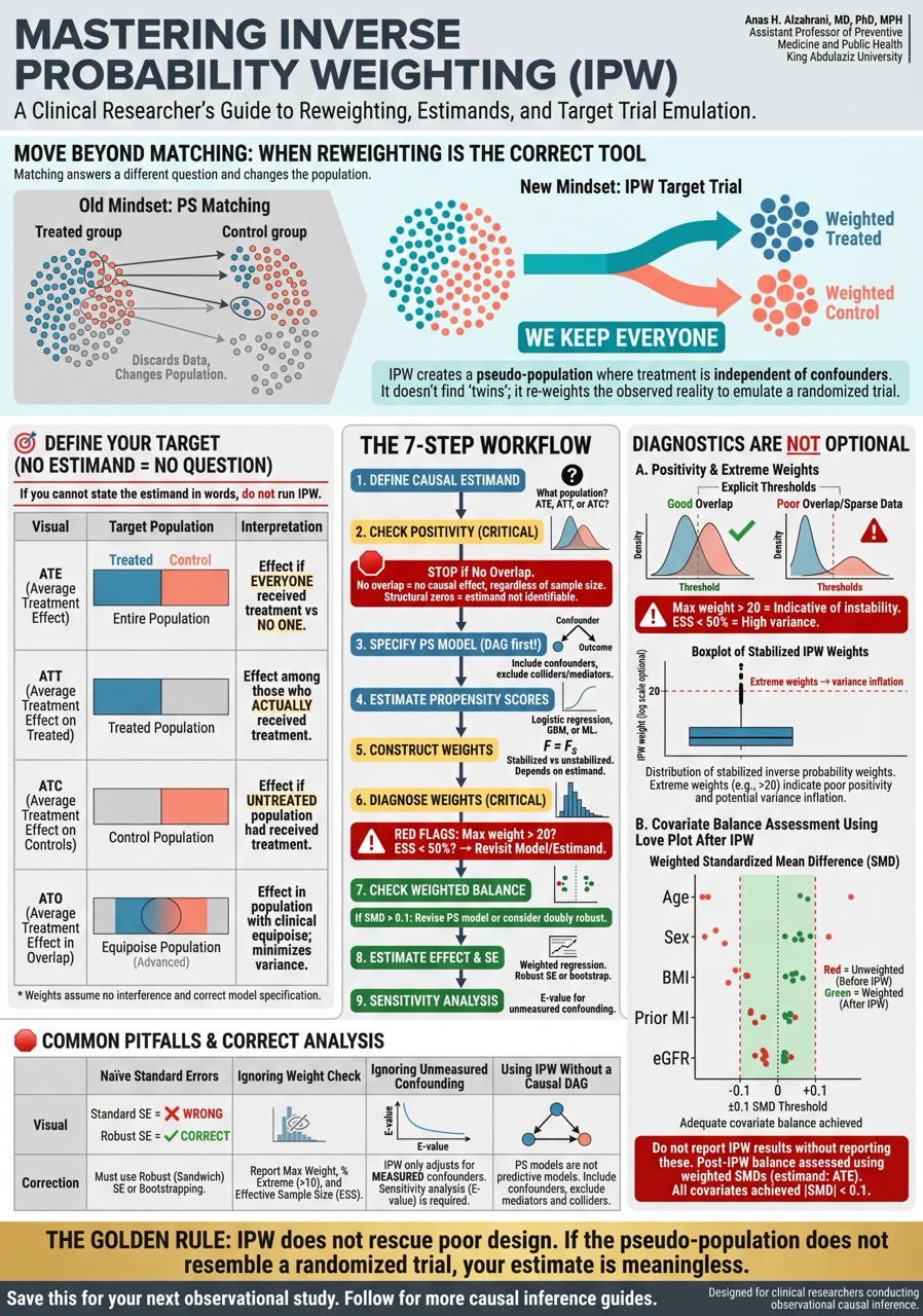
Inverse Probability Weighting
ATE/ATT/ATC/ATO estimands, the 9-step workflow with STOP conditions, pseudo-populations, weight diagnostics, and the E-value for unmeasured confounding.
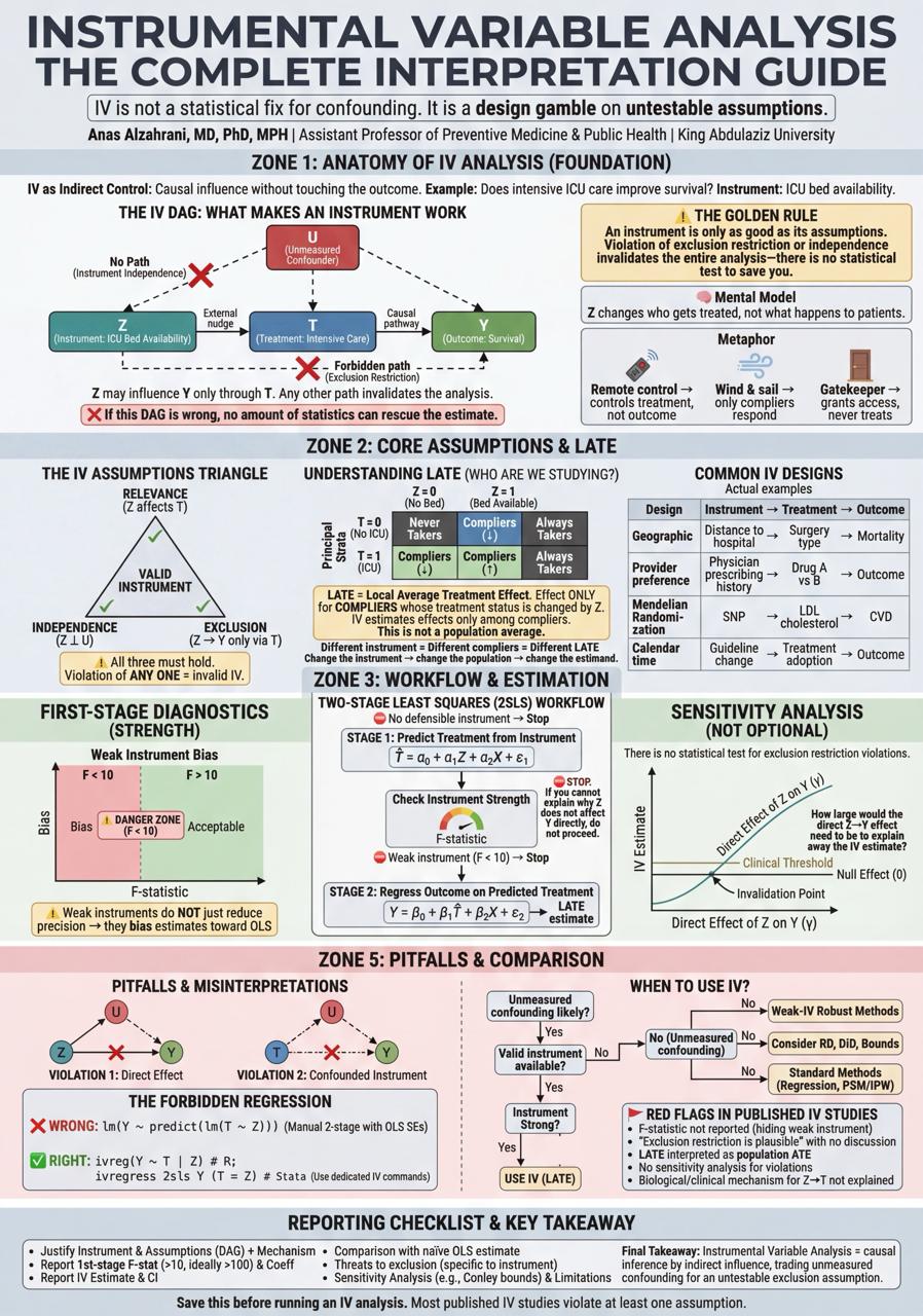
Instrumental Variables
The LATE framework, compliance types, the Forbidden Regression, weak instrument diagnostics, sensitivity analysis, and when IV is the wrong tool.
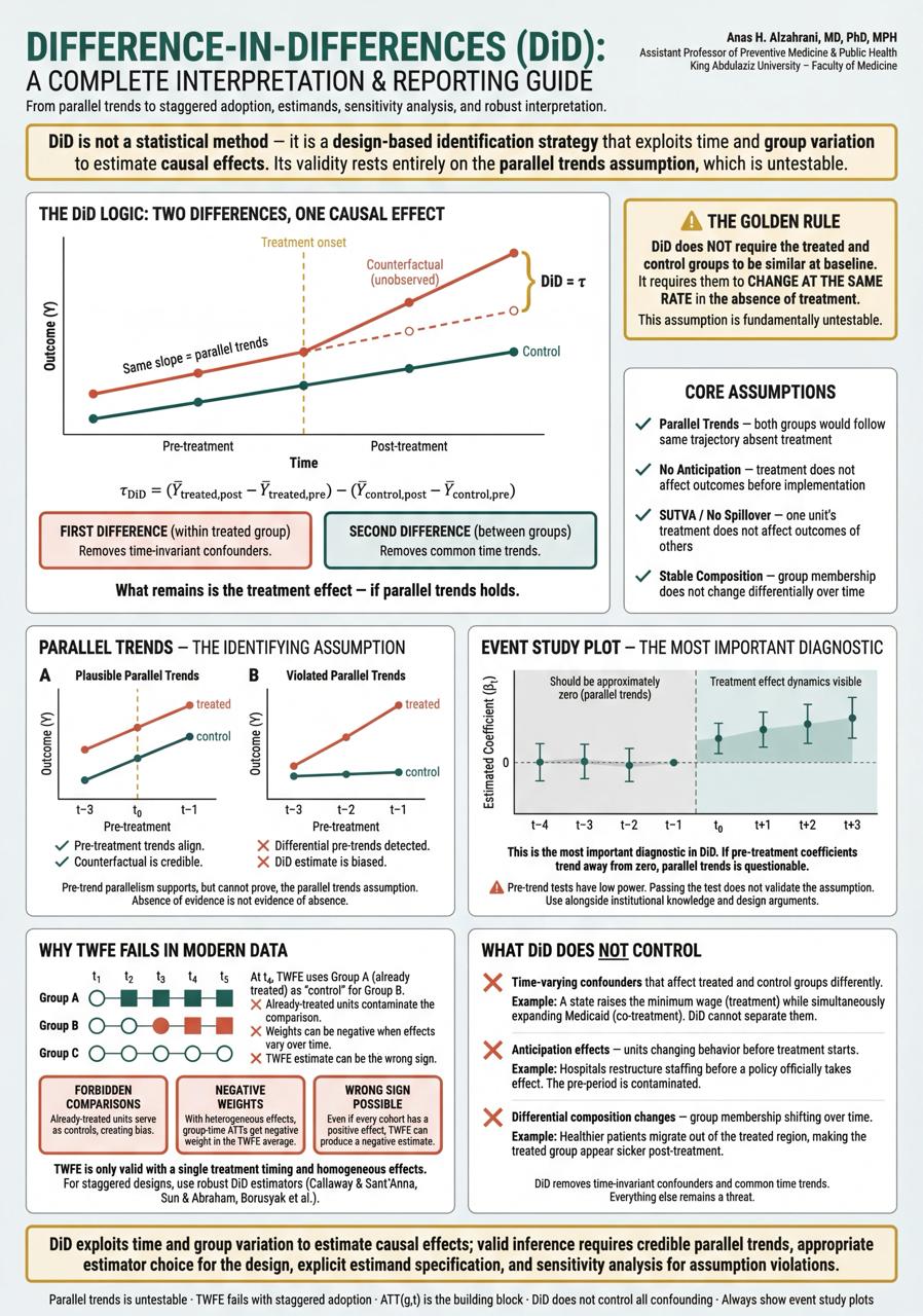
Difference-in-Differences
Parallel trends (not similar levels), TWFE failures in staggered adoption, event study plots, and why Callaway & Sant'Anna matters for modern DiD.
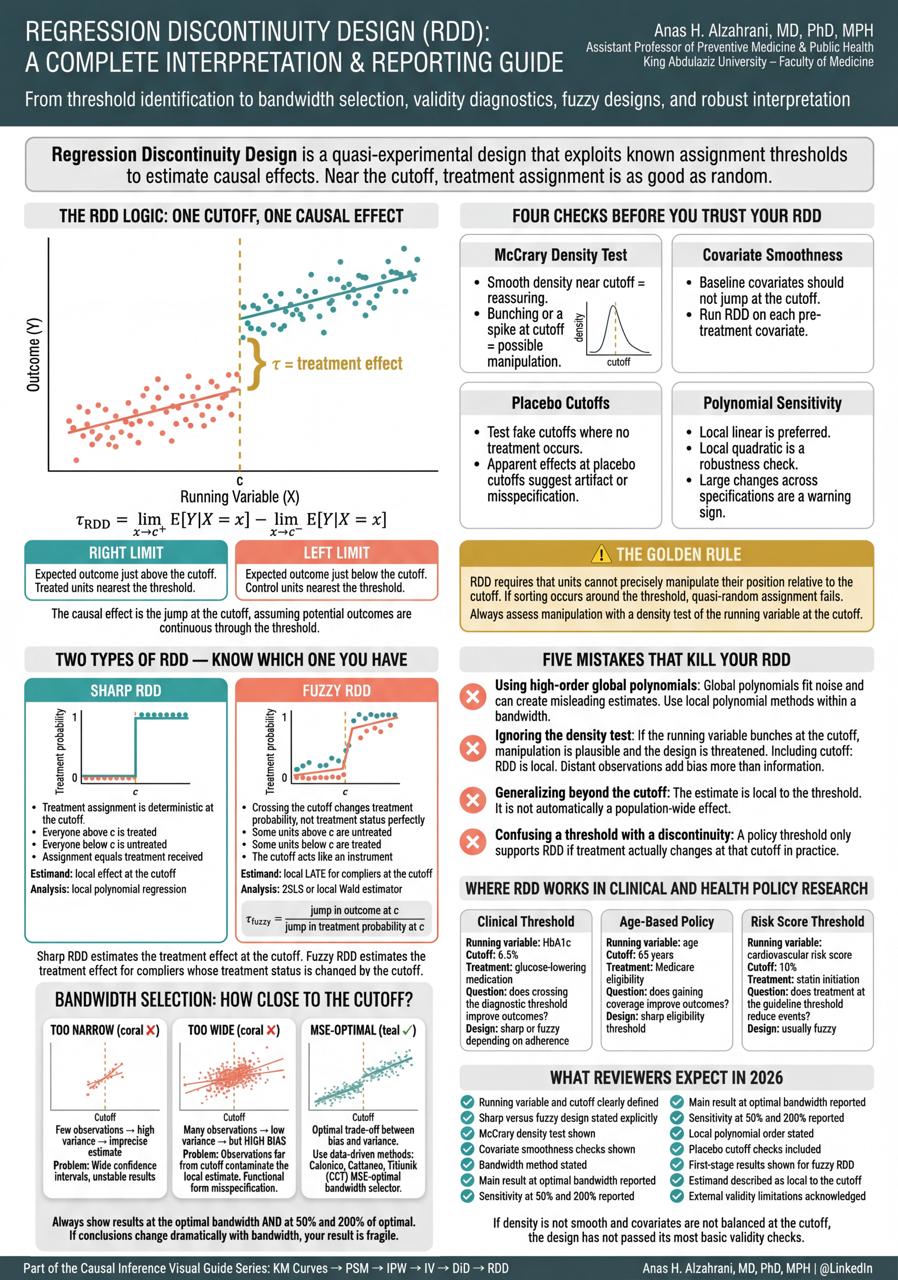
Regression Discontinuity Design
Sharp vs fuzzy RDD, bandwidth selection (too narrow / too wide / MSE-optimal), five mistakes that kill your RDD, and what reviewers expect.
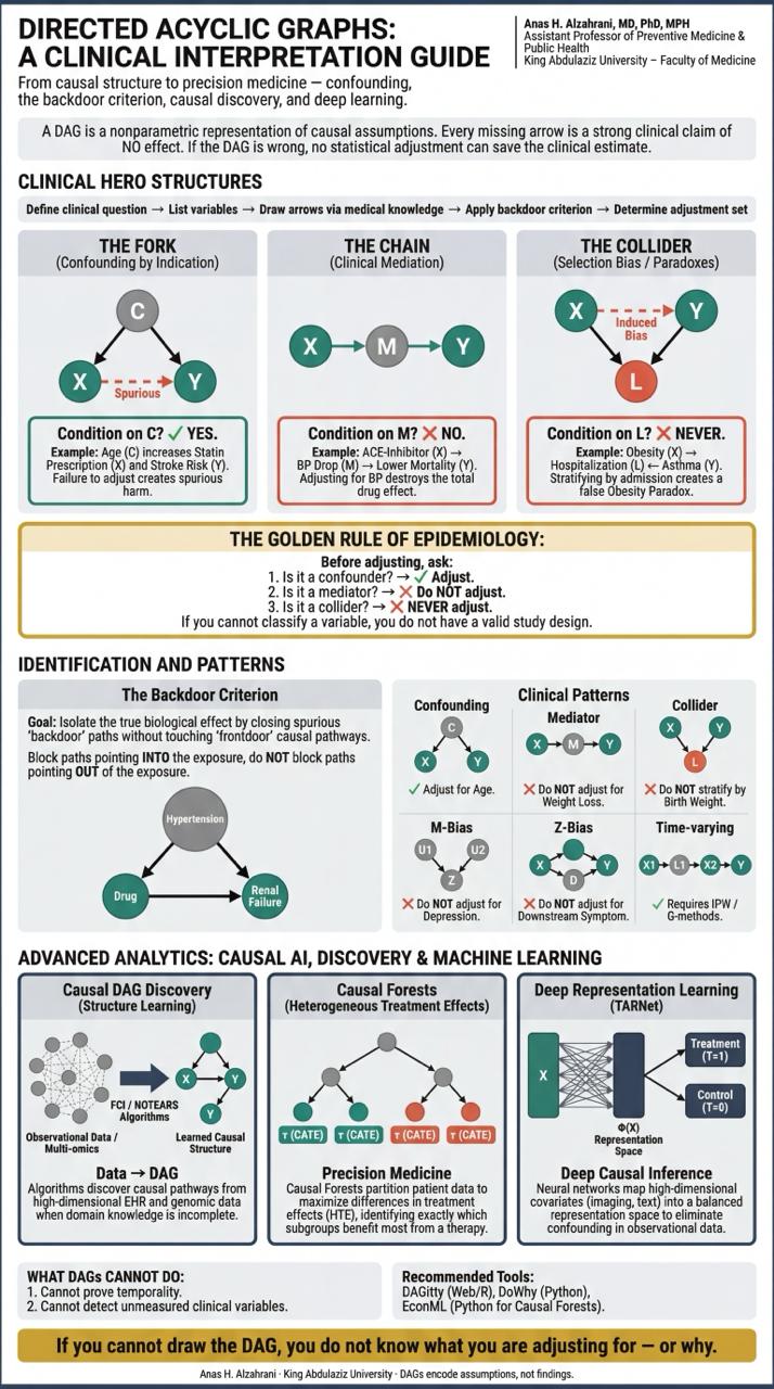
Directed Acyclic Graphs
Forks, chains, colliders, M-Bias, Z-Bias, the backdoor criterion, the obesity paradox, and why if you can't draw the DAG, you don't know what you're adjusting for.
AI & Research
Practical AI workflows for research teams, with validation, privacy, reporting, and human oversight built in.
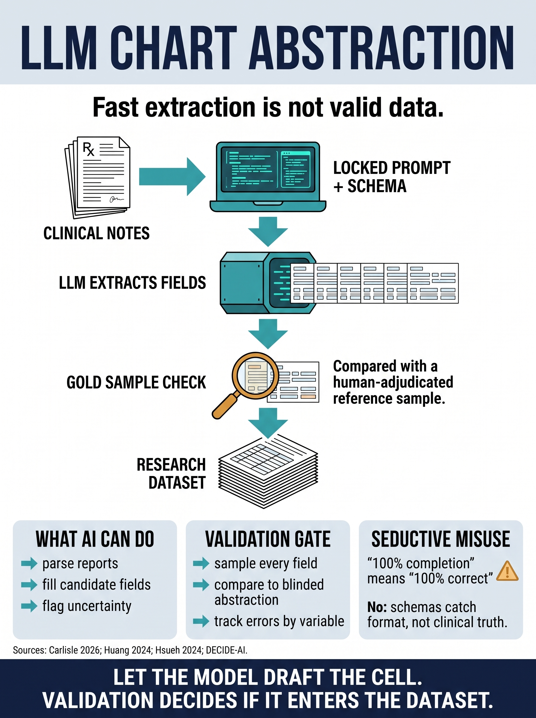
LLM Chart Abstraction: Fast Extraction Is Not Valid Data
A practical workflow for using LLMs to draft structured fields from EHR notes, operative reports, imaging reports, and pathology reports without treating completed JSON as validated research data. The guide separates locked prompts and schemas, privacy controls, field-level gold-sample validation, error audits, and human review before AI-extracted variables enter an analysis.
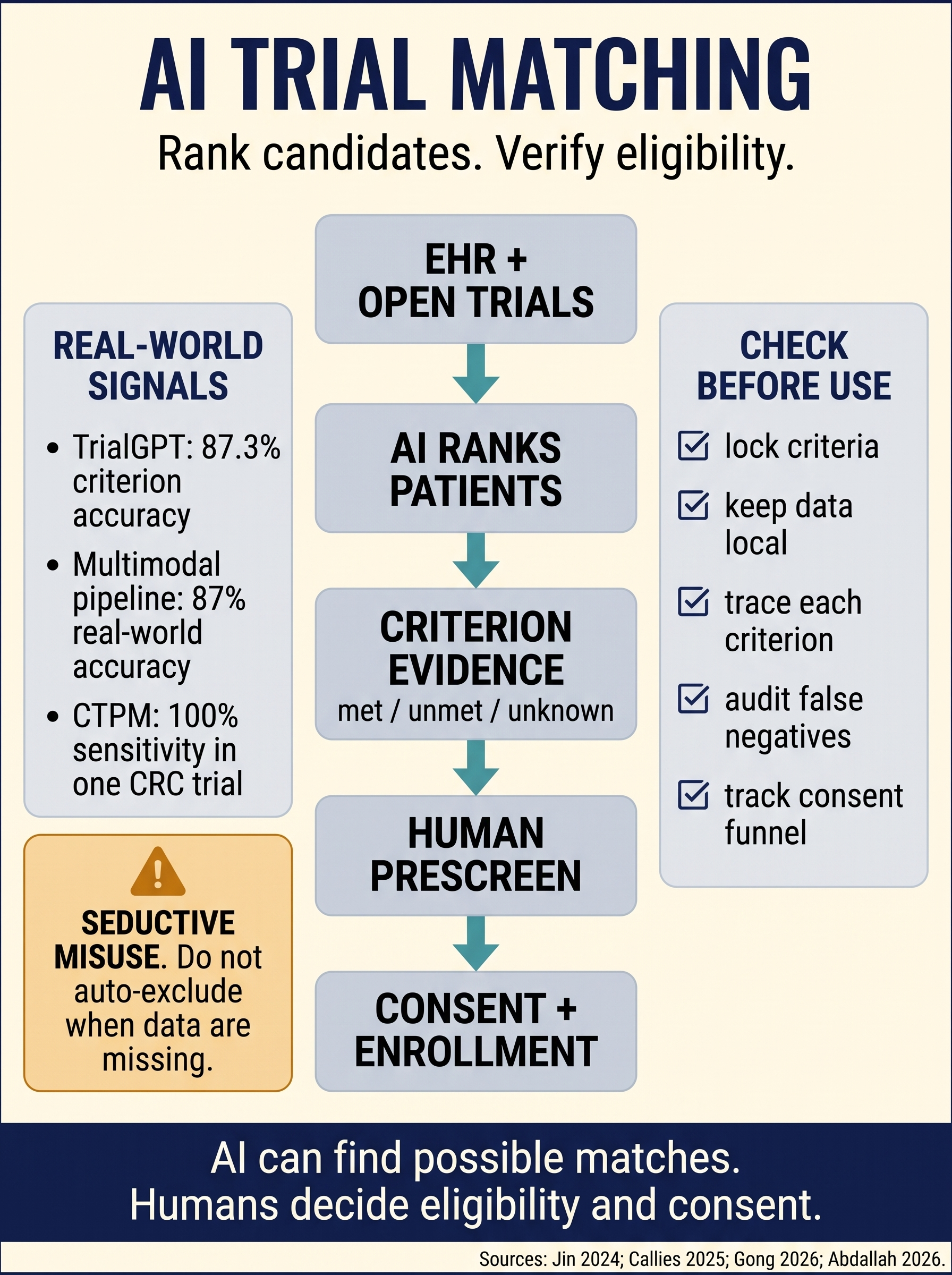
AI Trial Matching Prescreening
A workflow for using AI to rank plausible patient-trial matches without turning a prescreening queue into an eligibility decision. The guide separates locked criteria, criterion-level evidence, missing-data flags, human verification, privacy controls, and the consent funnel.
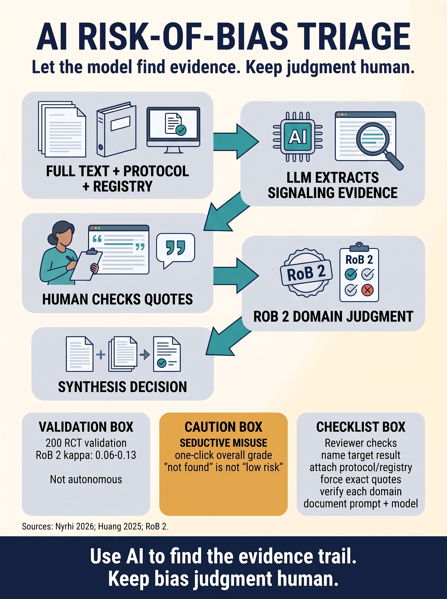
AI Risk-of-Bias Triage
A practical workflow for using LLMs to find and organize the evidence trail for RoB 2 signaling questions without outsourcing the bias judgment. The guide separates source retrieval, exact quote verification, domain-level human review, and validation thresholds before model-assisted assessments enter a synthesis.

7-Layer Memory Architecture
A multi-layer memory system for persistent AI agents — from profile K-V stores through episodic logs to long-term curated memory. Designed, tested, and validated in production.
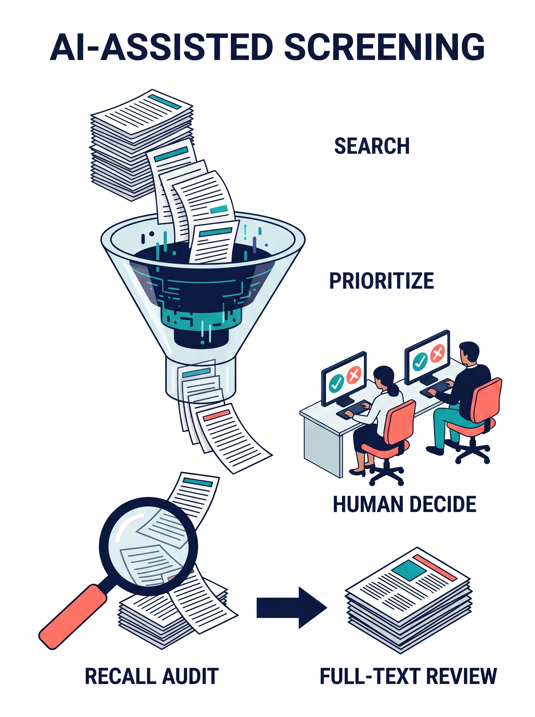
AI-Assisted Screening in Systematic Reviews
A practical workflow for using AI to prioritize title and abstract screening without letting it replace systematic search, eligibility decisions, or reviewer accountability. The guide shows how active-learning tools can move likely includes to the top, why generative AI needs tighter reporting and human verification, and how a recall audit protects the low-ranked tail before a team stops screening.
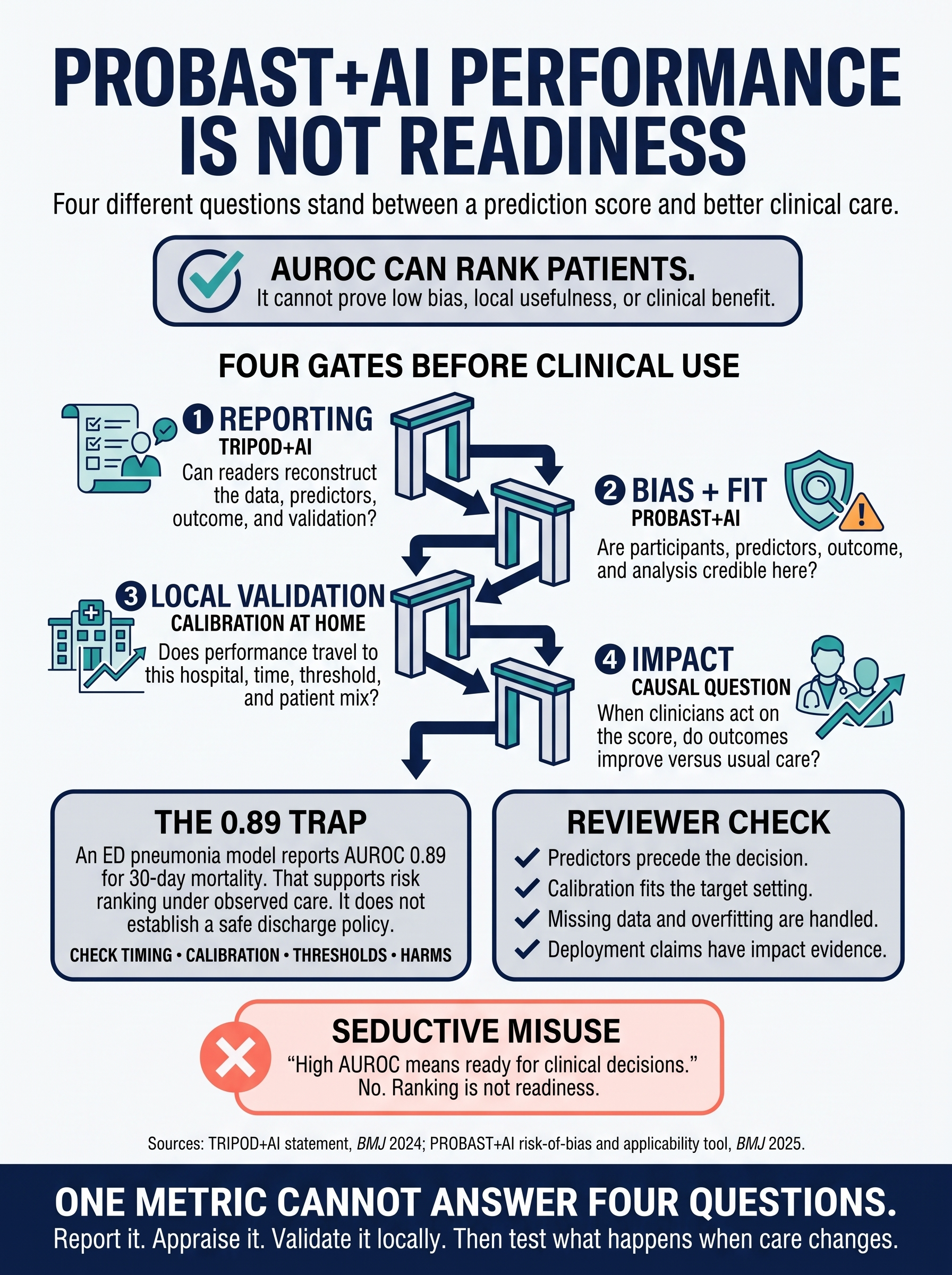
PROBAST+AI for Prediction Models
A reviewer pathway for reading AI prediction-model papers without letting a performance metric become a clinical claim. The guide separates TRIPOD+AI reporting, PROBAST+AI bias and applicability assessment, local validation, and the causal impact question that begins once clinicians act on the score.
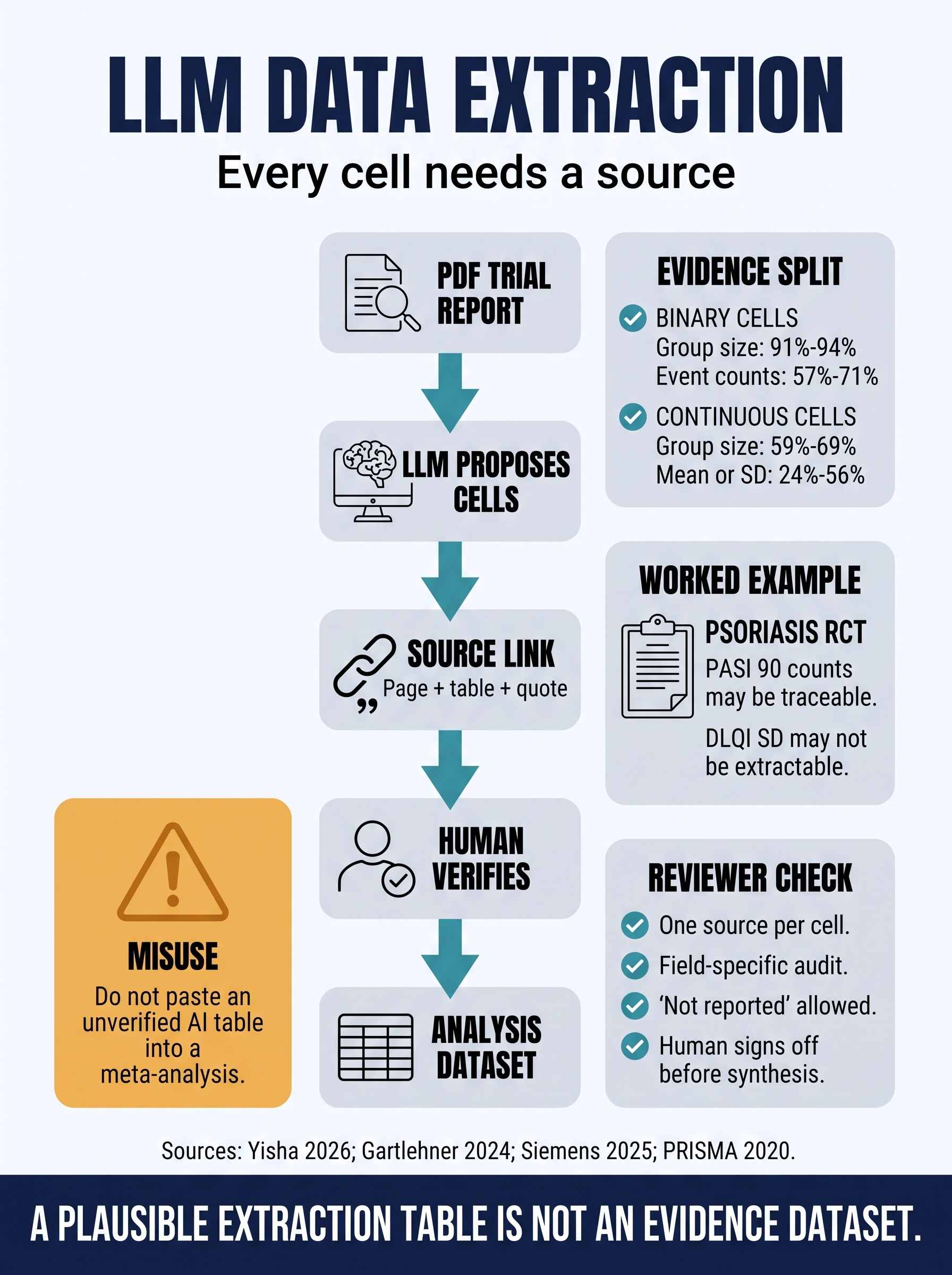
LLM Data Extraction for Evidence Synthesis
A practical workflow for using LLMs to propose systematic-review extraction cells without letting a plausible table become an evidence dataset. The guide teaches cell-level source tracing, human verification, field-specific error audits, and why binary extraction performance does not license unattended continuous-outcome extraction.
Study Design Clinic
Clinically realistic questions turned into estimands, time-zero definitions, comparators, DAGs, and analysis strategies before any model is trusted.
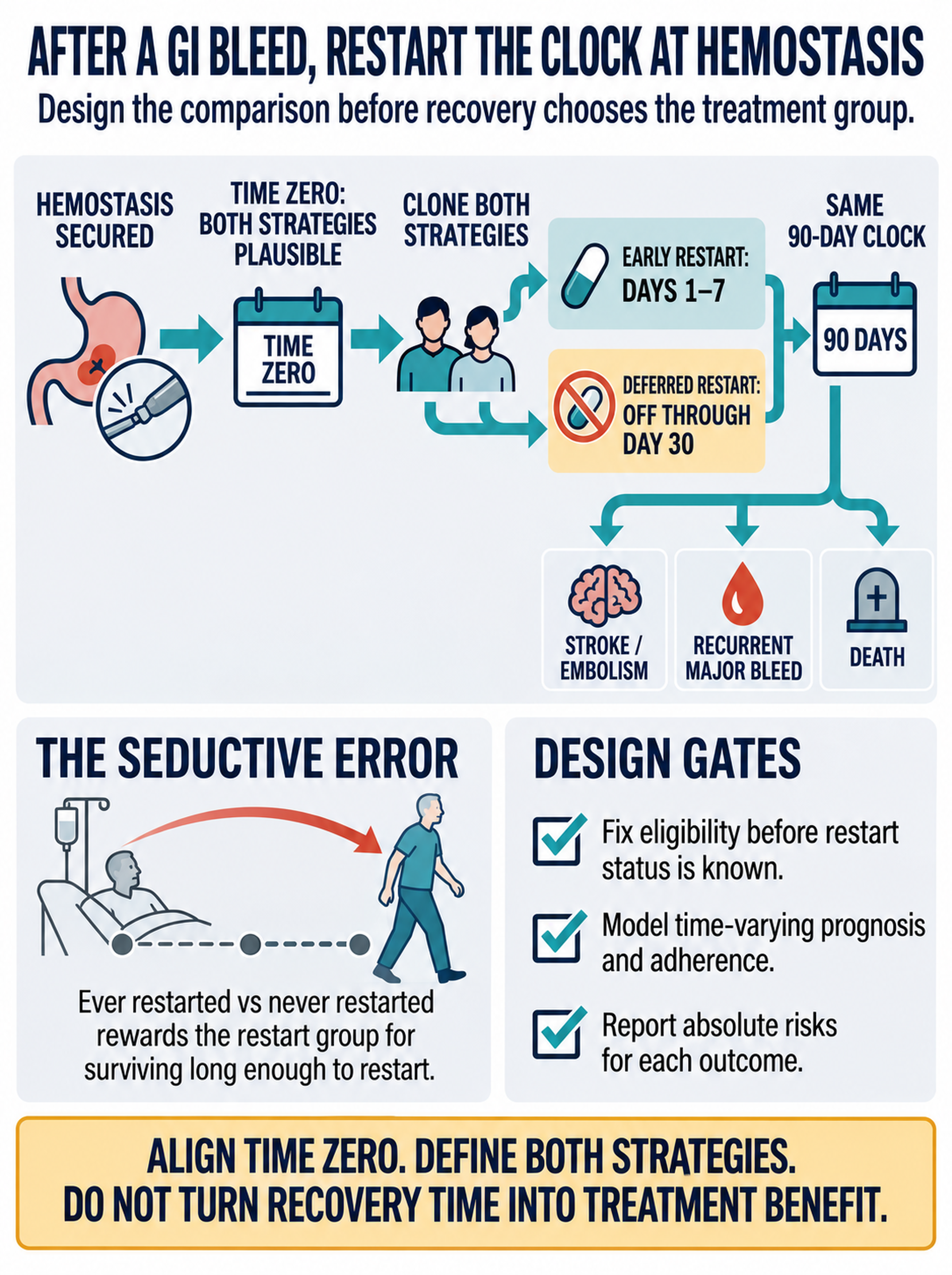
After a GI Bleed, Restart the Clock at Hemostasis
A study-design clinic for comparing early versus deferred anticoagulation restart after major gastrointestinal bleeding without rewarding the restart group for surviving long enough to restart. The guide fixes time zero at a standardized post-hemostasis reassessment, clones both grace-period strategies, and reports stroke, rebleeding, and death on the same 90-day clock.
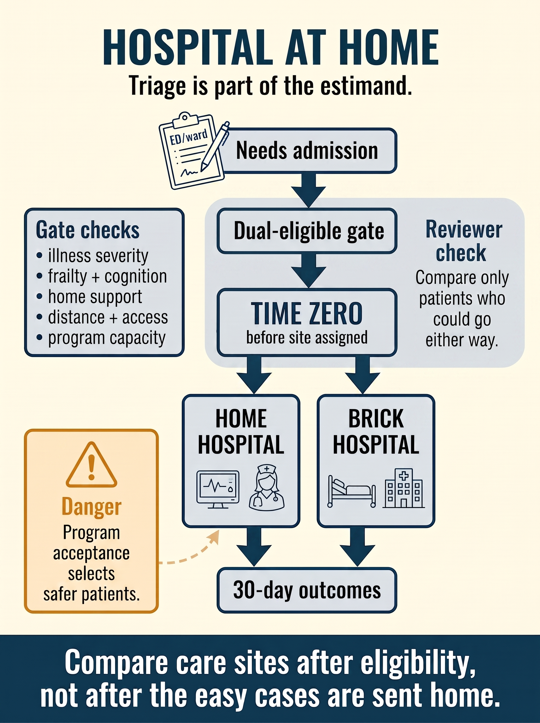
Hospital-at-Home Needs a Fair Front Door
A study-design clinic for evaluating hospital-at-home without letting the program's triage screen choose the low-risk treatment group. The guide starts time zero after acute hospital-level need and dual eligibility are confirmed, but before site-of-care assignment, so home-hospital patients are compared with inpatients who could genuinely have gone either way.
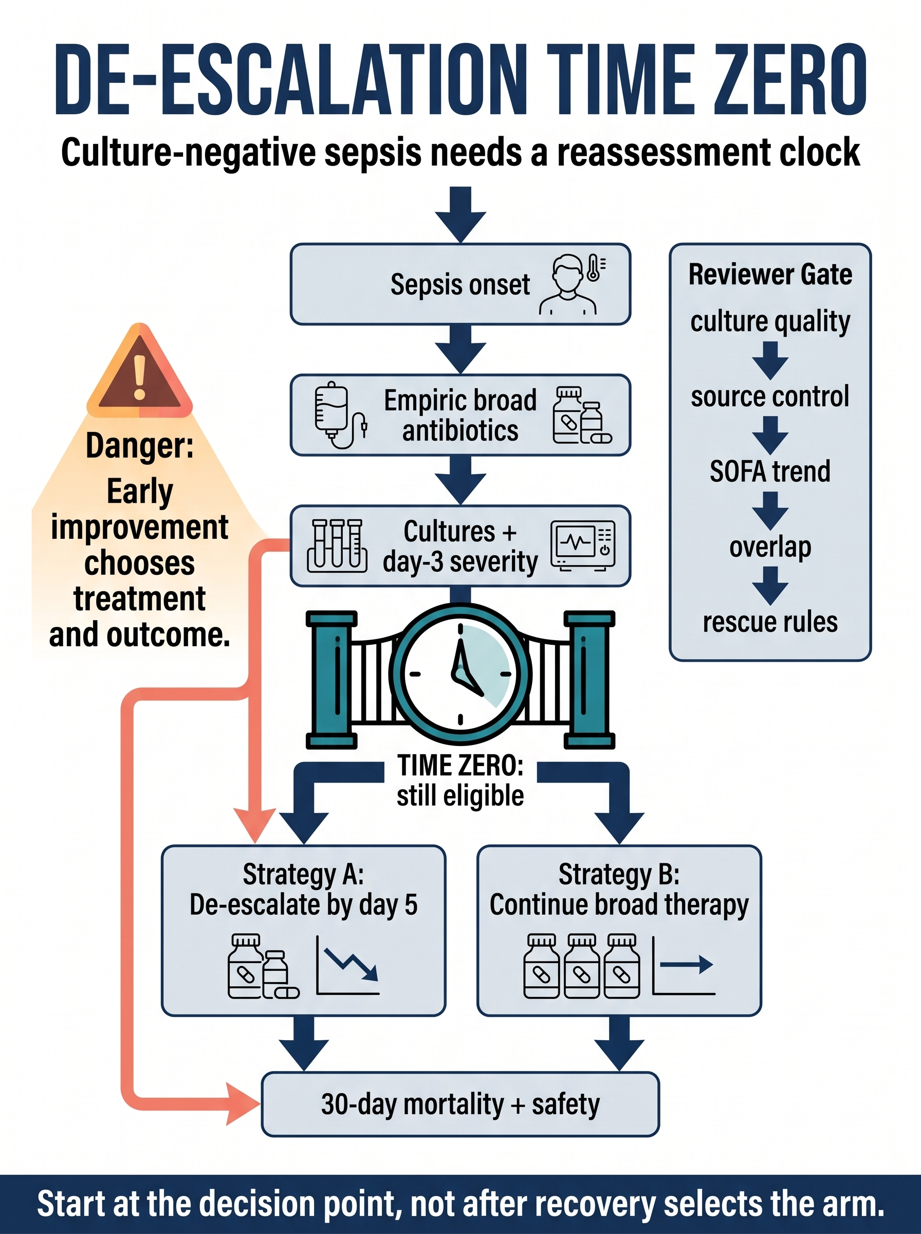
Antibiotic De-escalation Needs a Decision Clock
A study-design clinic for evaluating broad-spectrum antibiotic de-escalation in culture-negative suspected sepsis without letting early recovery choose the treatment group. The guide starts time zero at the reassessment point, after culture results and day-3 severity are known while either strategy is still clinically plausible.
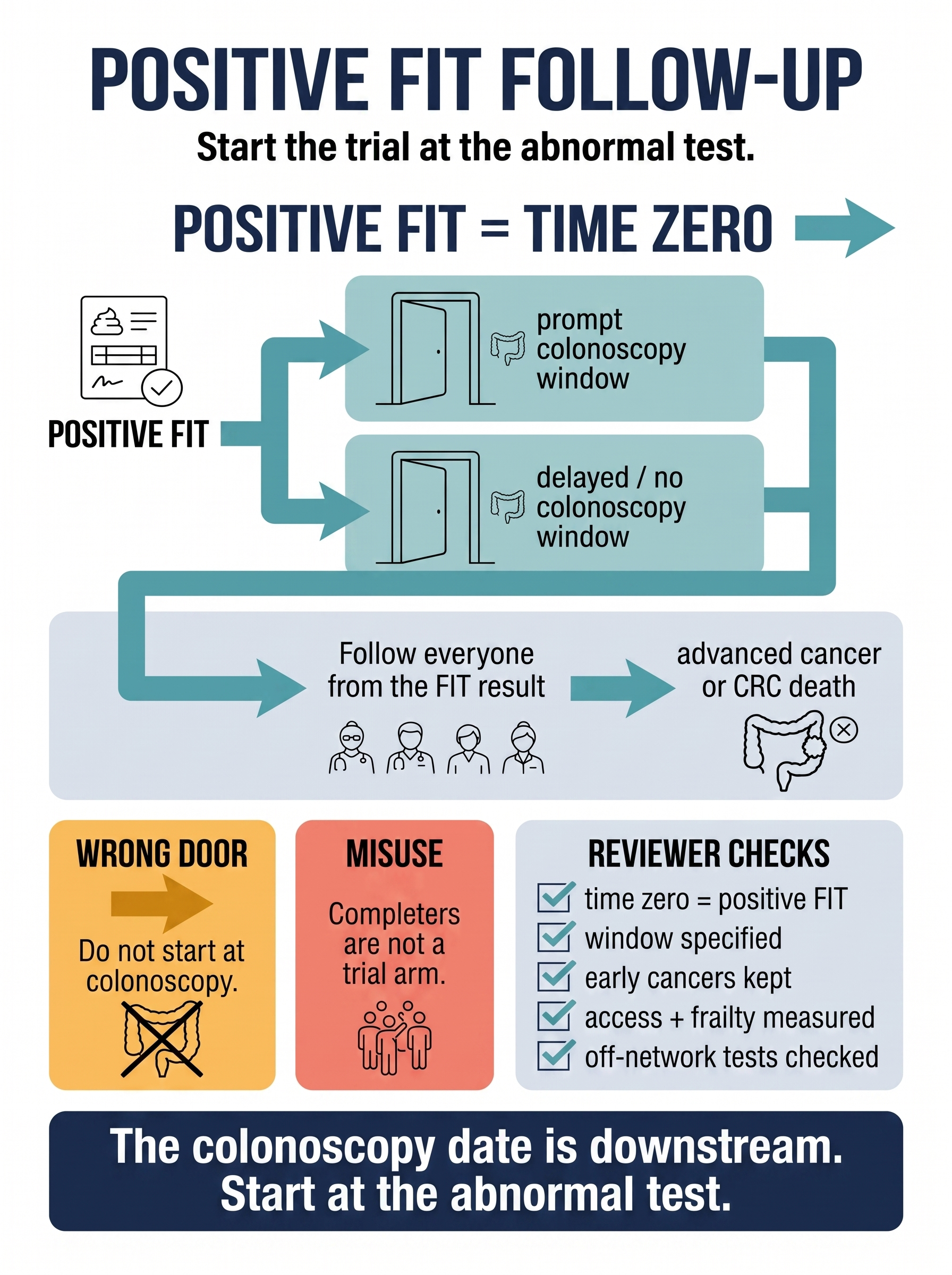
Positive FIT Follow-Up: Start the Trial at the Abnormal Test
A study-design clinic for evaluating prompt diagnostic colonoscopy after a positive fecal immunochemical test without conditioning on people who already completed the procedure. The guide starts time zero at the abnormal test, defines prompt versus delayed/no follow-up strategies, keeps early cancers and deaths in follow-up, and shows why colonoscopy completers are not a trial arm.
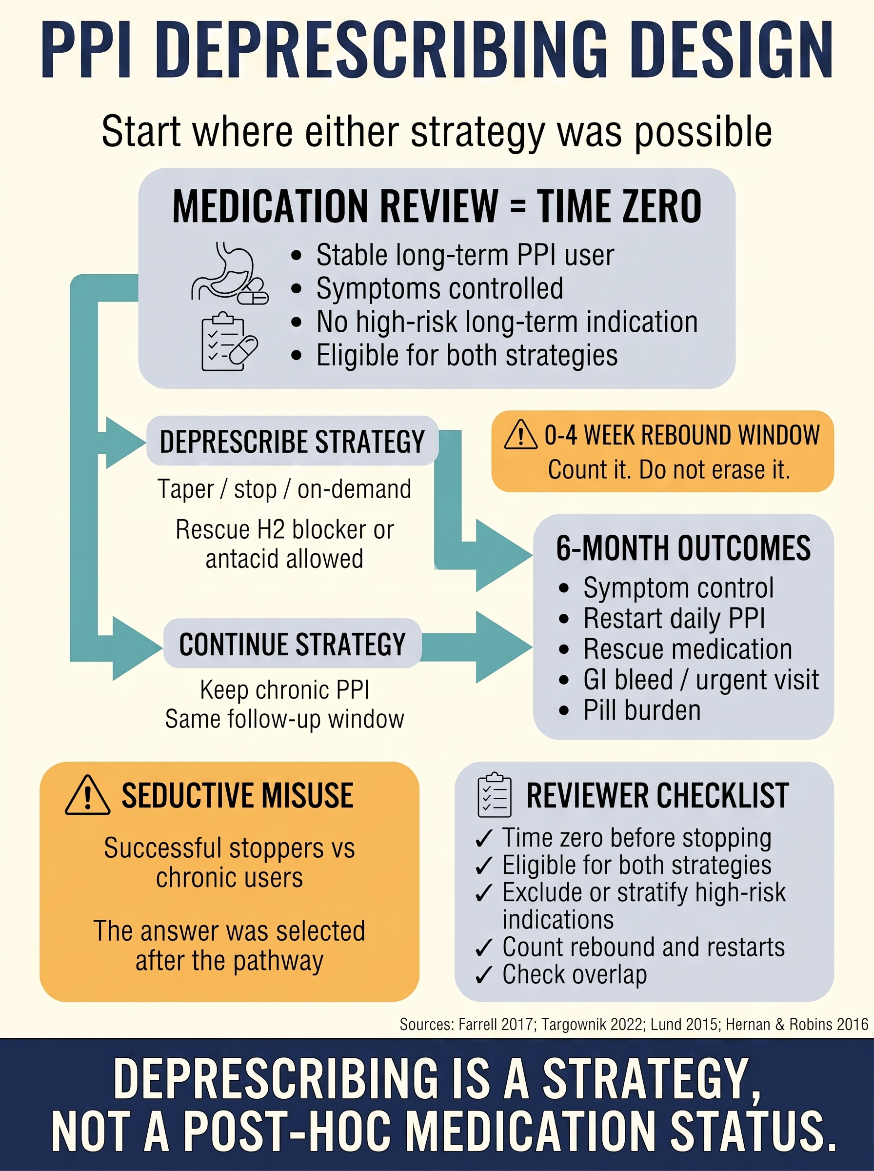
PPI Deprescribing Needs a Real Comparator
A study-design clinic for evaluating proton pump inhibitor deprescribing without comparing successful stoppers with chronic users after the pathway has already selected them. The guide starts at medication-review time zero, defines eligible patients, compares plausible deprescribing and continuation strategies, and keeps rebound symptoms, rescue therapy, restarting, and bleeding in the outcome pathway.
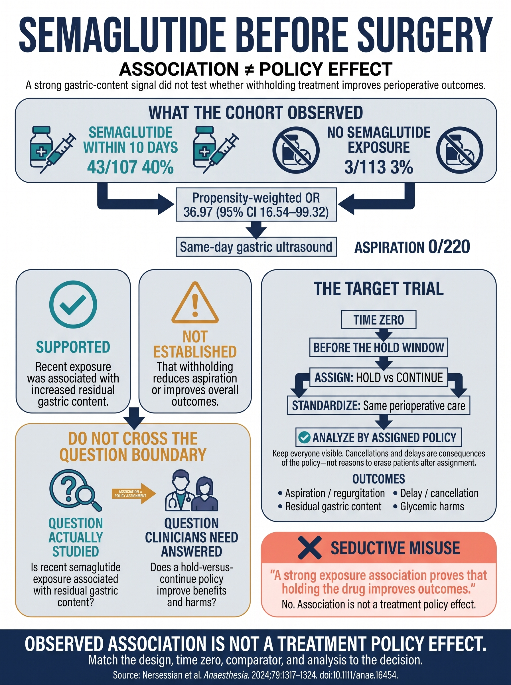
This Study Did Not Test Whether Semaglutide Should Be Held
A prospective cohort found markedly more residual gastric content after recent semaglutide exposure. The guide shows exactly what that association supports, what it cannot establish, and why the hold-versus-continue policy question needs a different study.
Methods Frontier
Current methodological developments translated into practical design and review decisions for clinical researchers.
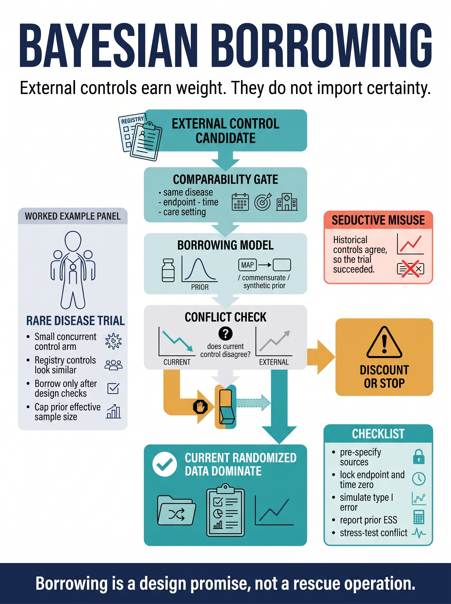
Bayesian Dynamic Borrowing: External Controls Need a Discount Switch
A methods-frontier guide to using historical trials, registries, and real-world controls in small randomized trials without importing false certainty. The poster separates comparability gates, MAP, commensurate, and synthetic-prior models, conflict checks, prior effective sample size caps, operating-characteristic simulations, and the rule that current randomized data must dominate when external controls disagree.
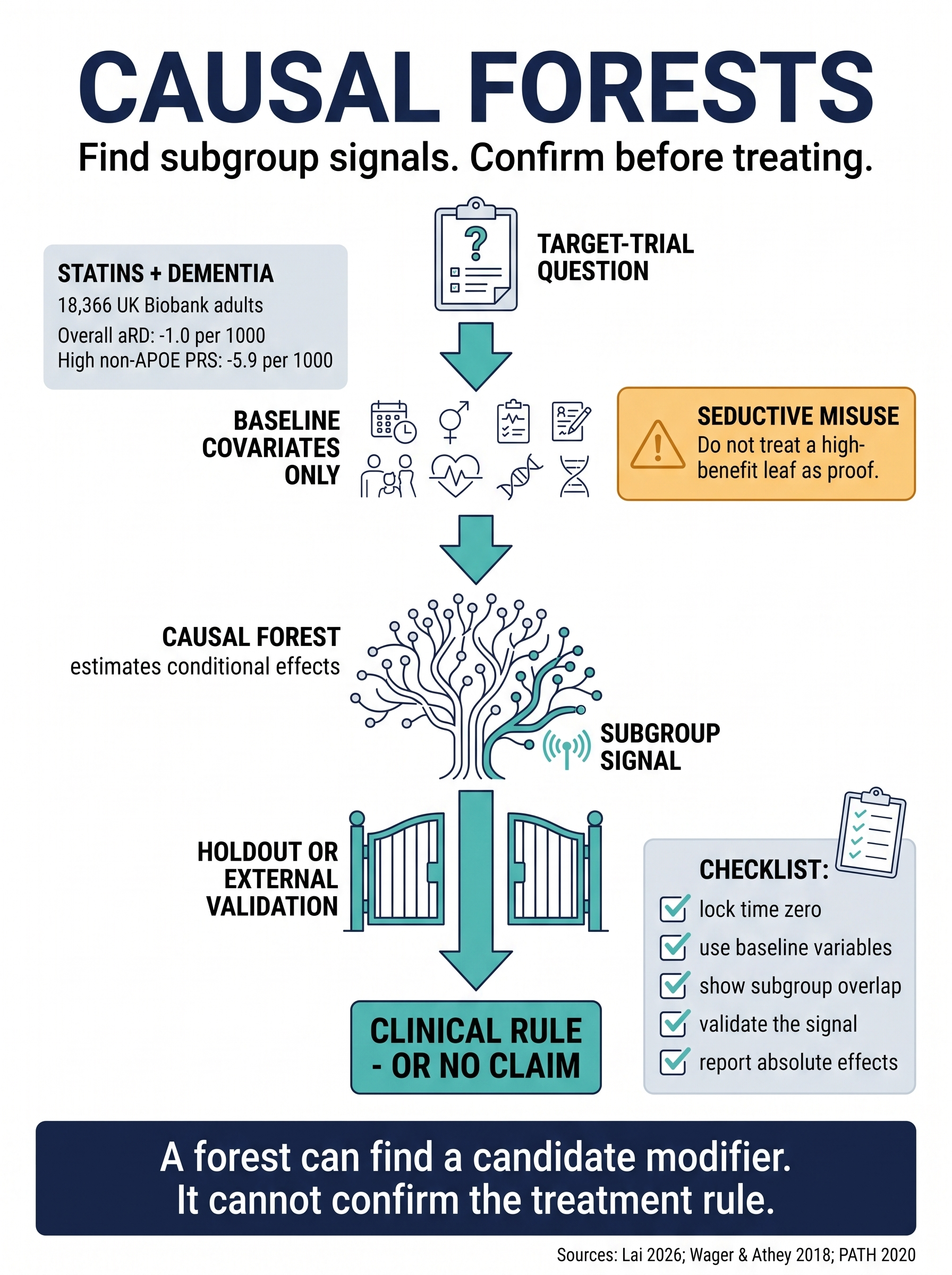
Causal Forests: Find Subgroup Signals, Then Confirm
A methods-frontier guide to causal forests for heterogeneous treatment effects in clinical research. The guide uses a 2026 statin-dementia target-trial emulation to show why causal ML can suggest baseline-defined effect modifiers, but a high-benefit leaf still needs overlap checks, absolute effects, validation, replication, and clinical actionability before it becomes a treatment rule.
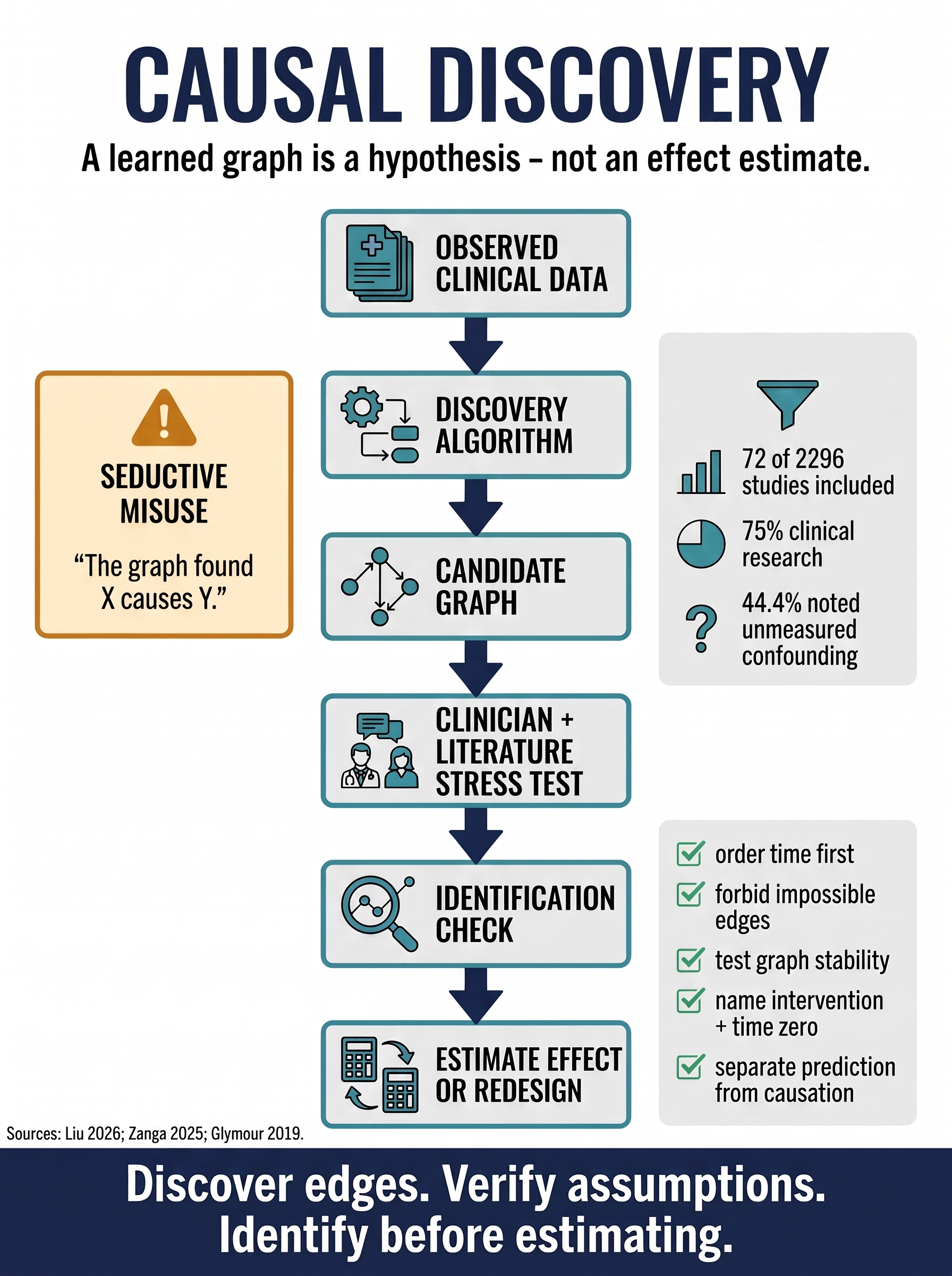
Causal Discovery: A Graph Is a Hypothesis
A methods-frontier guide to using causal discovery in clinical data without mistaking a learned graph for an effect estimate. The poster separates observed data, discovery algorithms, candidate graphs, clinical stress testing, identification, and the decision to estimate or redesign.
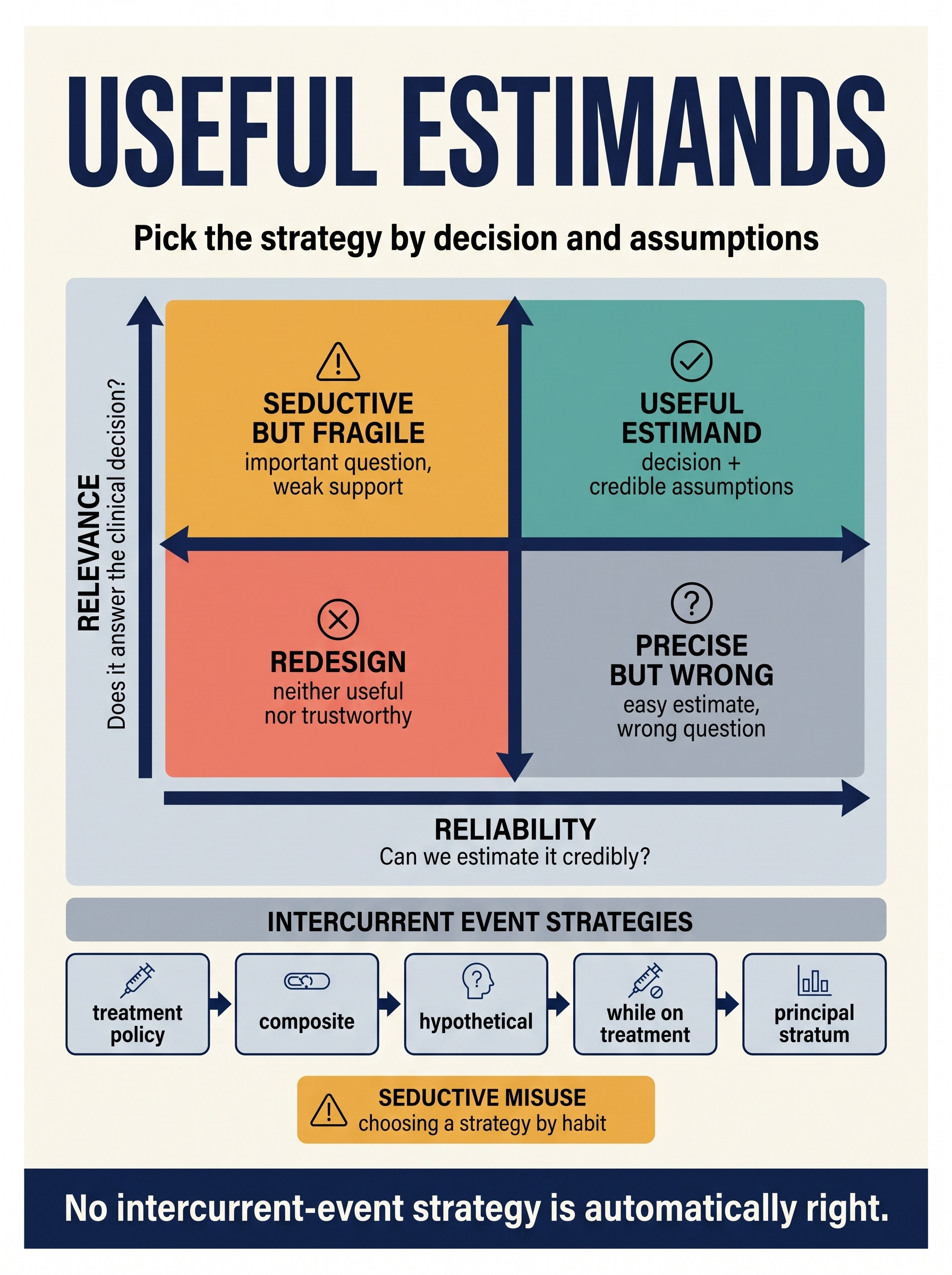
Useful Estimands: Balance Relevance With Reliability
A discovery-radar guide to Kahan, Li, Harhay, and Cro's 2026 relevance-versus-reliability test for choosing intercurrent-event strategies. The guide shows why treatment policy, composite, hypothetical, while-on-treatment, and principal-stratum strategies are decision tools, not quality ranks, and why an estimand is useful only when it answers a real decision and can be estimated under credible assumptions.
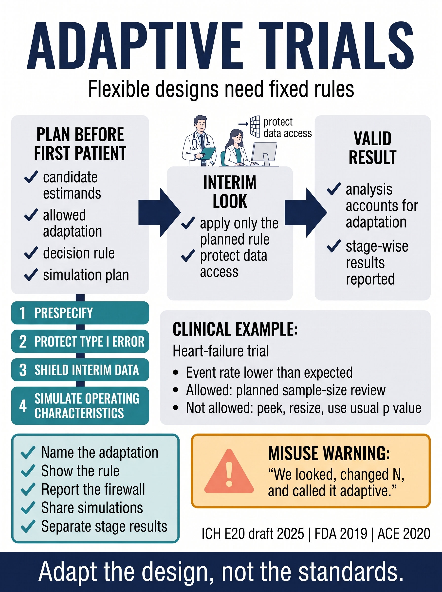
Adaptive Design Gates in Clinical Trials
A practical guide to the 2025 ICH E20 adaptive-design frontier: flexibility is credible only when the adaptation rule is pre-specified, interim information is protected, Type I error and estimation are accounted for, and operating characteristics are simulated across plausible clinical scenarios.
Paper Autopsies
Recent clinical and methods papers dissected for what their design permits, what it cannot establish, and what reviewers should inspect before trusting the headline.
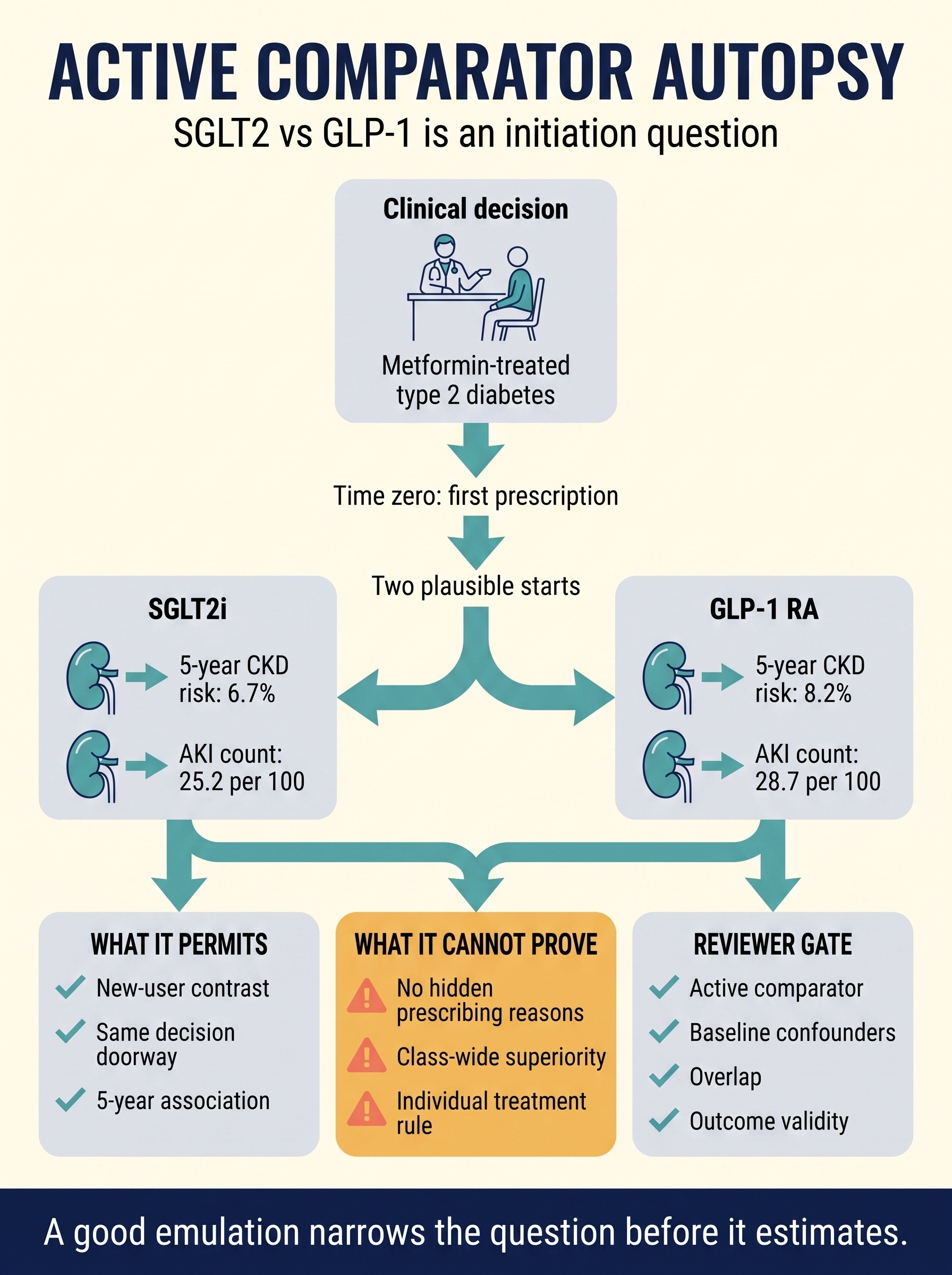
Active Comparator Autopsy: SGLT2 vs GLP-1
A paper autopsy of Jensen and colleagues' 2026 JAMA Internal Medicine target-trial emulation comparing SGLT2 inhibitor initiation with GLP-1 receptor agonist initiation for kidney outcomes in type 2 diabetes. The guide shows why active-comparator, new-user design improves the clinical question while still depending on measured-confounding, overlap, outcome-validity, and channeling assumptions.
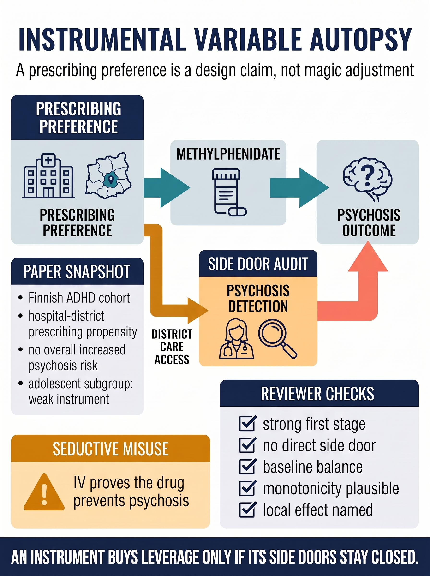
Instrumental Variable Autopsy
A paper autopsy of Healy and colleagues' 2026 JAMA Psychiatry instrumental-variable study of methylphenidate and later psychosis risk. The guide shows how hospital-district prescribing propensity can act as a treatment lever, why a strong first stage is not enough, and how reviewers should audit side doors from district context to outcome detection.
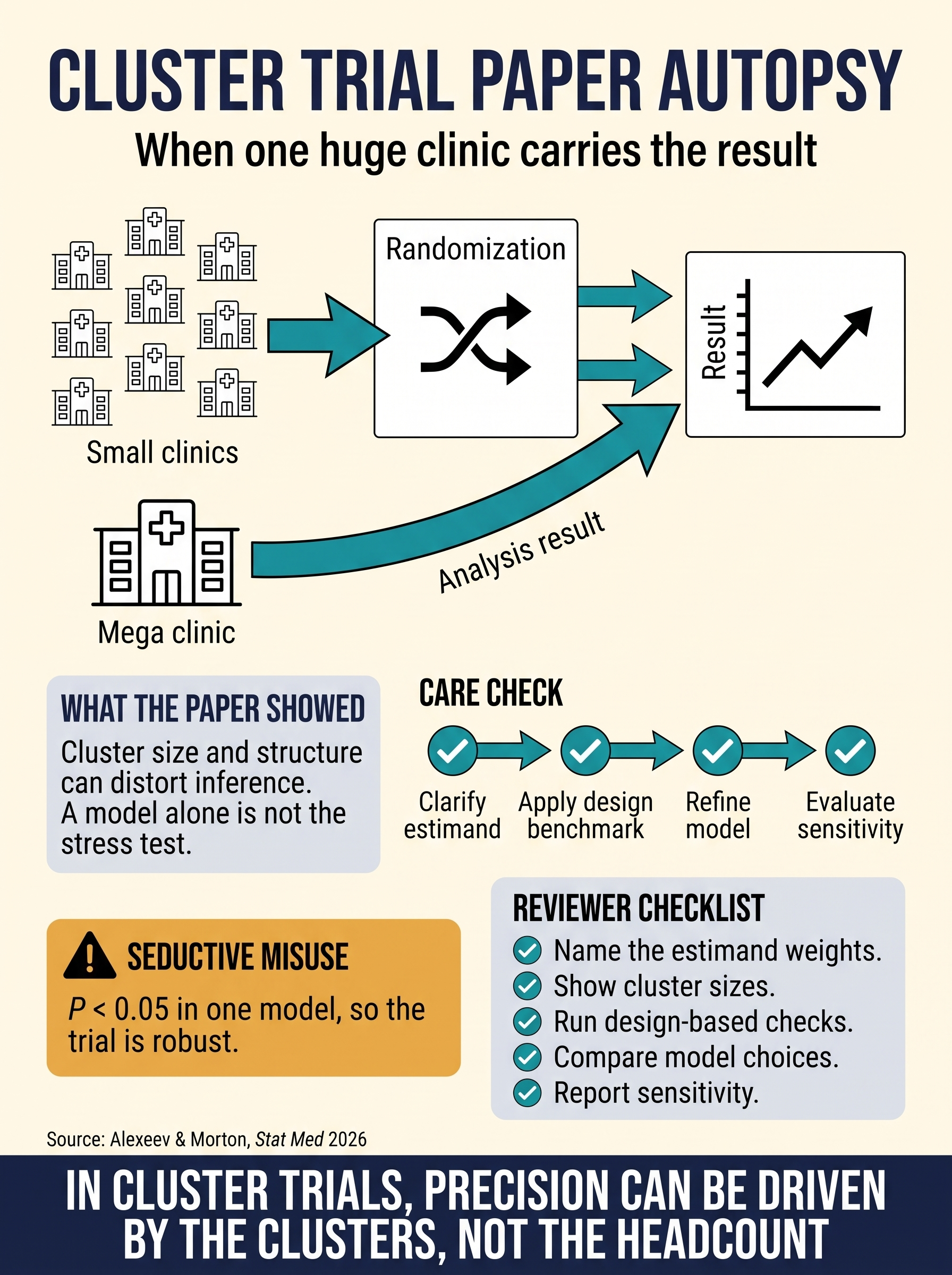
Cluster Trial Paper Autopsy
A paper autopsy of Alexeev and Morton's 2026 CARE framework for cluster-randomized trials. The guide shows why a large patient count can still hide fragile inference when cluster sizes, leverage, estimand weights, and model choices are not stress-tested against the randomized units.
Reviewing & Reporting
Manuscript craft for researchers and reviewers: transparent reporting, reproducibility, interpretation, and the common ways a paper's headline can drift away from its design.
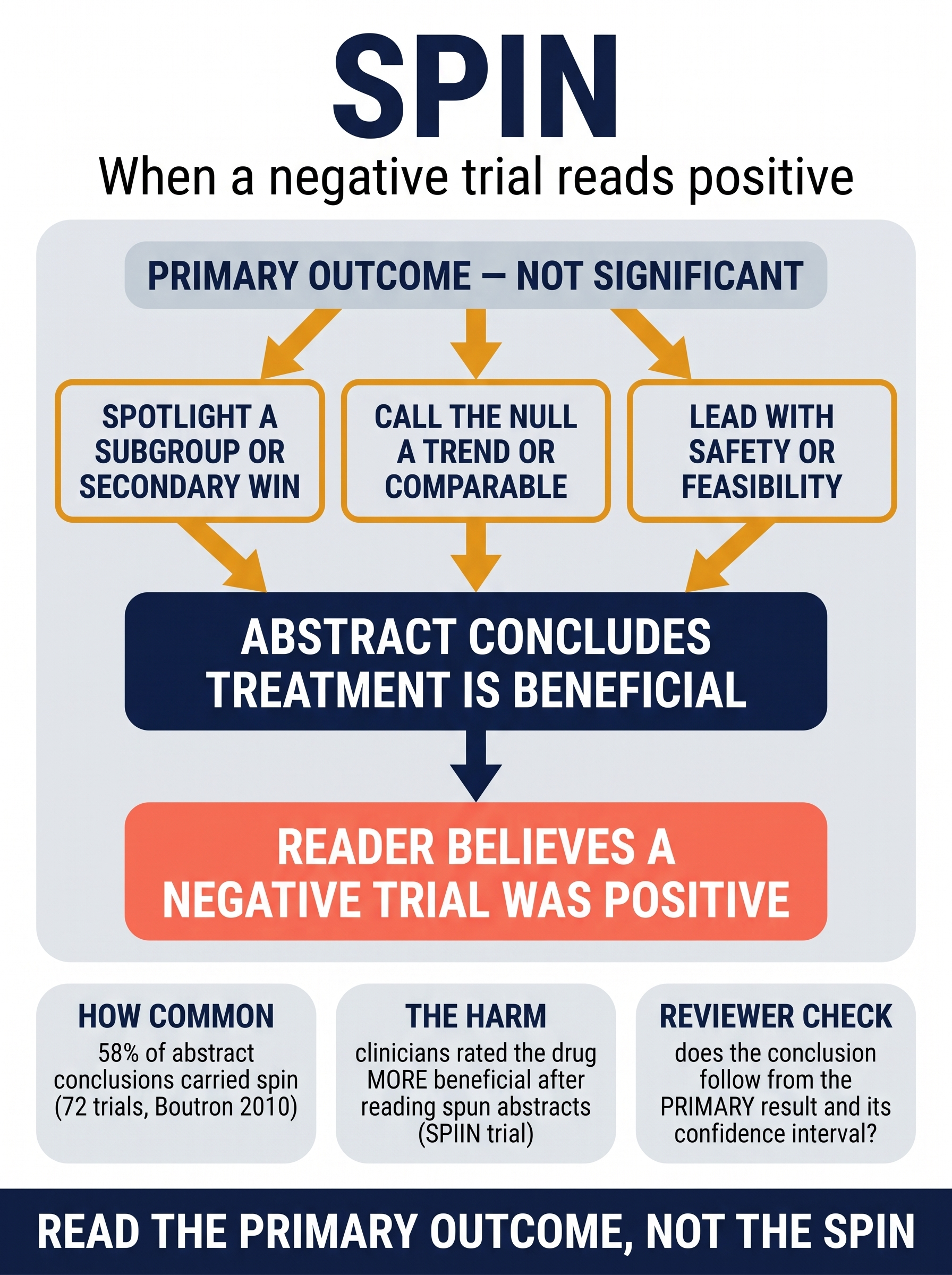
Spin: When a Negative Trial Reads Positive
A reviewer and reporting-craft guide to spin: the reporting strategies that make a statistically nonsignificant primary outcome read as a positive finding. The guide traces the null-to-positive pathway — spotlighting a subgroup or secondary win, redescribing the null as a trend, and leading with safety or feasibility — then anchors the reviewer's check to the prespecified primary result and its confidence interval. Evidence base: Boutron 2010 (spin in 58% of abstract conclusions across 72 trials with nonsignificant primary outcomes) and the SPIIN randomized experiment, where clinicians rated the treatment as more beneficial after reading spun abstracts.
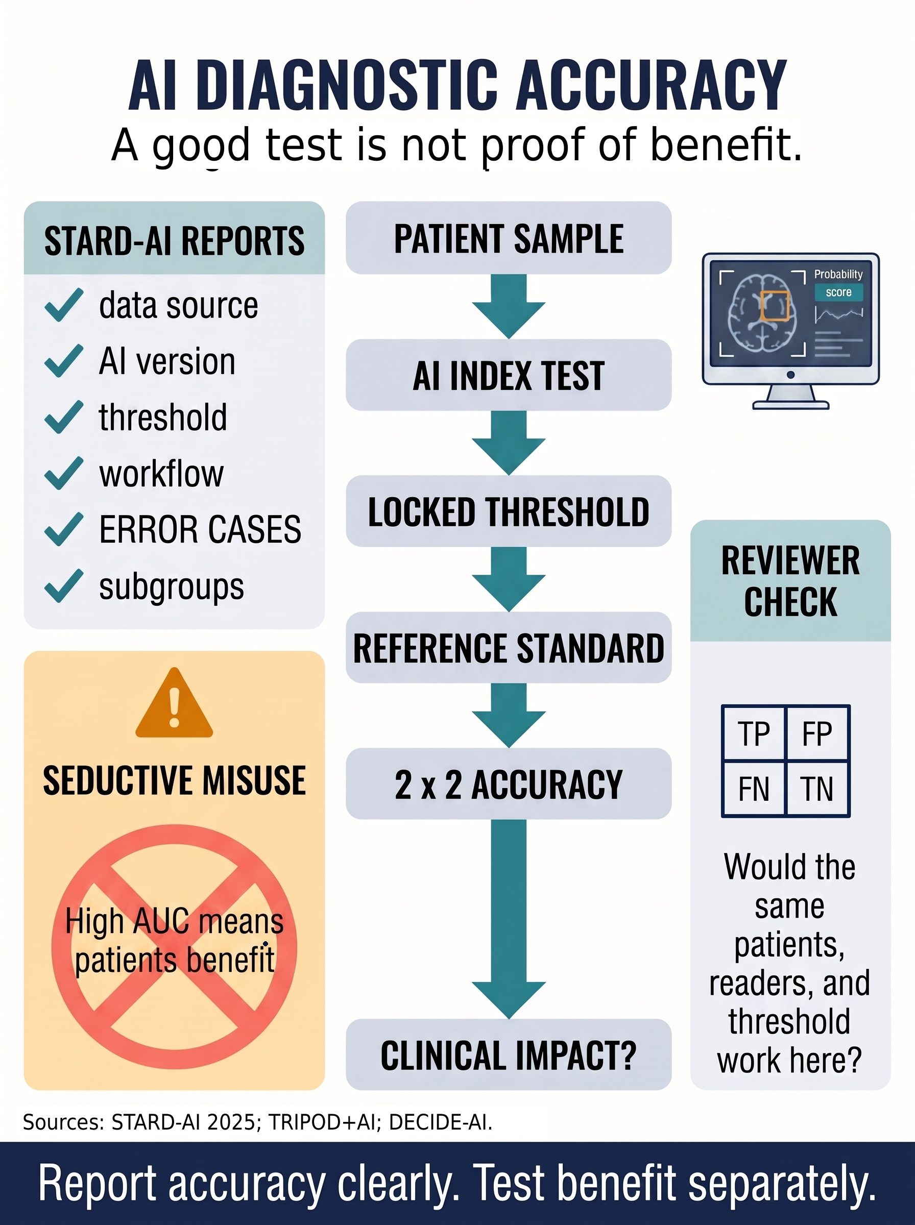
STARD-AI: Diagnostic Accuracy Is Not Clinical Benefit
A discovery radar guide for reviewing AI diagnostic-accuracy studies without sliding from AUC, sensitivity, and specificity into unsupported patient-benefit claims. The guide separates patient sample, AI index test, locked threshold, reference standard, accuracy table, and the separate impact study needed before clinical benefit is asserted.
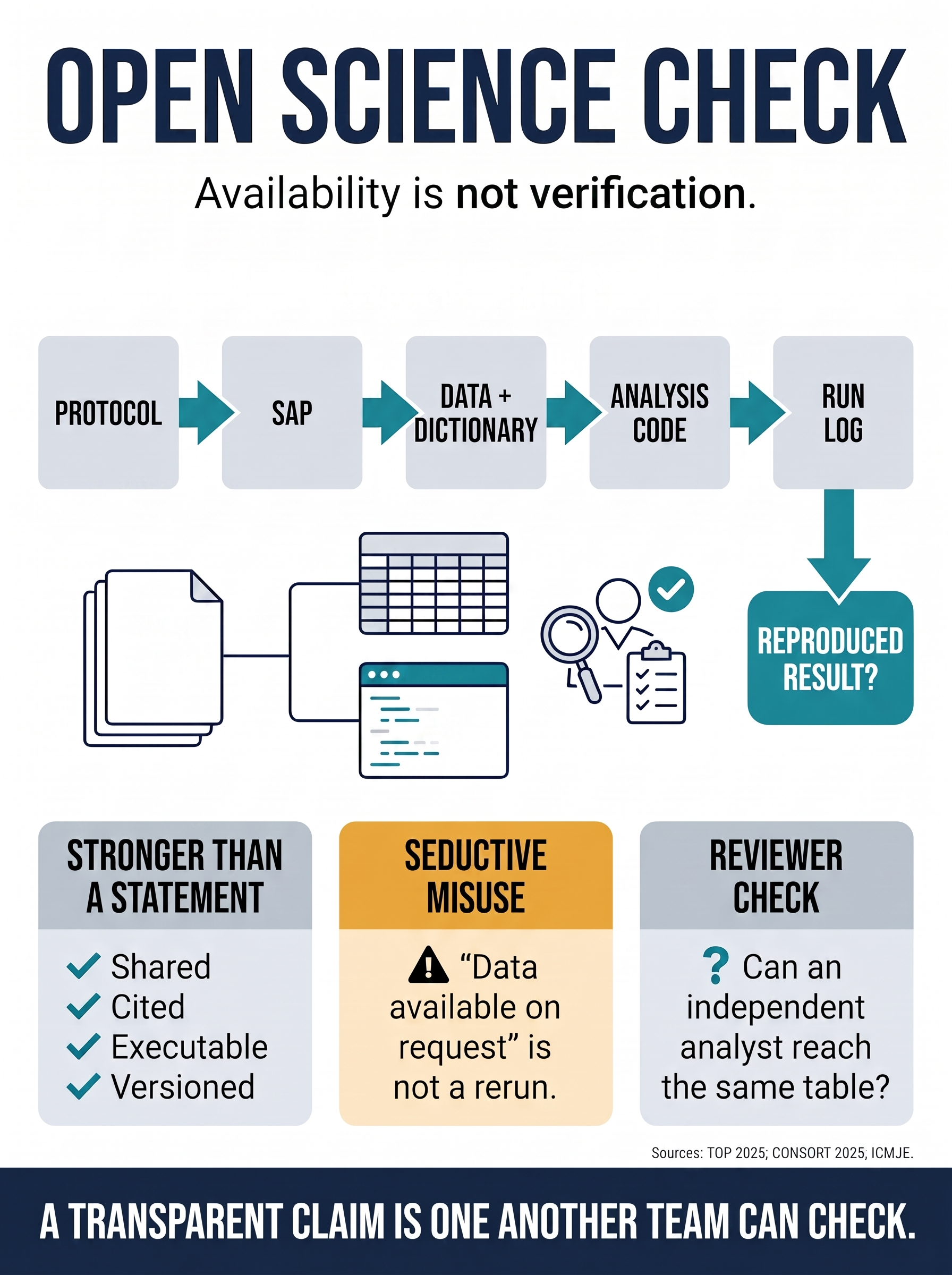
Open Science Check: Availability Is Not Verification
A reviewer guide for distinguishing open-science statements from verifiable empirical claims. The guide traces protocol, SAP, data dictionary, analysis code, and run log before asking whether an independent analyst can reach the same table.
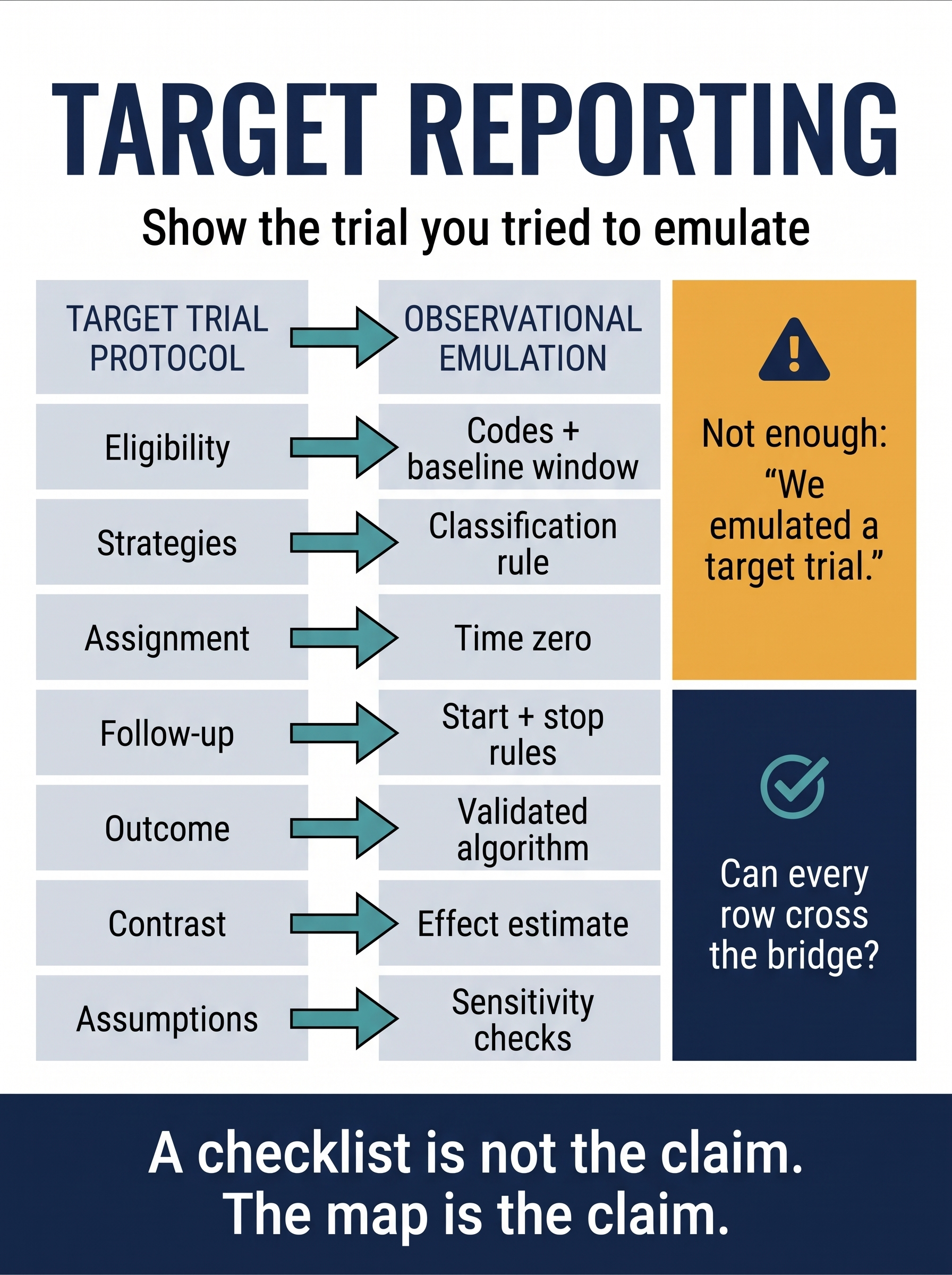
TARGET Reporting: Show the Trial You Tried to Emulate
A reviewer guide to TARGET reporting for observational target trial emulations. The guide asks whether every target-trial protocol component is visibly mapped to a defensible data operation, so a modern causal label does not hide time-zero drift, weak outcome measurement, missing assumptions, or opaque sensitivity checks.
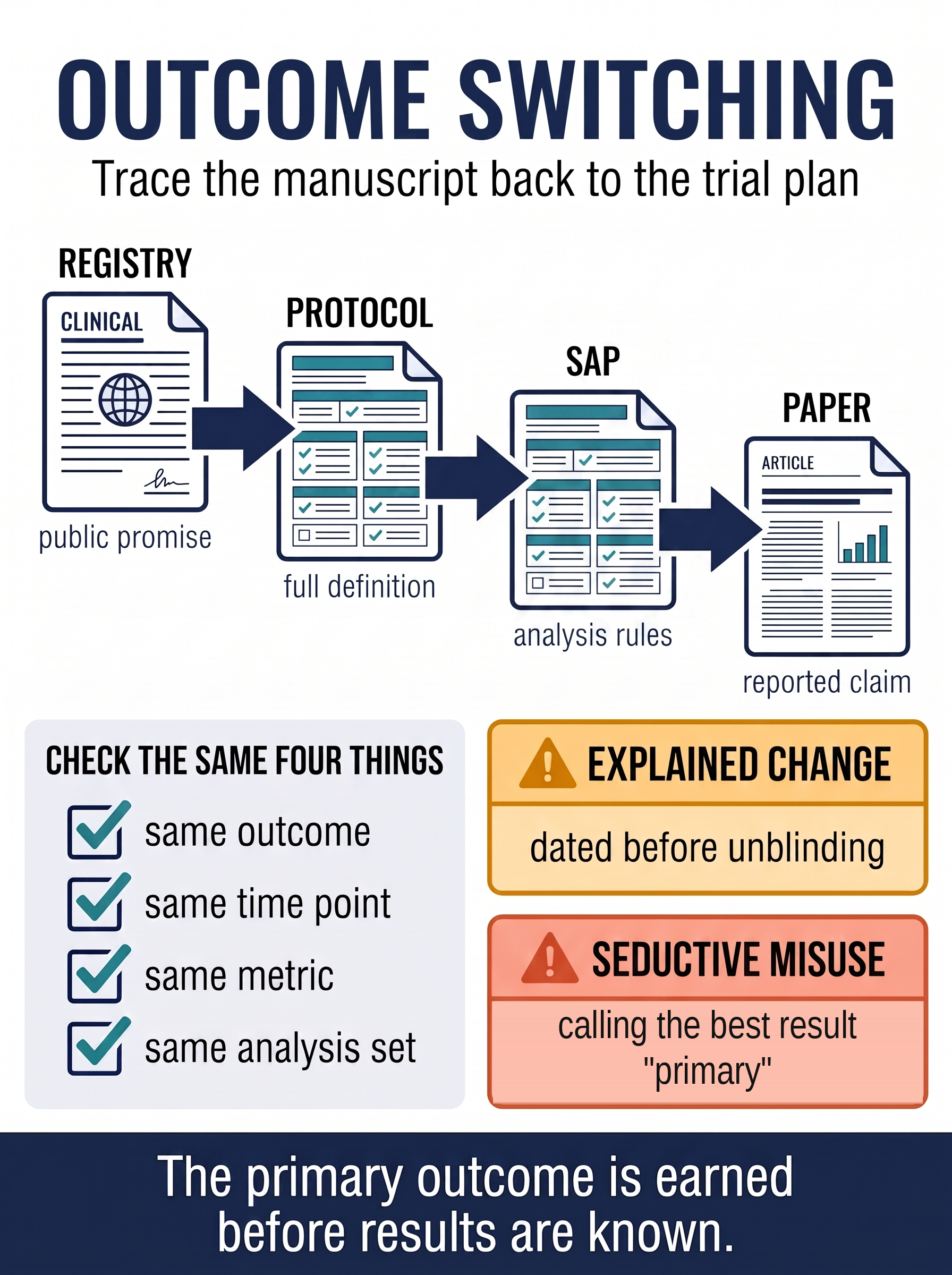
Outcome Switching: Trace the Manuscript Back to the Trial Plan
A reviewer trace from registry to protocol to statistical analysis plan to paper. The guide separates credible, dated outcome amendments from unexplained post-result relabelling, and shows why a registered trial still needs its primary claim checked against the original clinical target.
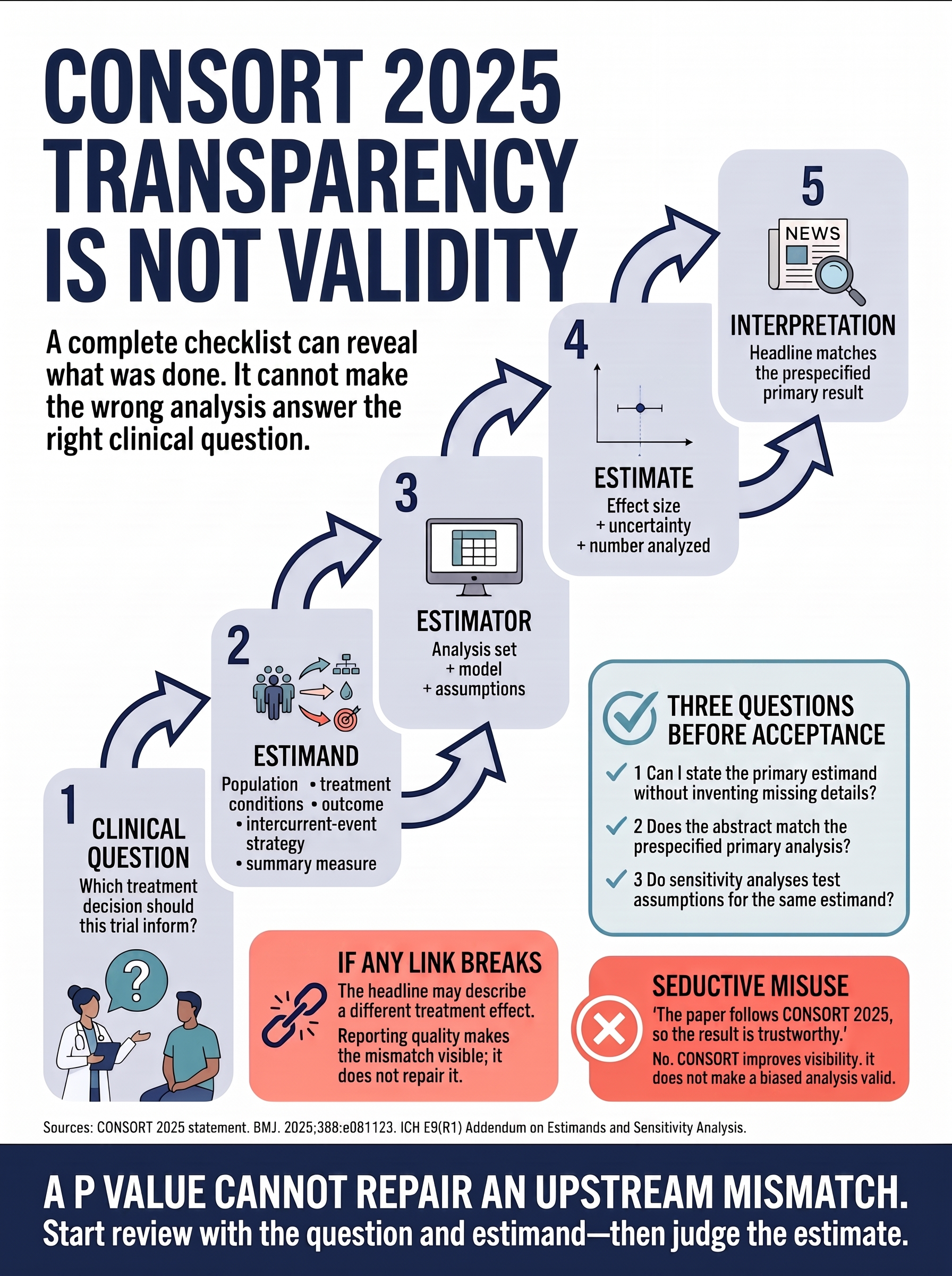
CONSORT Is Not a Validity Certificate
A reviewer workflow for tracing the abstract claim back through the clinical question, estimand, estimator, analysis set, intercurrent events, and sensitivity analyses before accepting what the trial result means.
Clinical Trials & Sensitivity Analysis
Stress-test the assumptions behind trial conclusions while preserving the clinical question.
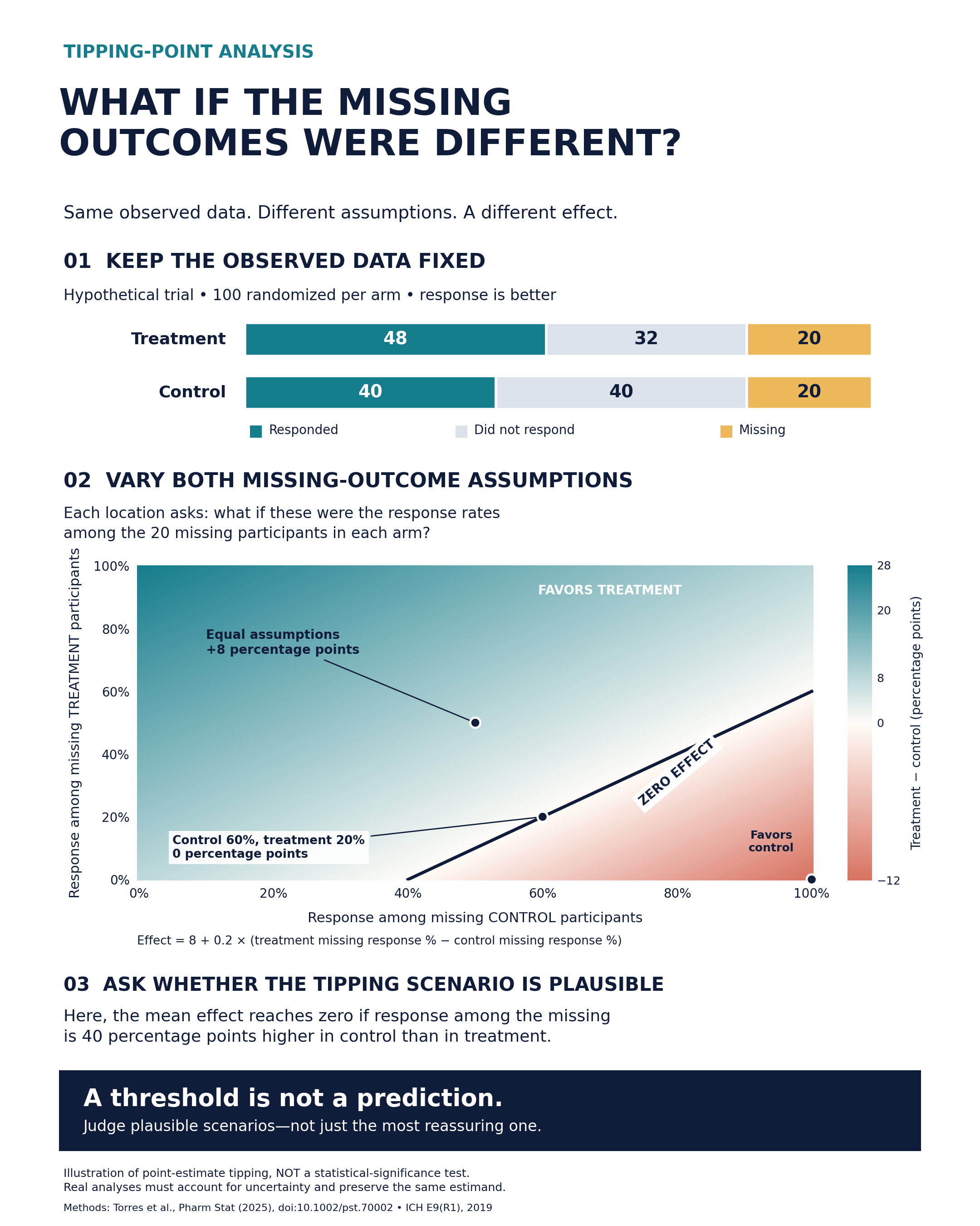
What If the Missing Outcomes Were Different?
A worked tipping-point heatmap: hold observed outcomes fixed, vary missing response rates in both randomized arms, and locate where the point estimate changes sign. The visual distinguishes this threshold from statistical significance and asks whether the tipping scenario is clinically plausible.
Advanced Causal Inference
Longitudinal causal problems are where a lot of observational papers quietly break. These guides cover the designs and diagnostics you need when treatment and confounding evolve over time, how to use marginal structural models when standard adjustment starts eating the treatment pathway, how to emulate the trial you wish you had actually run, how to think carefully about mechanisms, how not to let the analytic sample quietly hijack the causal question, what happens when the variables themselves are fuzzier than the prose admits, why events that happen first can completely rewrite the endpoint story, and how to pressure-test causal claims with negative controls before you start believing your own model.
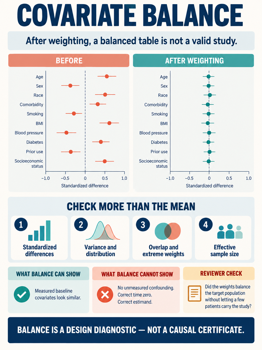
Covariate Balance After Weighting: A Balanced Table Is Not a Valid Study
A design-diagnostics guide for propensity-score weighting that moves beyond a post-weighting Table 1. It shows reviewers how to combine standardized differences with distribution checks, overlap, weight tails, and effective sample size—and why excellent measured-covariate balance still cannot prove exchangeability, correct time zero, or a coherent estimand.
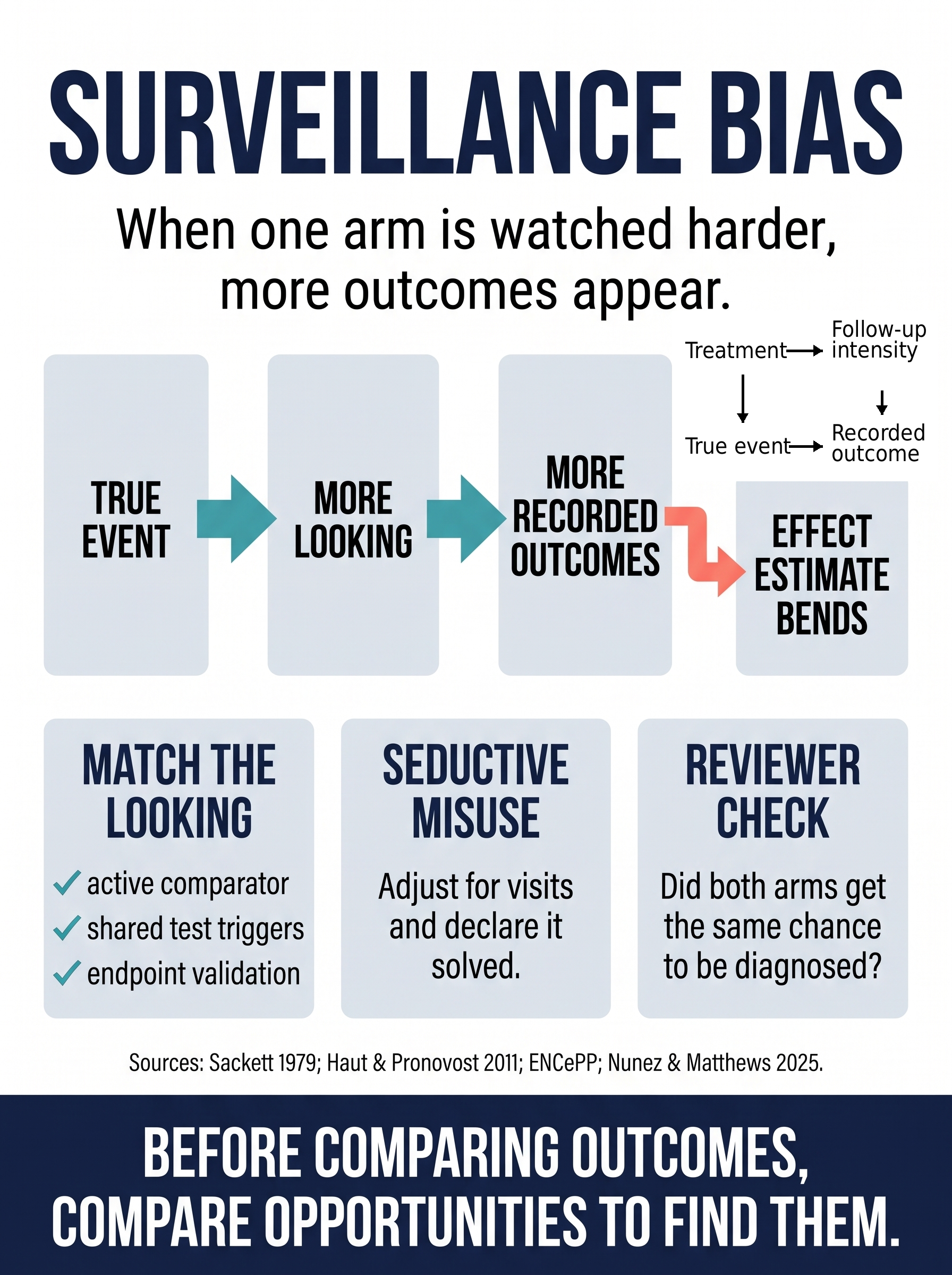
Surveillance Bias: When Looking Harder Creates More Outcomes
A causal-reasoning guide for EHR and claims studies where the recorded endpoint depends on how hard each arm is watched, tested, imaged, and coded. The guide separates true clinical events from recorded outcomes, shows why post-baseline visit adjustment is not a magic fix, and gives reviewers a design checklist for active comparators, shared testing triggers, endpoint validation, and negative-control outcomes.
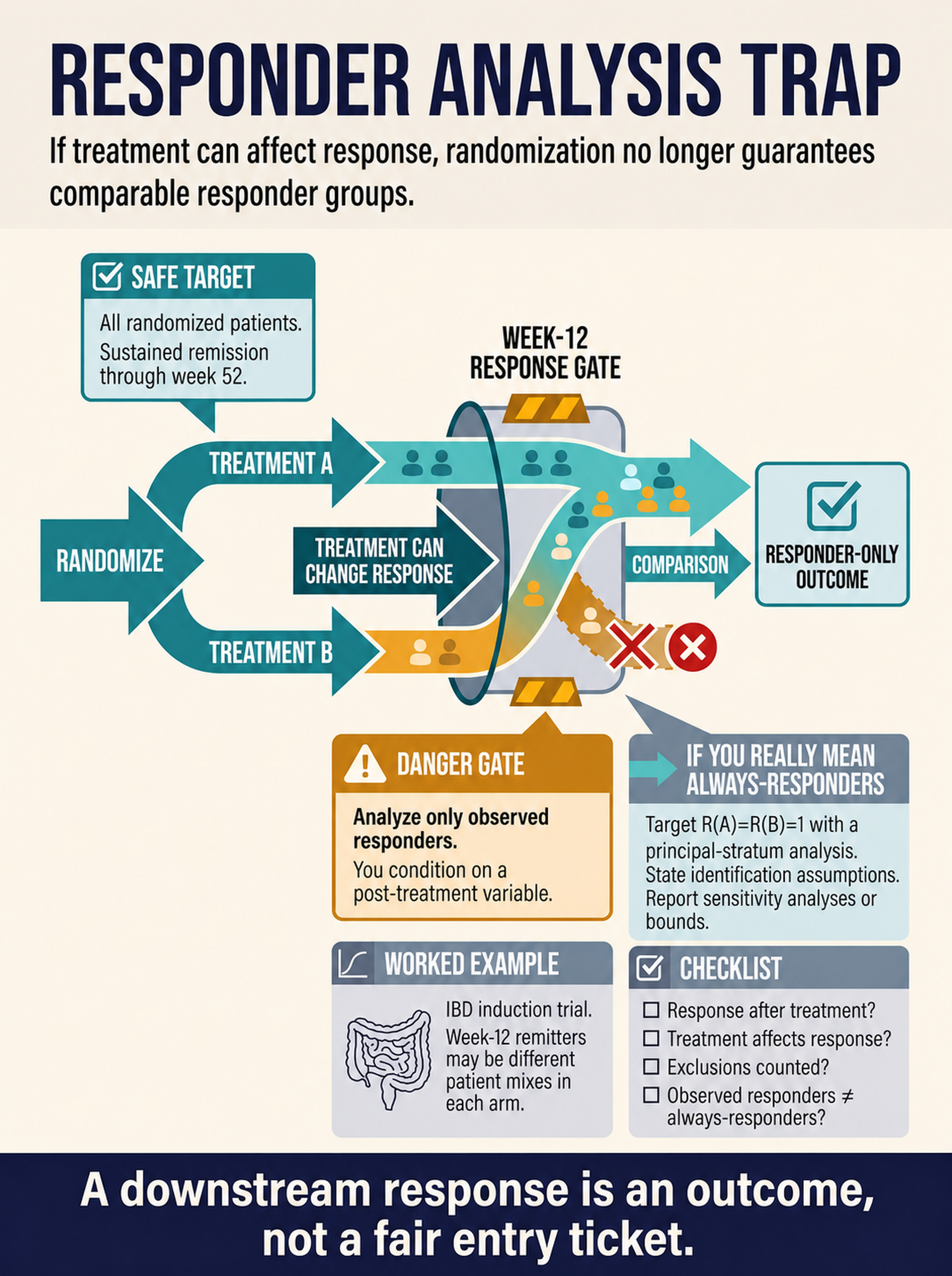
Responder Analysis Trap: When Post-Randomization Response Becomes the Door
A causal-reasoning guide to the responder-only comparison that looks patient-centered until treatment can affect who enters the subgroup. The guide separates observed responders from latent always-responders, keeps nonresponse inside the estimand strategy, and shows why randomization no longer guarantees comparable groups after restriction to observed responders.
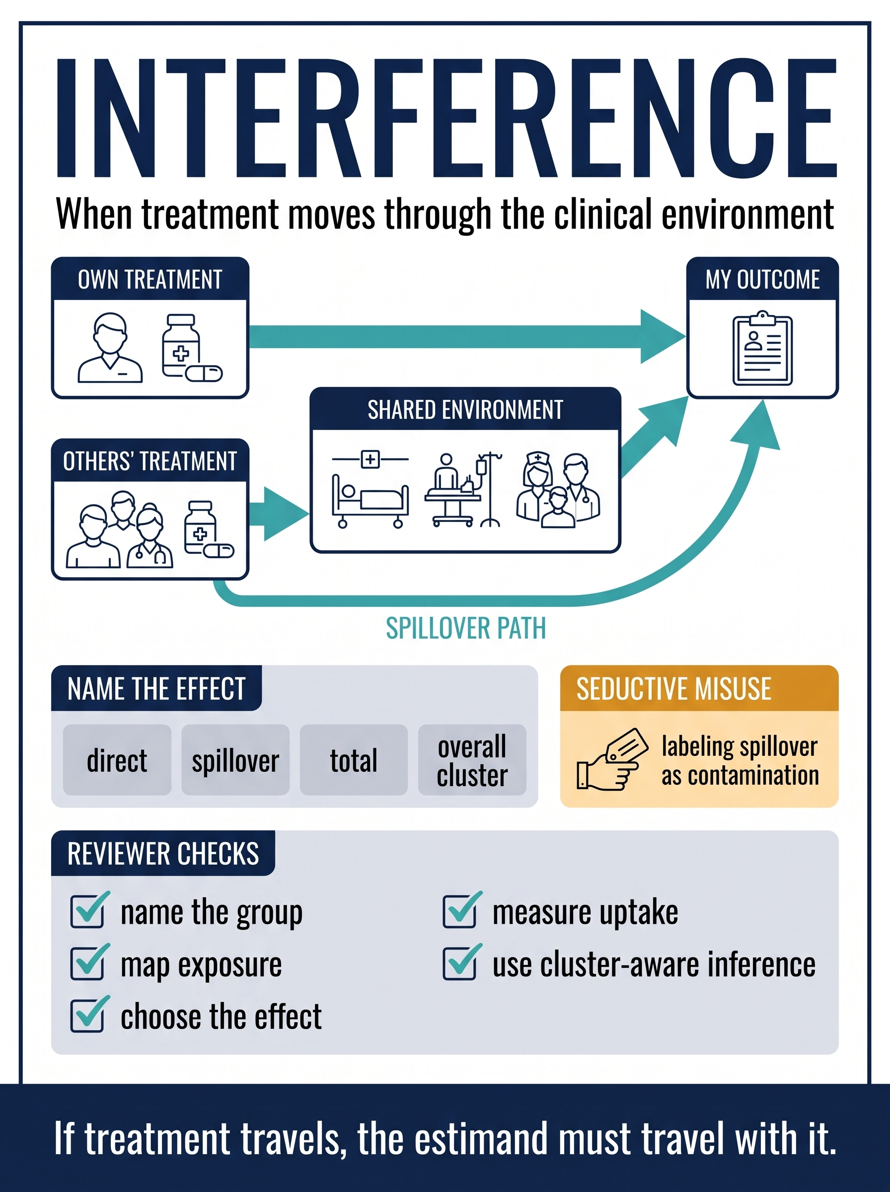
Interference: When Treatment Travels
A design-first guide to clinical studies where one patient's treatment can change another patient's outcome through wards, clinicians, households, infection pressure, or shared care pathways. The guide separates direct, spillover, total, and overall cluster effects so reviewers can see when contamination is actually the causal question.
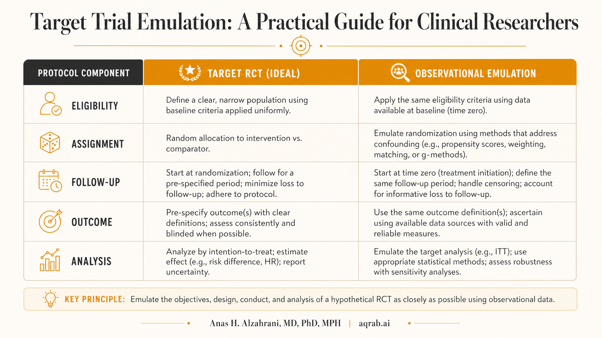
Target Trial Emulation Failure Modes
A visual guide to the design mistakes that make observational treatment comparisons look cleaner than they are. Covers time zero, immortal time bias, grace periods, clone-censor-weight, and the reviewer checks that separate a real emulation from retrospective cosplay.
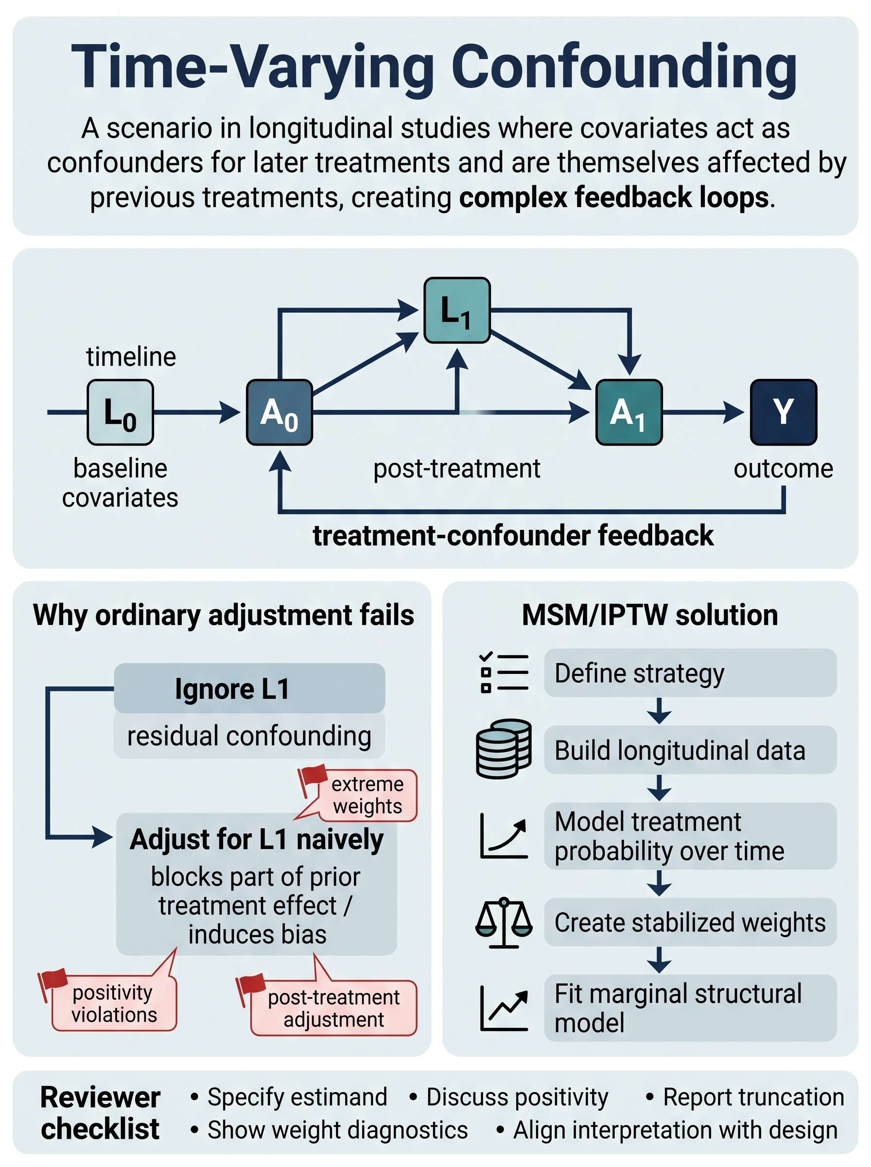
Time-Varying Confounding
Why standard adjustment can fail when later covariates both predict future treatment and are changed by prior treatment. A practical visual guide to treatment-confounder feedback, marginal structural models, stabilized weights, and the reviewer checks that actually matter.
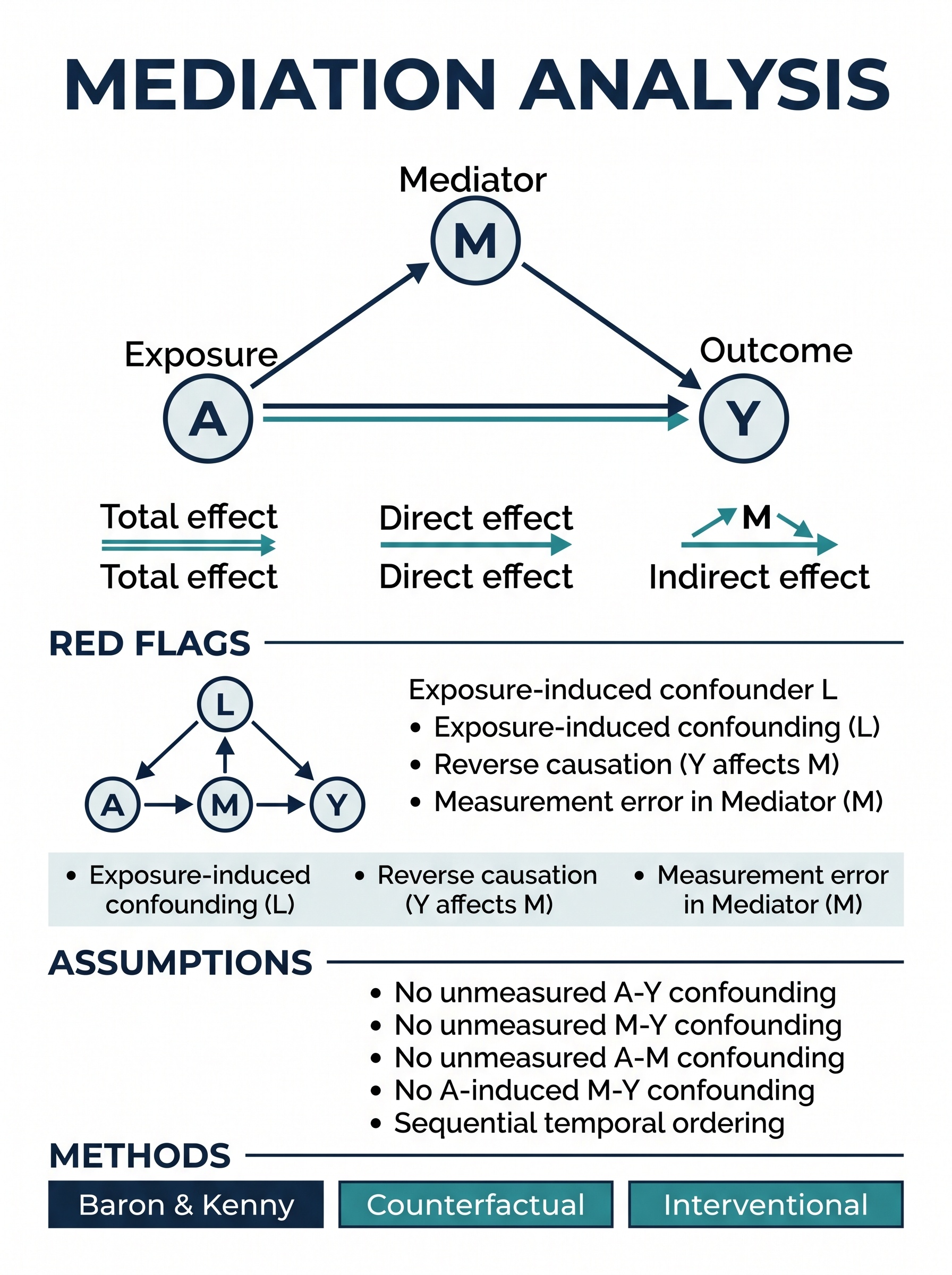
Mediation Analysis
A visual guide to separating total, direct, and indirect effects without overclaiming mechanism. Covers pathway-specific thinking, the assumptions that usually fail, and why mediator-outcome confounding can quietly break the whole analysis.
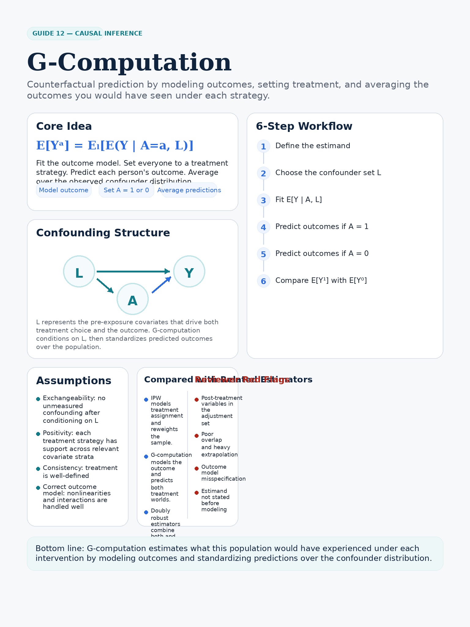
G-computation
A practical visual guide to counterfactual prediction and standardization: fit the outcome model, simulate intervention worlds, average over the target population, and check where model dependence can quietly bite.
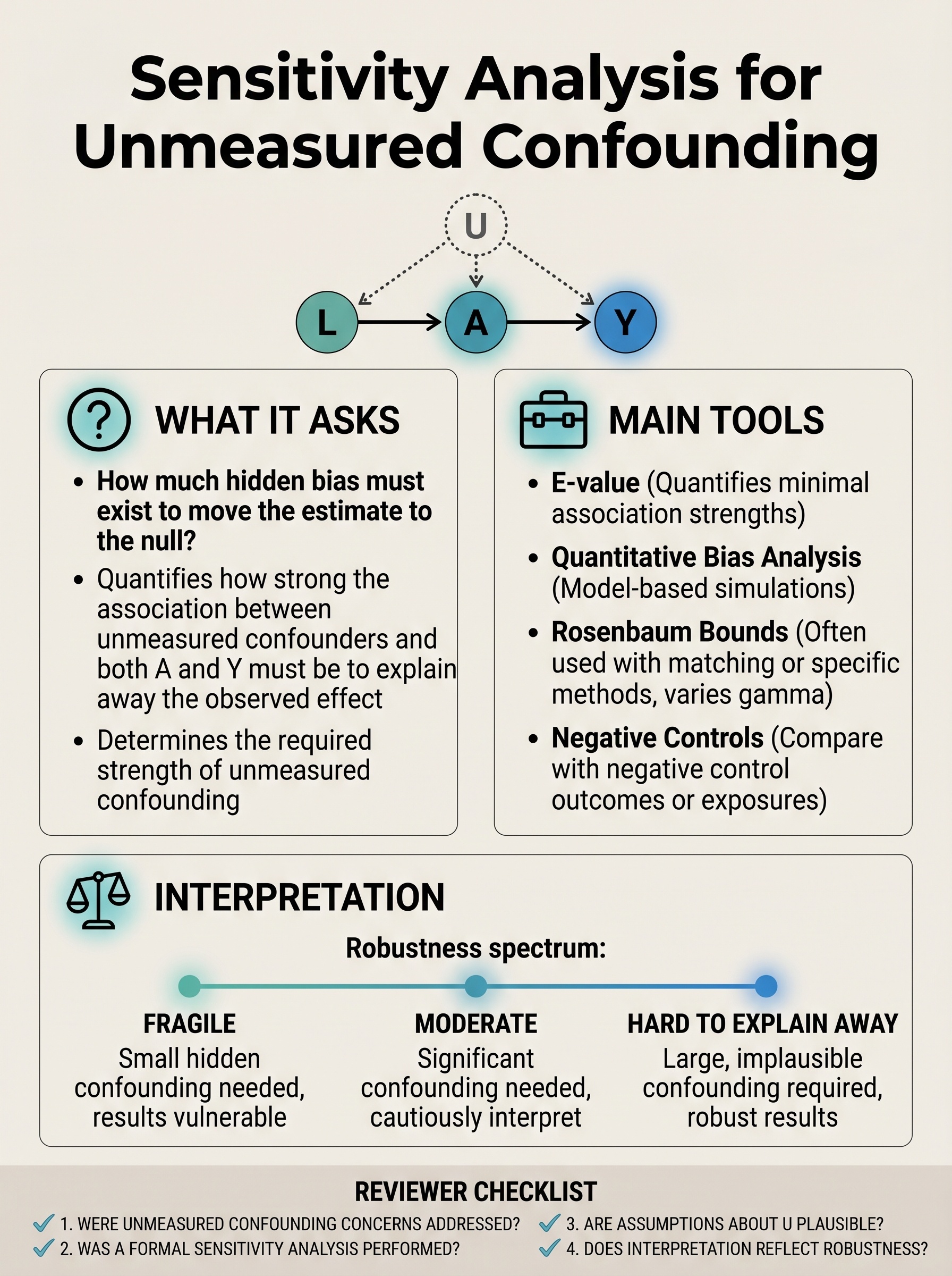
Sensitivity Analysis for Unmeasured Confounding
How to ask whether hidden bias could actually overturn your estimate. Covers E-values, quantitative bias analysis, Rosenbaum bounds, benchmarking, and the difference between real robustness and robustness theater.
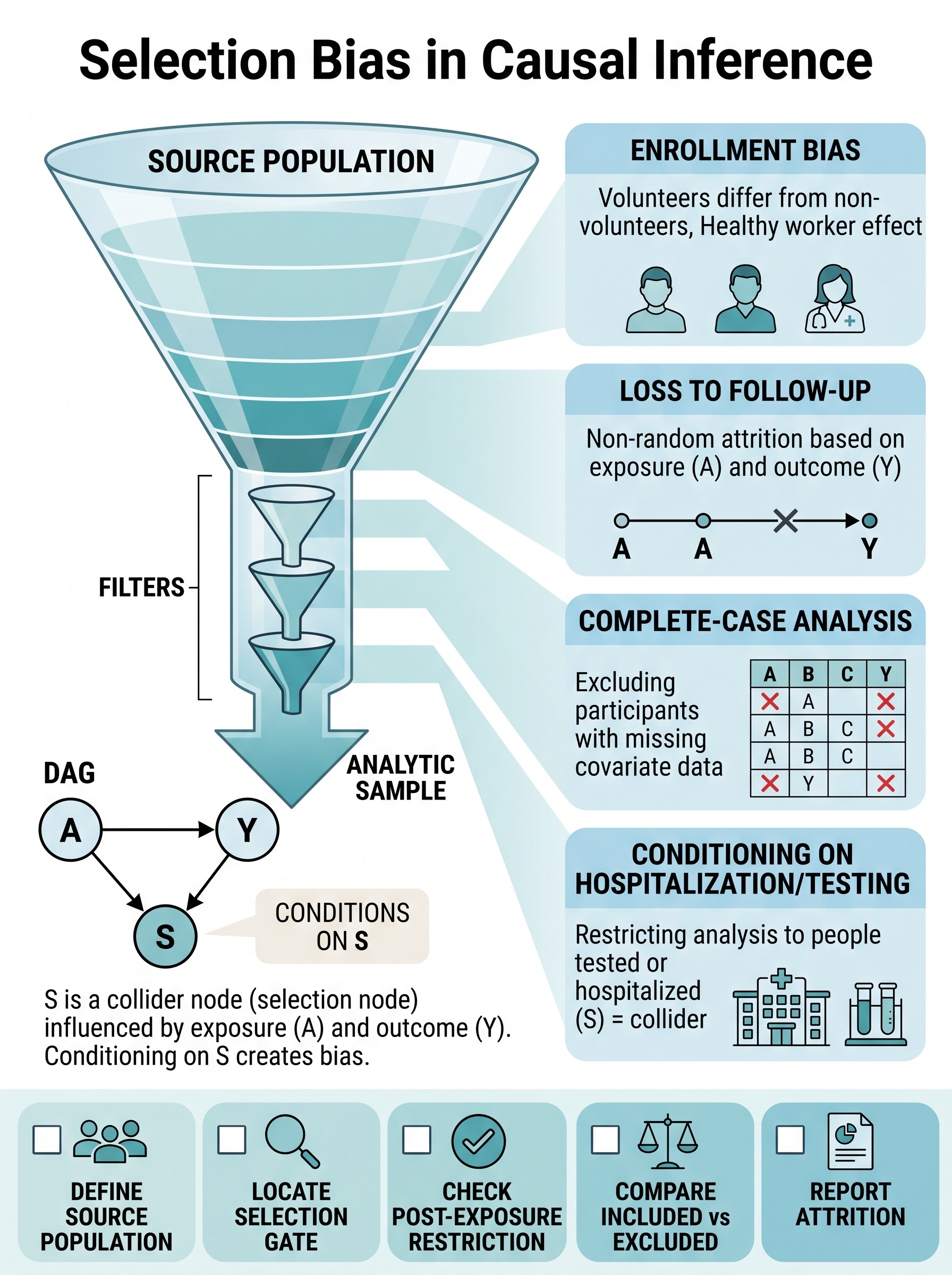
Selection Bias in Causal Inference
A visual guide to the moment your analytic sample stops representing the causal contrast you think you are estimating. Covers enrollment bias, informative censoring, complete-case selection, collider-driven restriction, and the checks that keep the counting process from becoming the whole story.
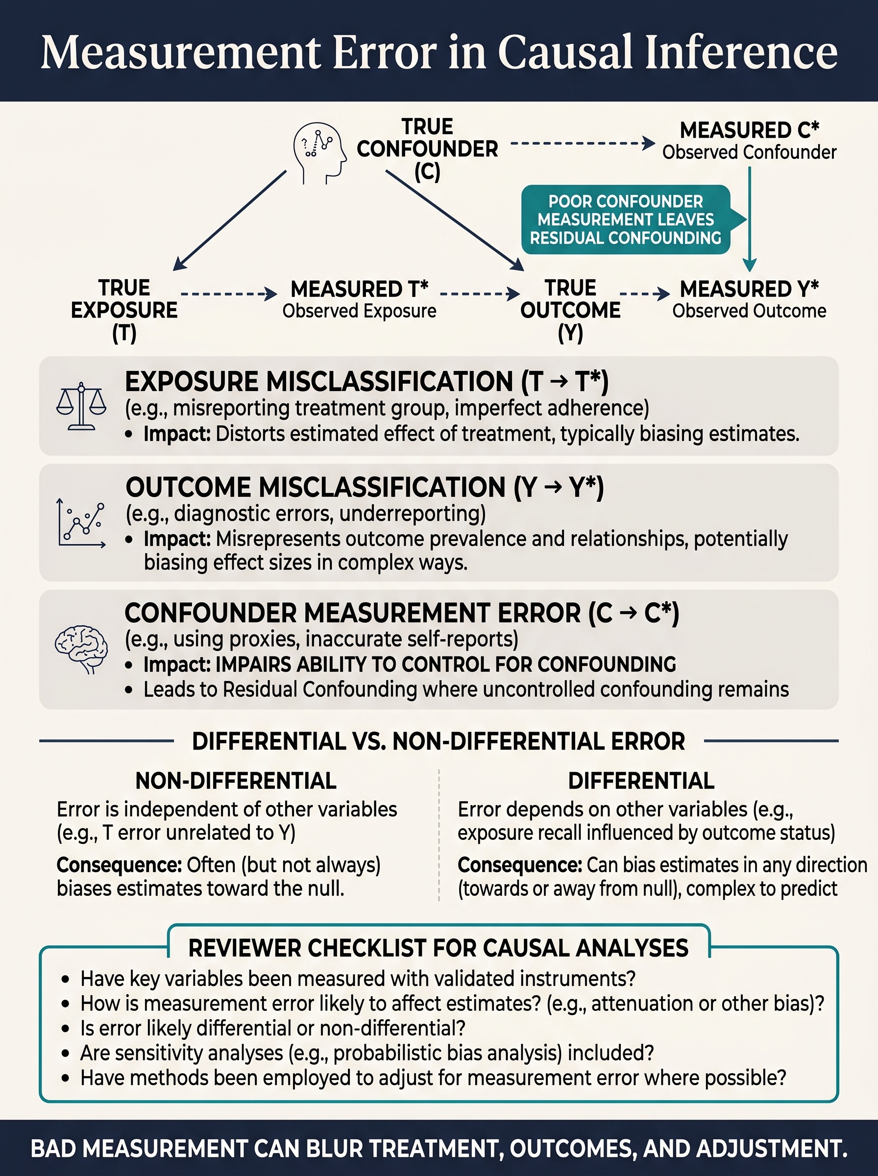
Measurement Error in Causal Inference
A visual guide to what happens when the variable in your model is only a blurry stand-in for the variable in the world. Covers exposure misclassification, outcome ascertainment, residual confounding from weak proxies, and why “probably toward the null” is not a serious measurement strategy.
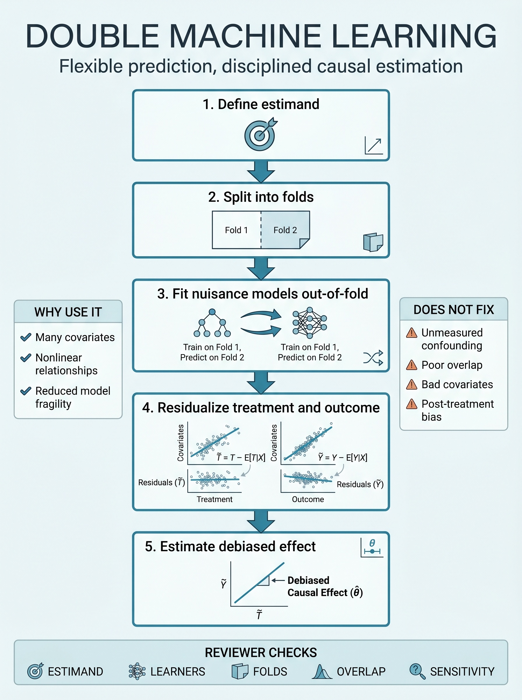
Double Machine Learning
A visual guide to using flexible prediction without turning the causal estimand into mush. Covers cross-fitting, orthogonalization, nuisance models, and the limits no algorithm can charm its way around.
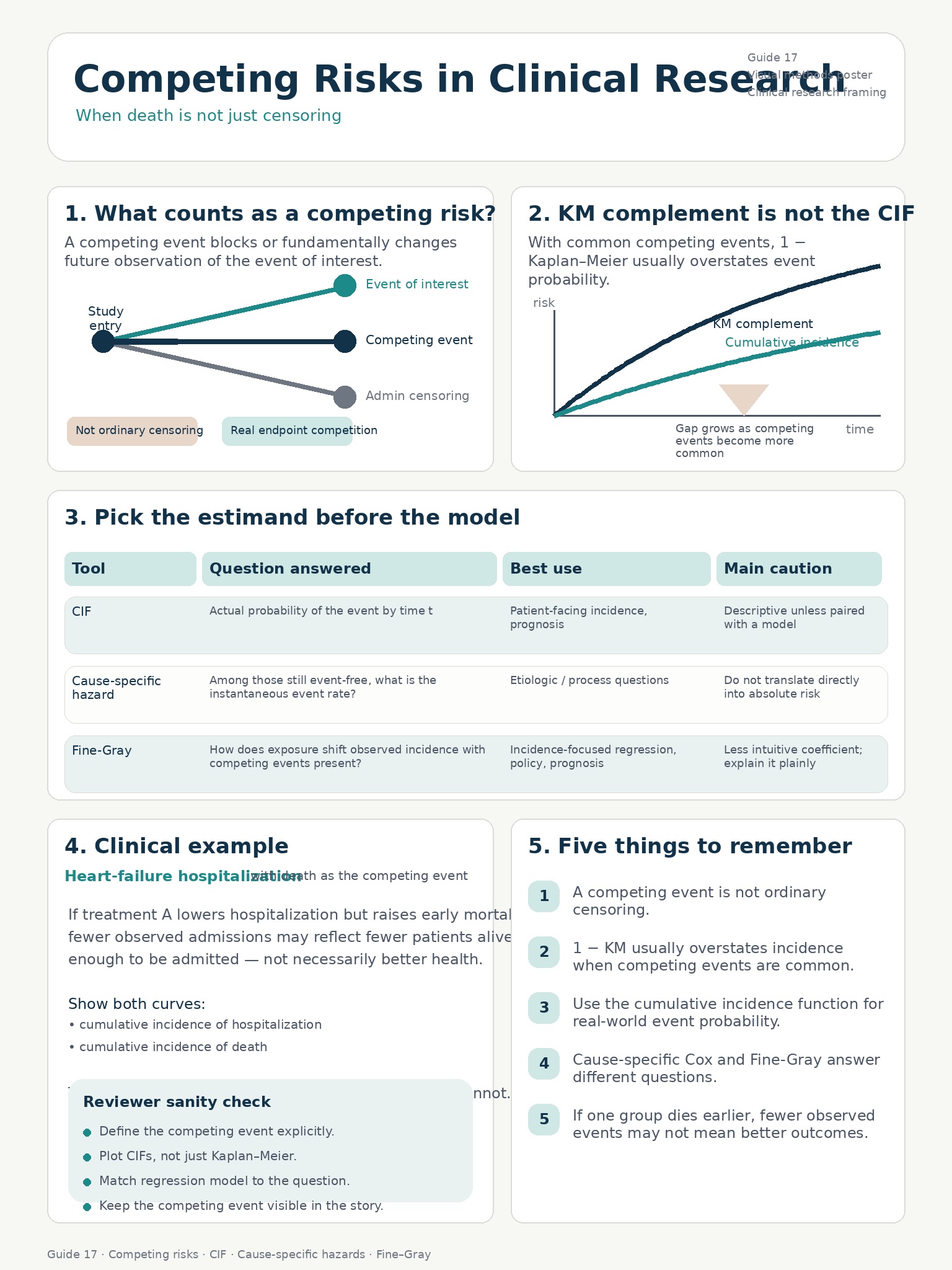
Competing Risks in Clinical Research
A visual guide to the moment death stops being a censoring convenience and becomes part of the estimand. Covers cumulative incidence, cause-specific hazards, Fine-Gray, and how to avoid mistaking fewer observed events for better outcomes.
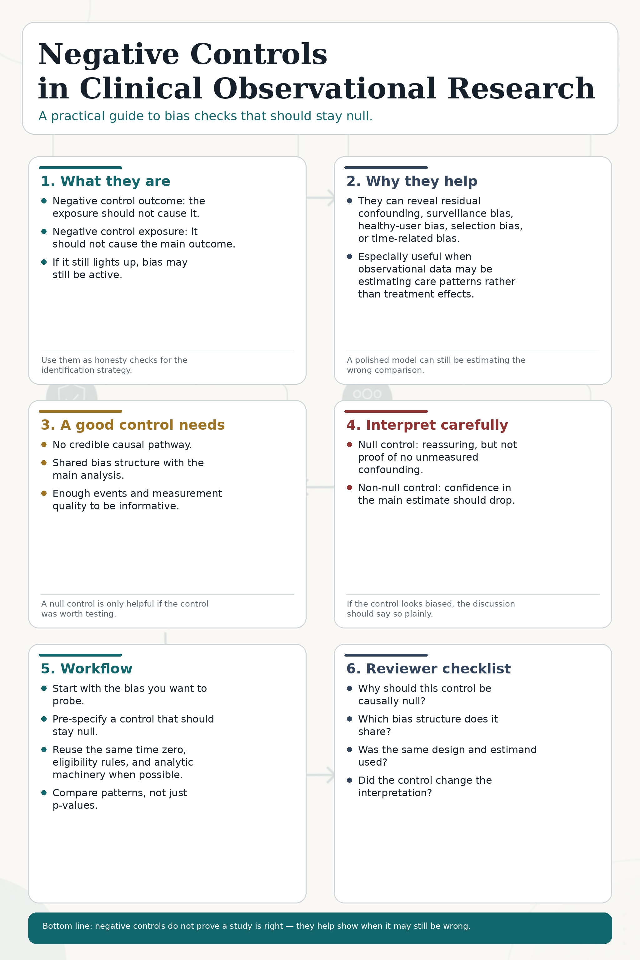
Negative Controls in Clinical Observational Research
A visual guide to one of the most useful bias checks in observational research: ask what should stay null, then see whether your design can keep it that way. Covers negative control outcomes, negative control exposures, shared bias structure, and how a bad control should make your causal claims noticeably humbler.
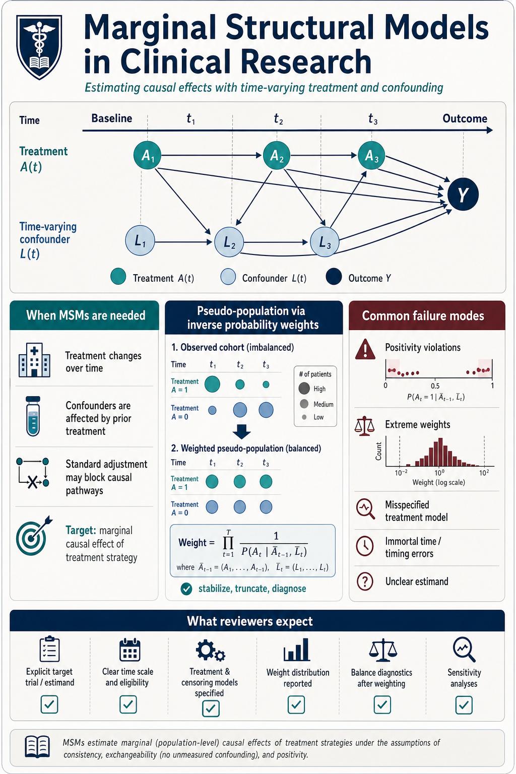
Marginal Structural Models in Clinical Research
A visual guide to the moment standard adjustment starts adjusting away the treatment story. Covers treatment-confounder feedback, inverse probability weighting, stabilized weights, informative censoring, and the reviewer checks that keep longitudinal causal claims from becoming beautifully formatted fiction.
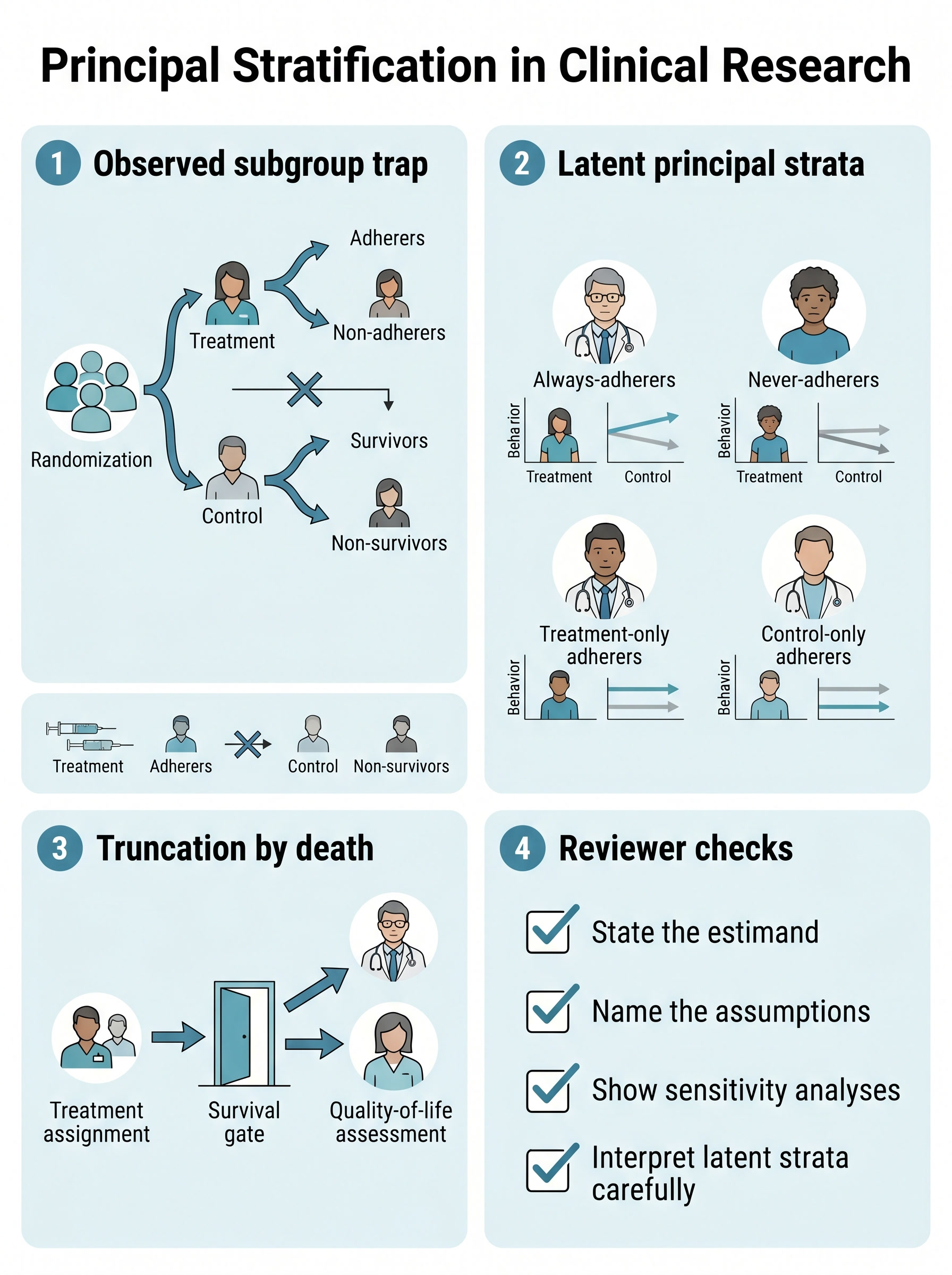
Principal Stratification in Clinical Research
A visual guide to the questions investigators keep asking in the wrong subgroup. Covers latent principal strata, truncation by death, the survivor average causal effect, and why “among adherers” is usually not the causal shortcut people hope it is.
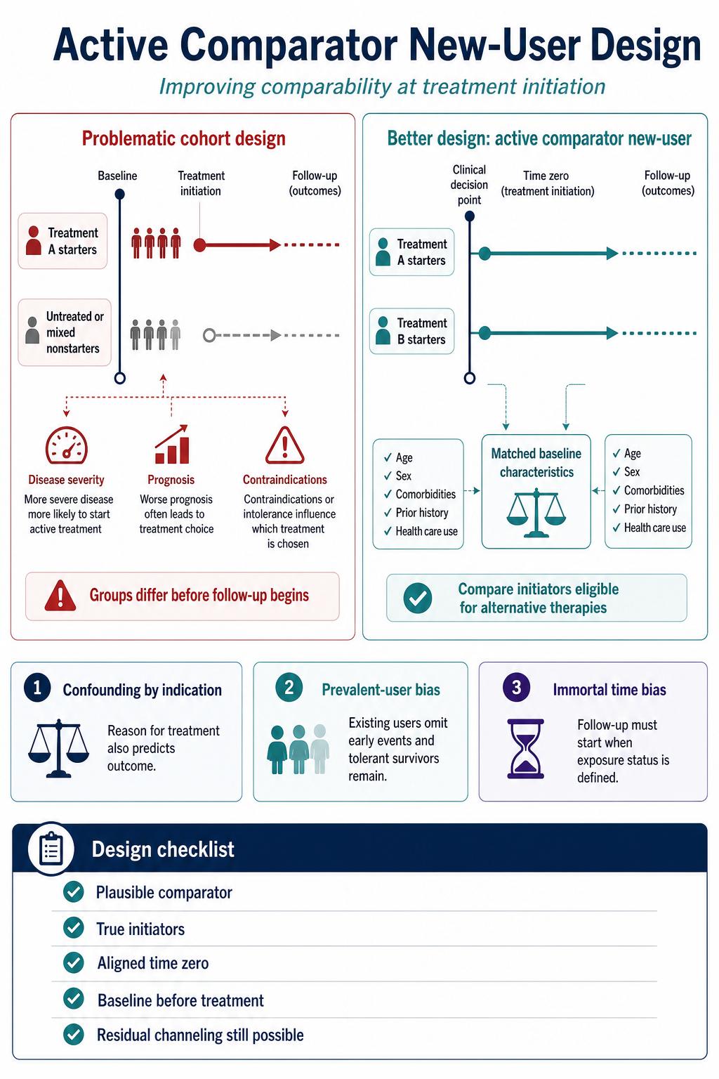
Active Comparator New-User Design in Clinical Research
A visual guide to building a drug comparison before the model starts improvising. Covers plausible alternative comparators, initiation-aligned time zero, true new users, and why treated-versus-untreated cohorts often estimate prescribing logic with a hazard ratio attached.
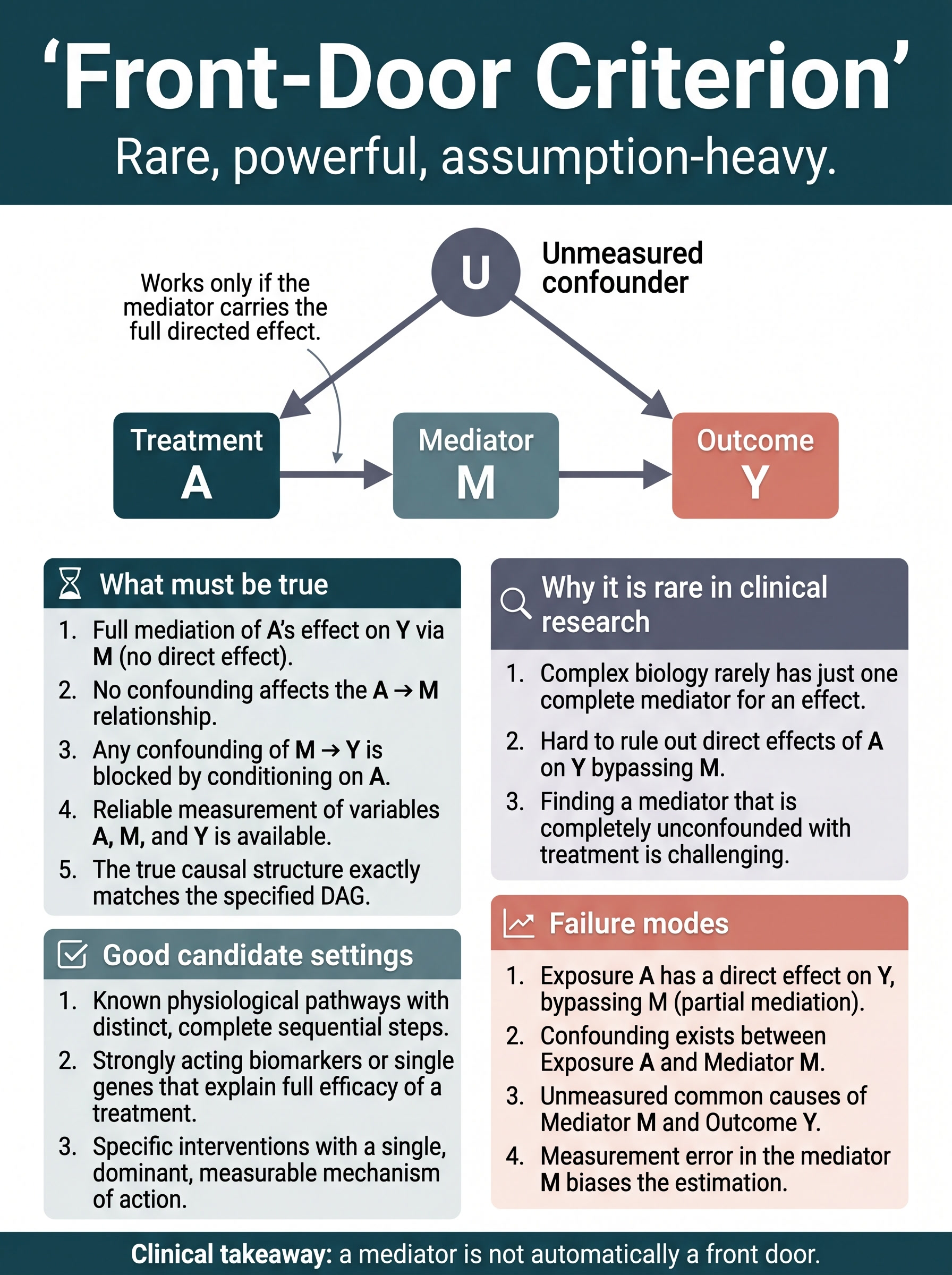
Front-Door Criterion in Clinical Research
A visual guide to one of causal inference's most elegant and most overclaimed ideas. Covers full mediation, mediator-path confounding, why front-door identification is rare in clinical data, and how to tell a real mechanism design from mediator-shaped wishful thinking.
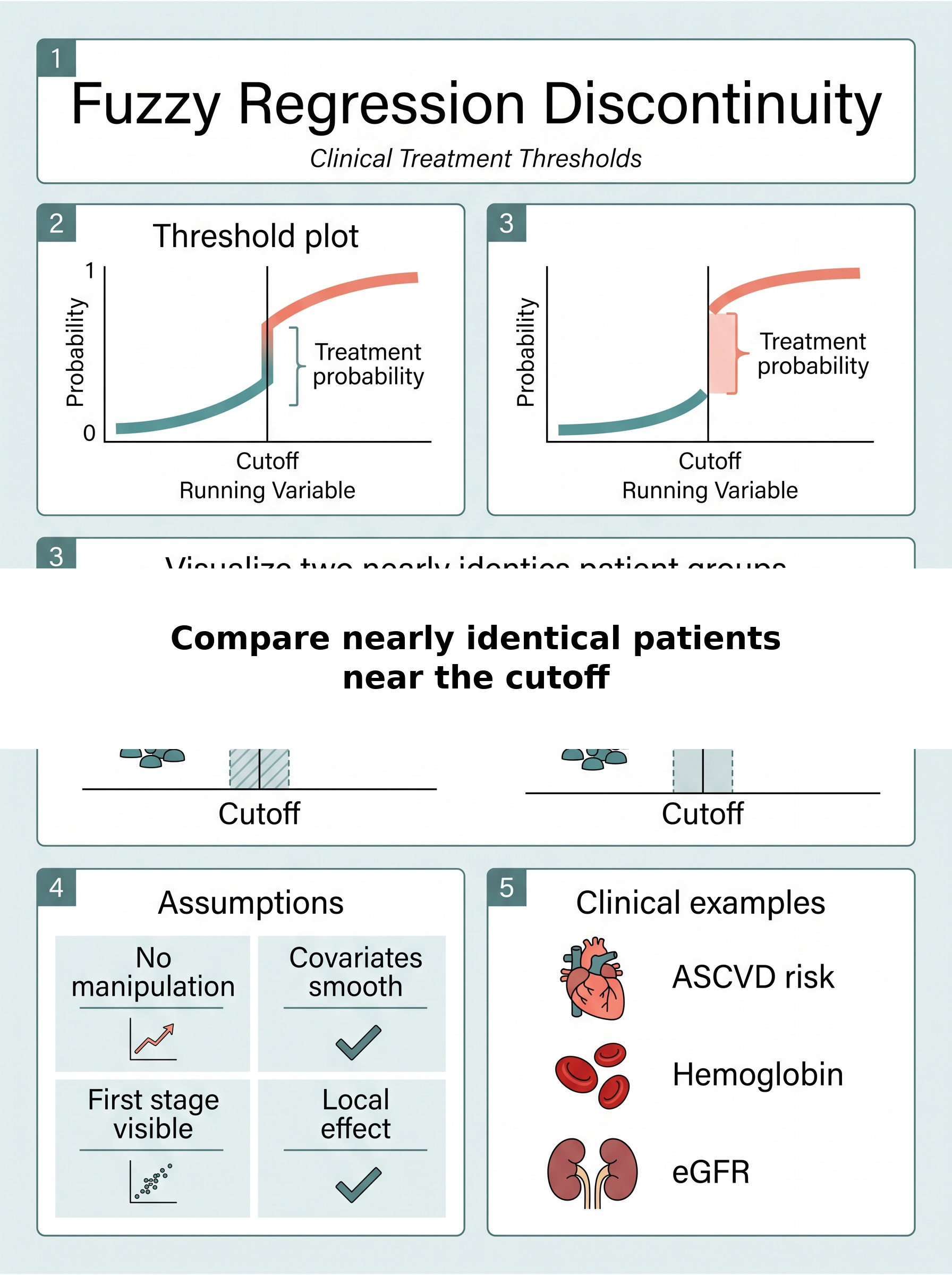
Fuzzy Regression Discontinuity at Clinical Treatment Thresholds
A visual guide to what happens when a guideline cutoff changes the odds of treatment without perfectly assigning it. Covers the first-stage jump, local causal interpretation near the boundary, manipulation risks, and why threshold-based clinical decisions are useful instruments only when the rule actually bites.
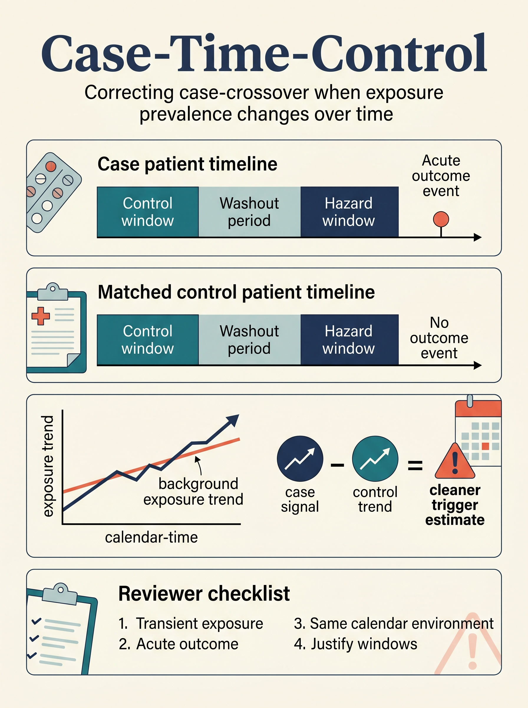
Case-Time-Control in Clinical Research
A visual guide to repairing case-crossover analyses when exposure prevalence drifts over calendar time. Covers hazard and control windows, matched controls, secular exposure trends, and the reviewer checks that separate a trigger design from calendar-time confounding with nicer formatting.
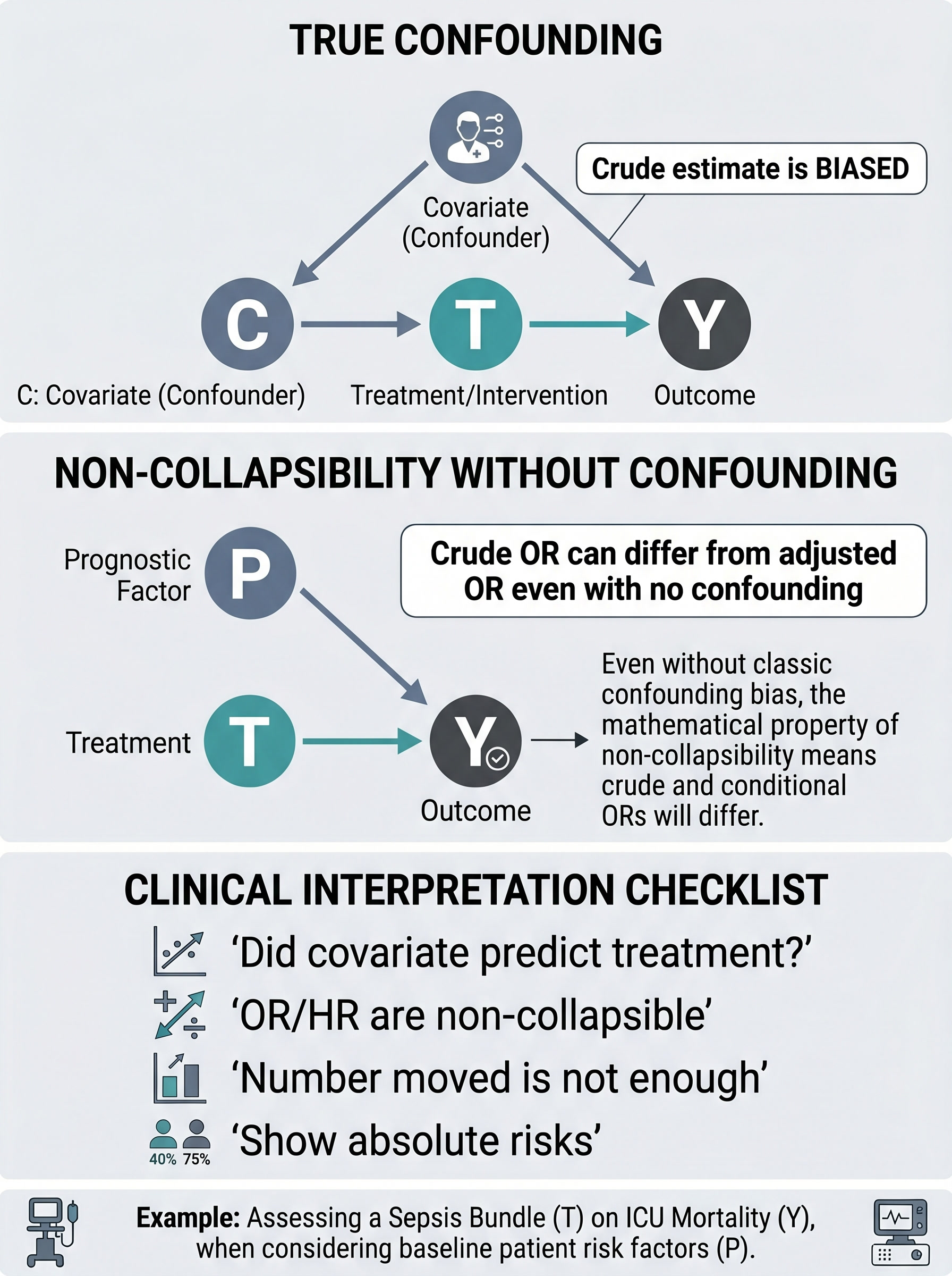
Non-Collapsibility vs Confounding in Clinical Research
A visual guide to the clinical mistake of treating every crude-to-adjusted odds-ratio shift as proof of confounding control. Covers true confounding, non-collapsibility without confounding, conditional versus marginal interpretation, and the reporting checks that keep logistic-regression folklore out of the discussion section.
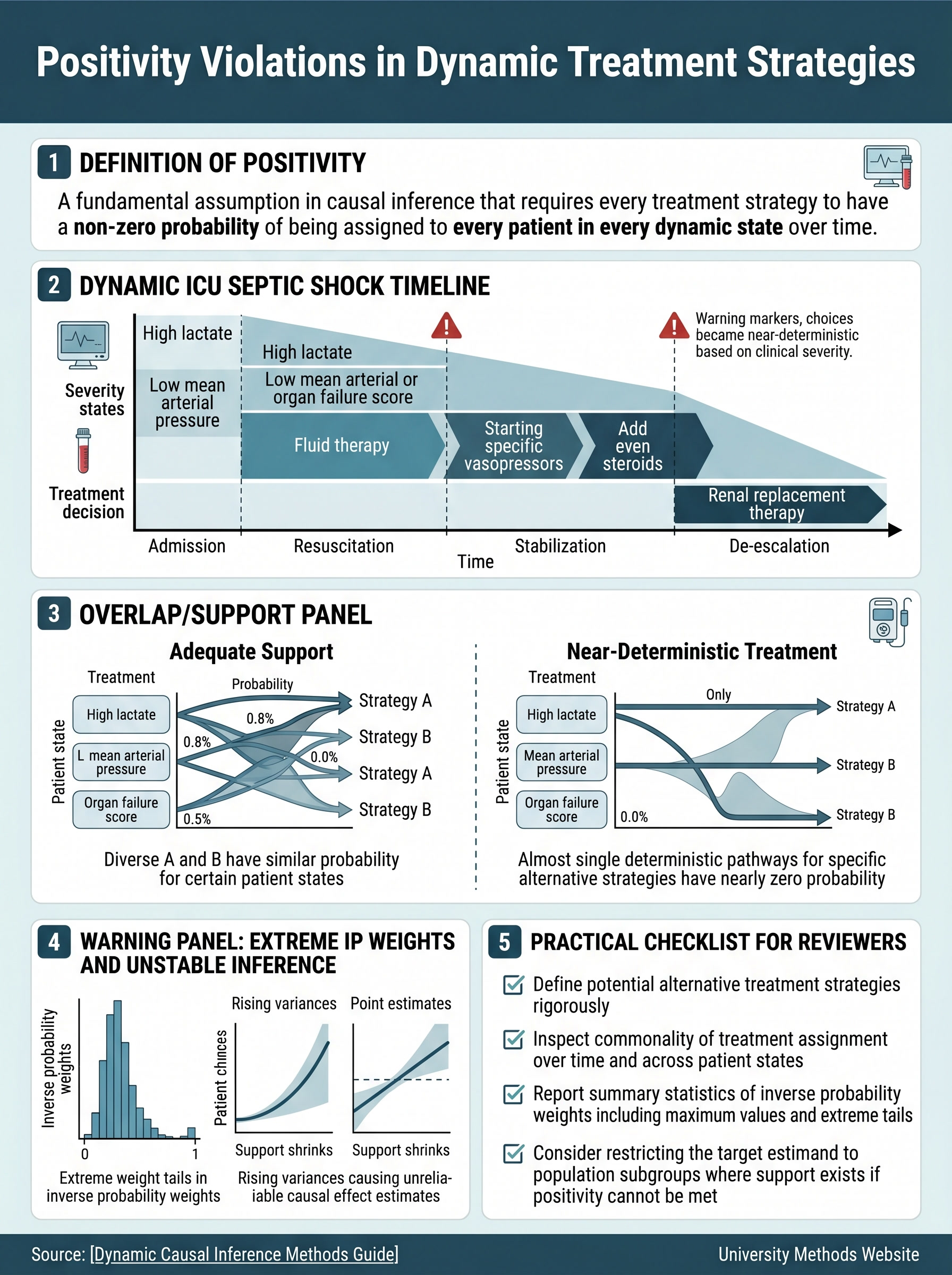
Positivity Violations in Dynamic Treatment Strategies
A visual guide to the point where longitudinal causal ambition outruns clinical data support. Covers evolving ICU severity states, near-deterministic treatment decisions, extreme inverse-probability weights, and how to narrow the estimand before a dynamic strategy analysis starts negotiating with absence.
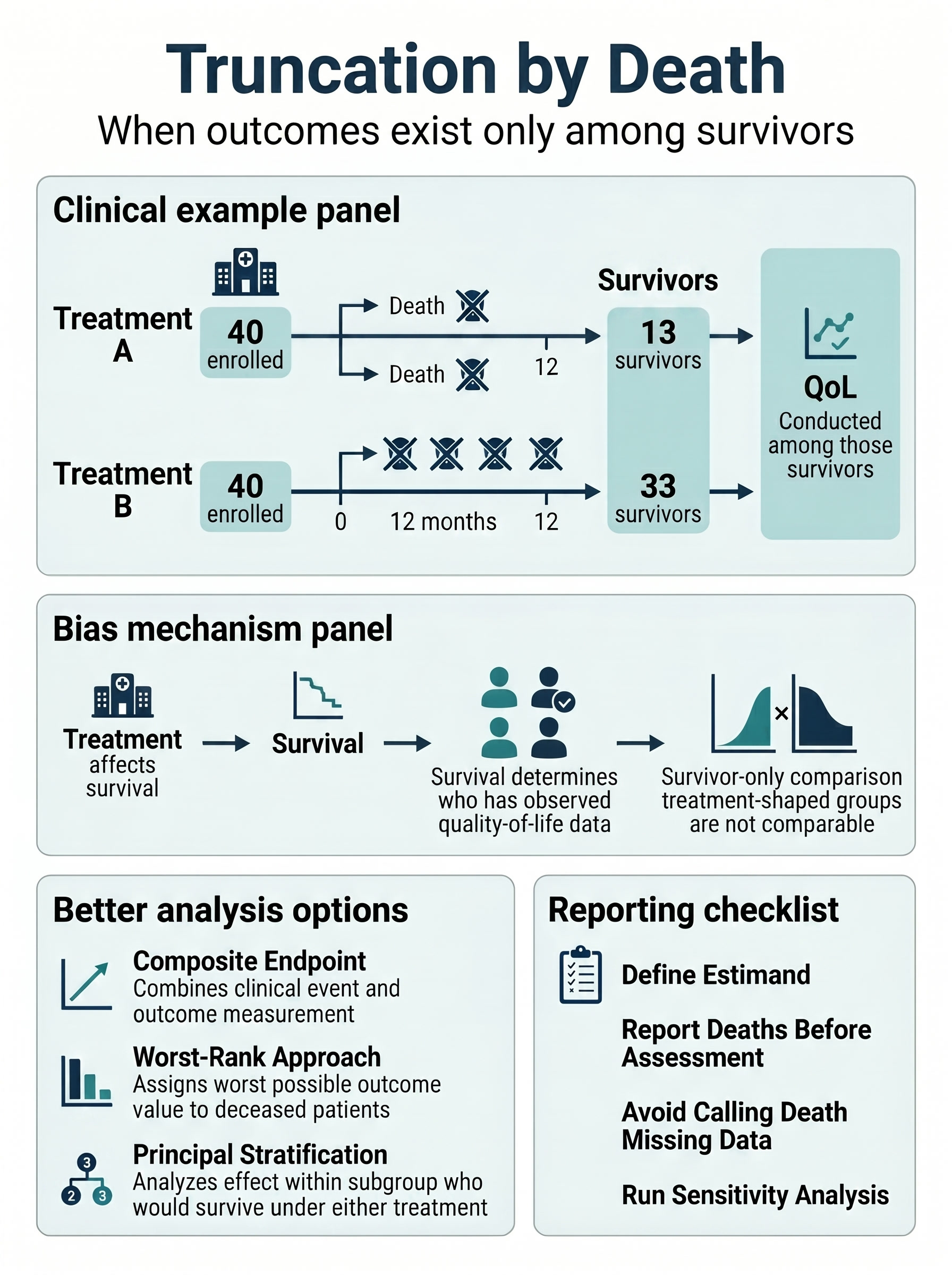
Truncation by Death in Clinical Research
A visual guide to the deceptively simple move of comparing outcomes only among survivors. Covers why post-treatment survival reshapes the analysis set, how truncation by death differs from routine missingness, and which alternatives keep later functional endpoints clinically honest.
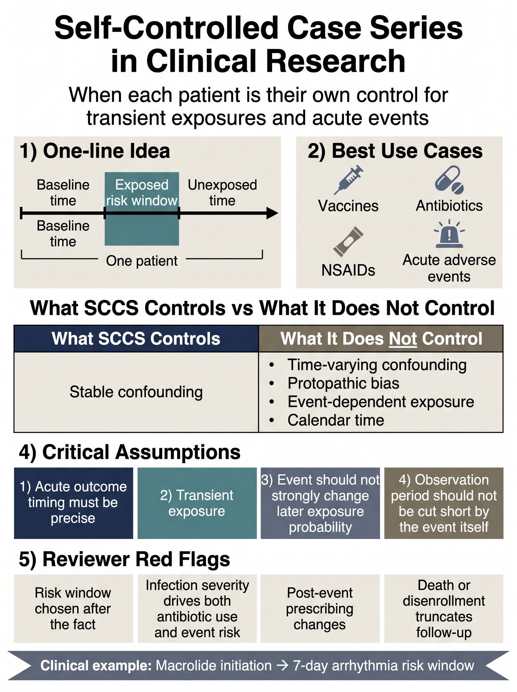
Self-Controlled Case Series in Clinical Research
A visual guide to the self-matched design people love for vaccine safety and drug-trigger questions. Covers transient exposures, acute outcomes, event-dependent exposure, protopathic bias, and the timeline assumptions that decide whether SCCS is elegant or just elegantly wrong.
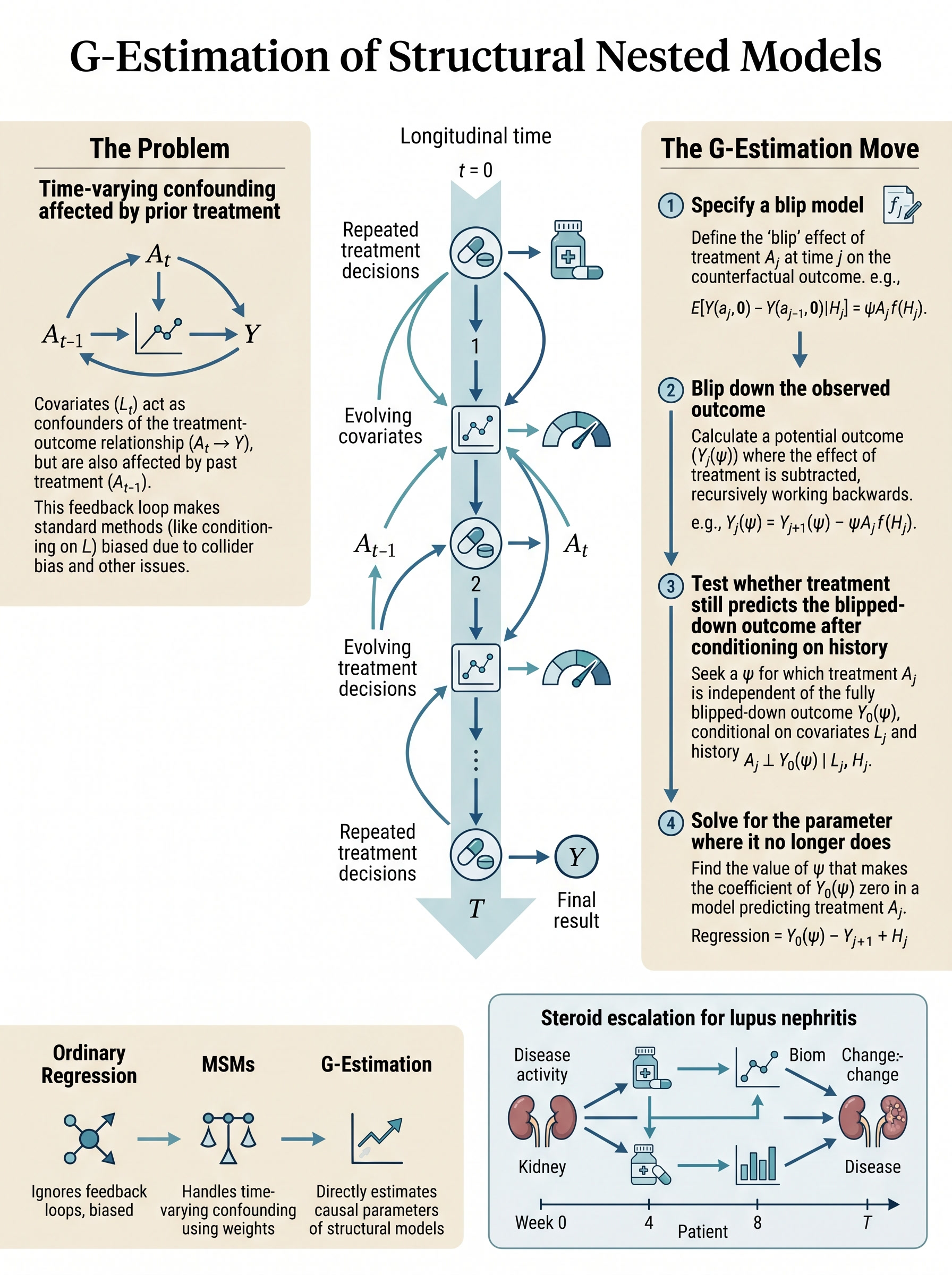
G-Estimation of Structural Nested Models in Clinical Research
A visual guide to one of causal inference's more exacting tools for sequential treatment decisions. Covers treatment-confounder feedback, blip models, blipped-down outcomes, and how to tell whether your repeated-treatment question needs structural nested thinking instead of ordinary adjustment with better manners.
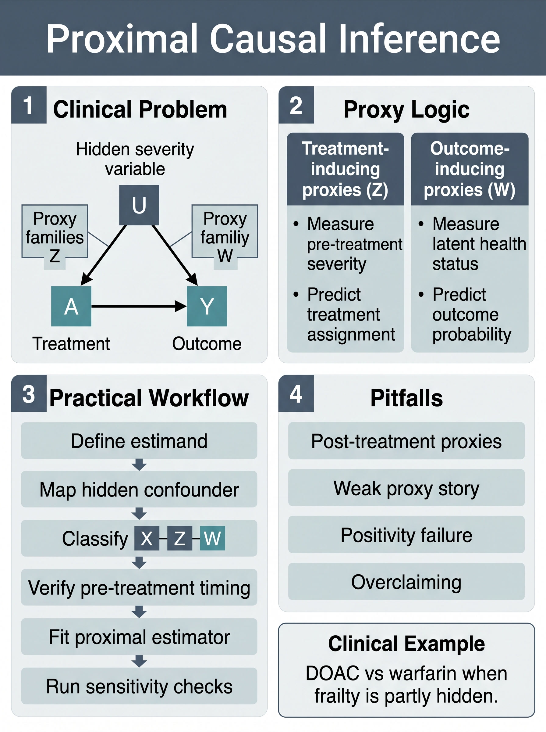
Proximal Causal Inference in Clinical Research
A visual guide to using proxy variables when the confounder you care about is only partly visible in the dataset. Covers treatment-inducing versus outcome-inducing proxies, bridge-function logic, timing discipline, and the difference between a rescue method and residual-confounding theater.
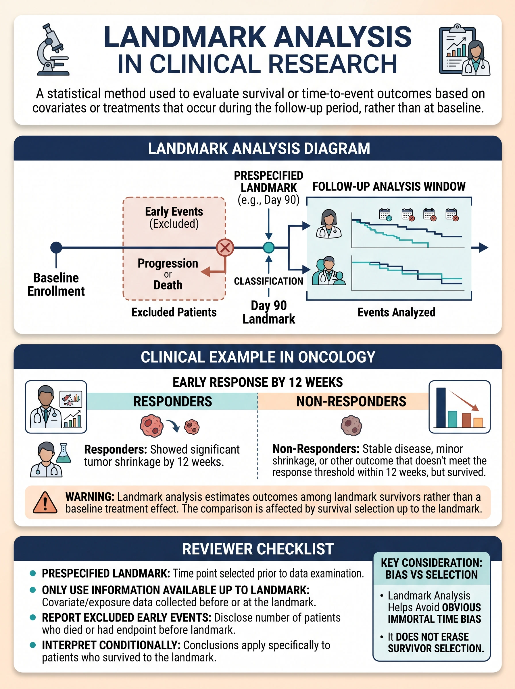
Landmark Analysis in Clinical Research
A visual guide to the conditional survival comparison that looks rigorous until people forget who had to survive long enough to enter it. Covers prespecified landmarks, responder-versus-non-responder oncology examples, immortal-time cleanup, and the survivor-selection warning label every paper should wear.
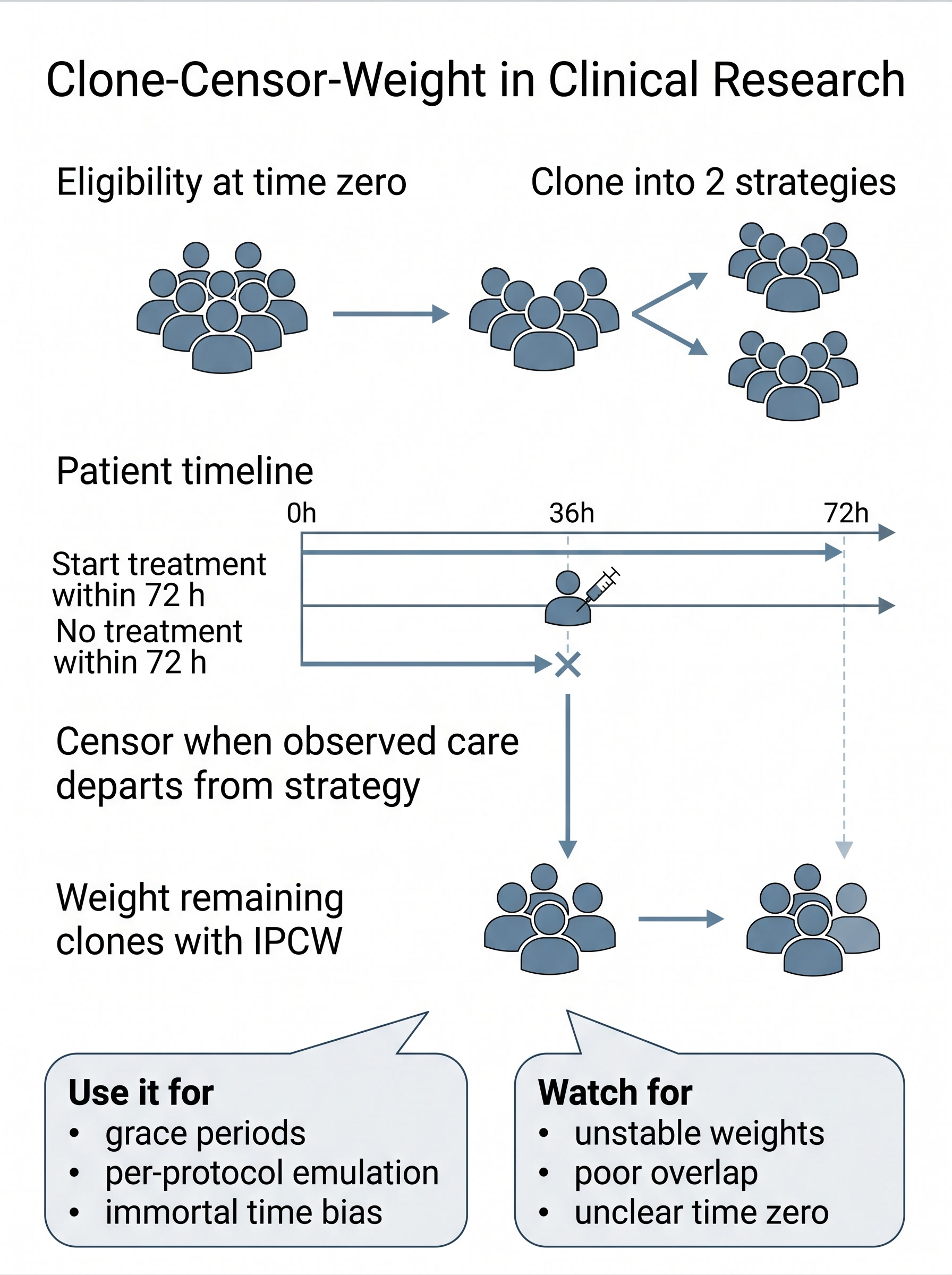
Clone-Censor-Weight in Clinical Research
A visual guide to the grace-period treatment strategy that saves target trial emulations from delayed-labeling nonsense. Covers baseline cloning, deviation censoring, IPCW, and the exact reviewer questions to ask before immortal time bias sneaks into the conclusions wearing a respectable tie.
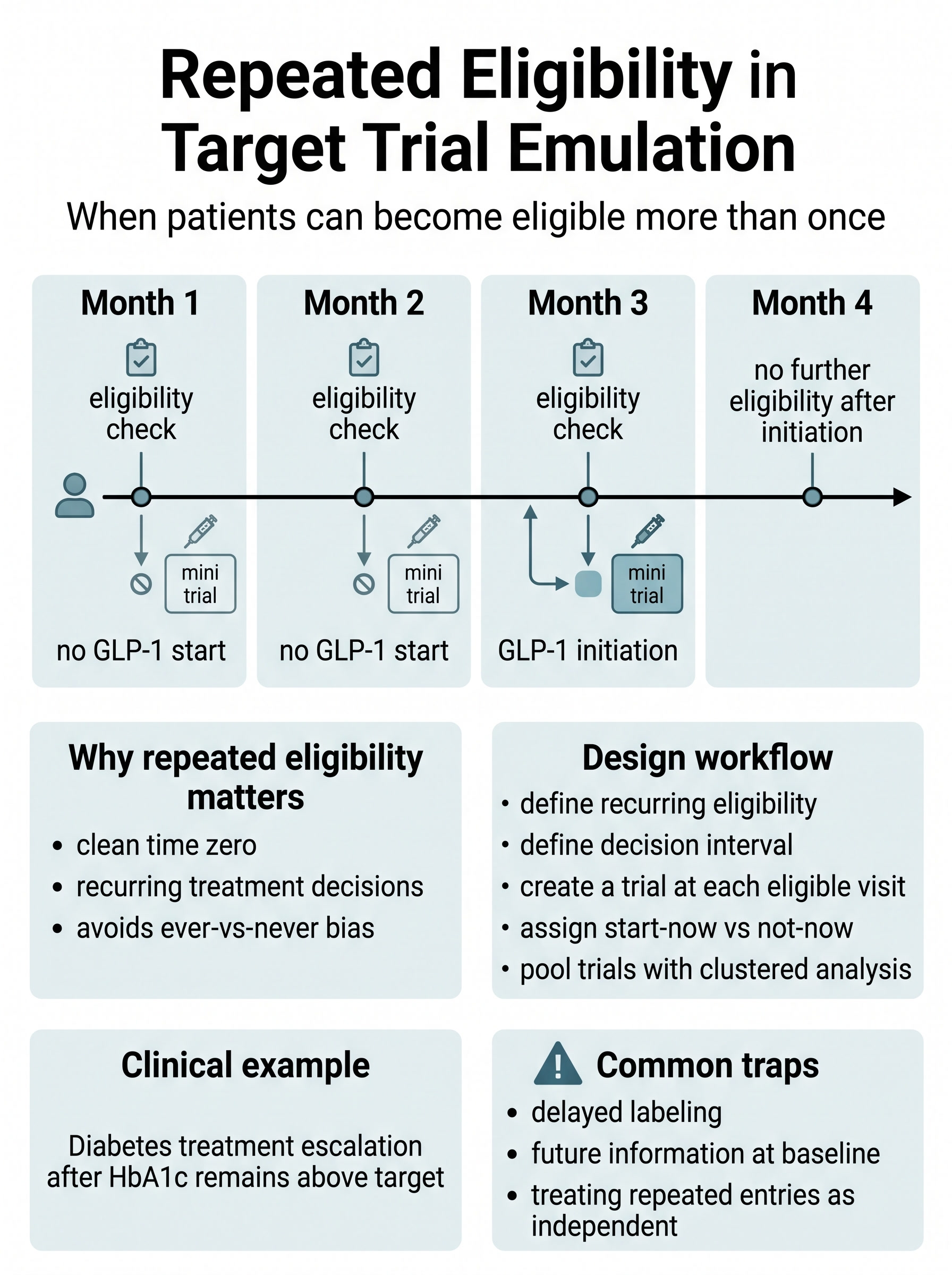
Repeated Eligibility in Target Trial Emulation
A visual guide to the recurring decision-point problem that appears when patients can become newly eligible again and again. Covers sequential trial emulation, visit-specific time zero, re-entry rules, pooled analysis with clustering, and why “ever versus never” is often just a slower way to say “we lost track of the design.”
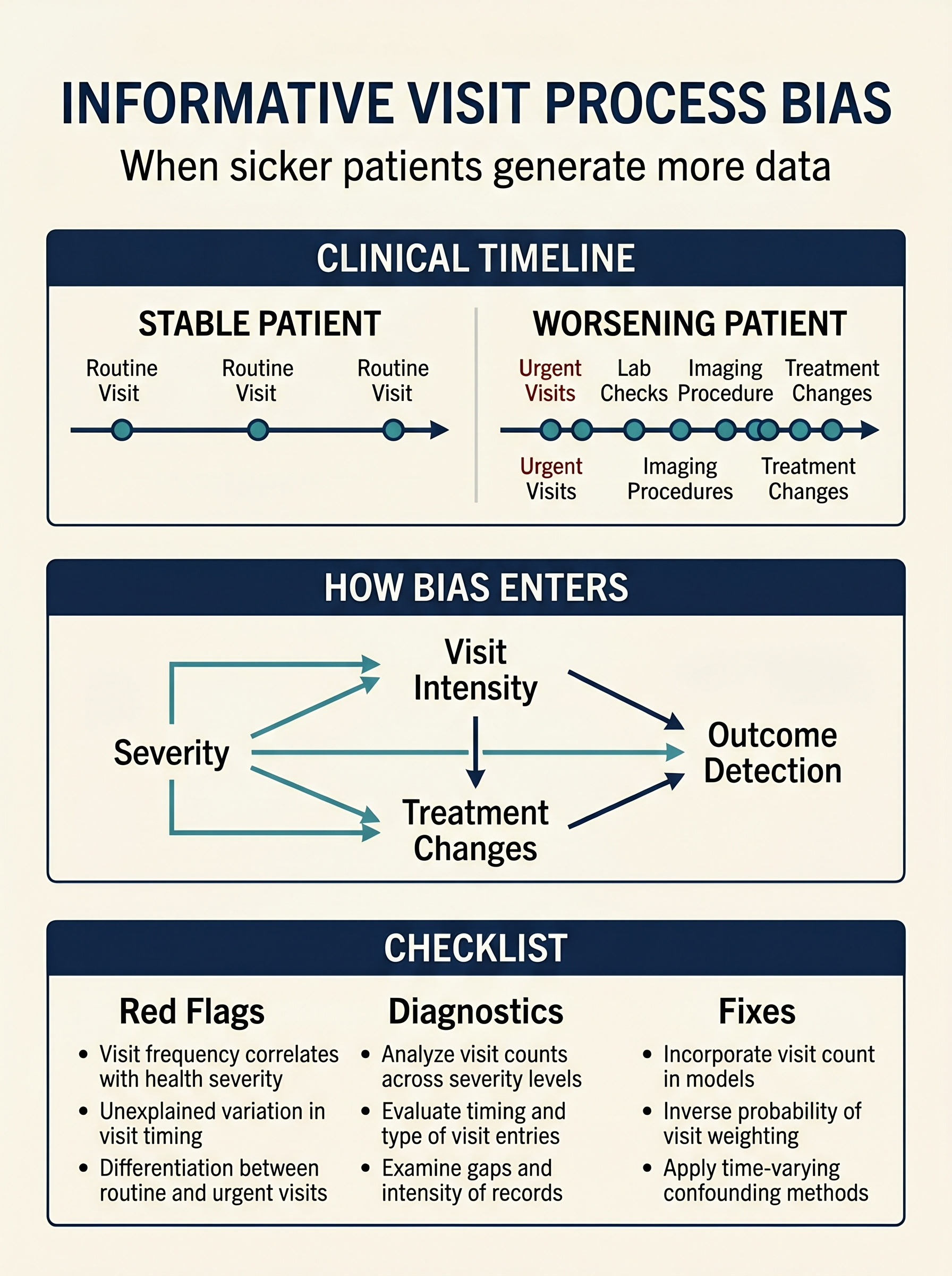
Informative Visit Process Bias in EHR-Based Clinical Causal Inference
A visual guide to the observational problem where sicker patients are seen, measured, and recorded more often than everyone else. Covers visit-driven covariate updating, selective outcome detection, treatment changes tied to encounter intensity, and the diagnostics that keep “more data” from masquerading as “more truth.”
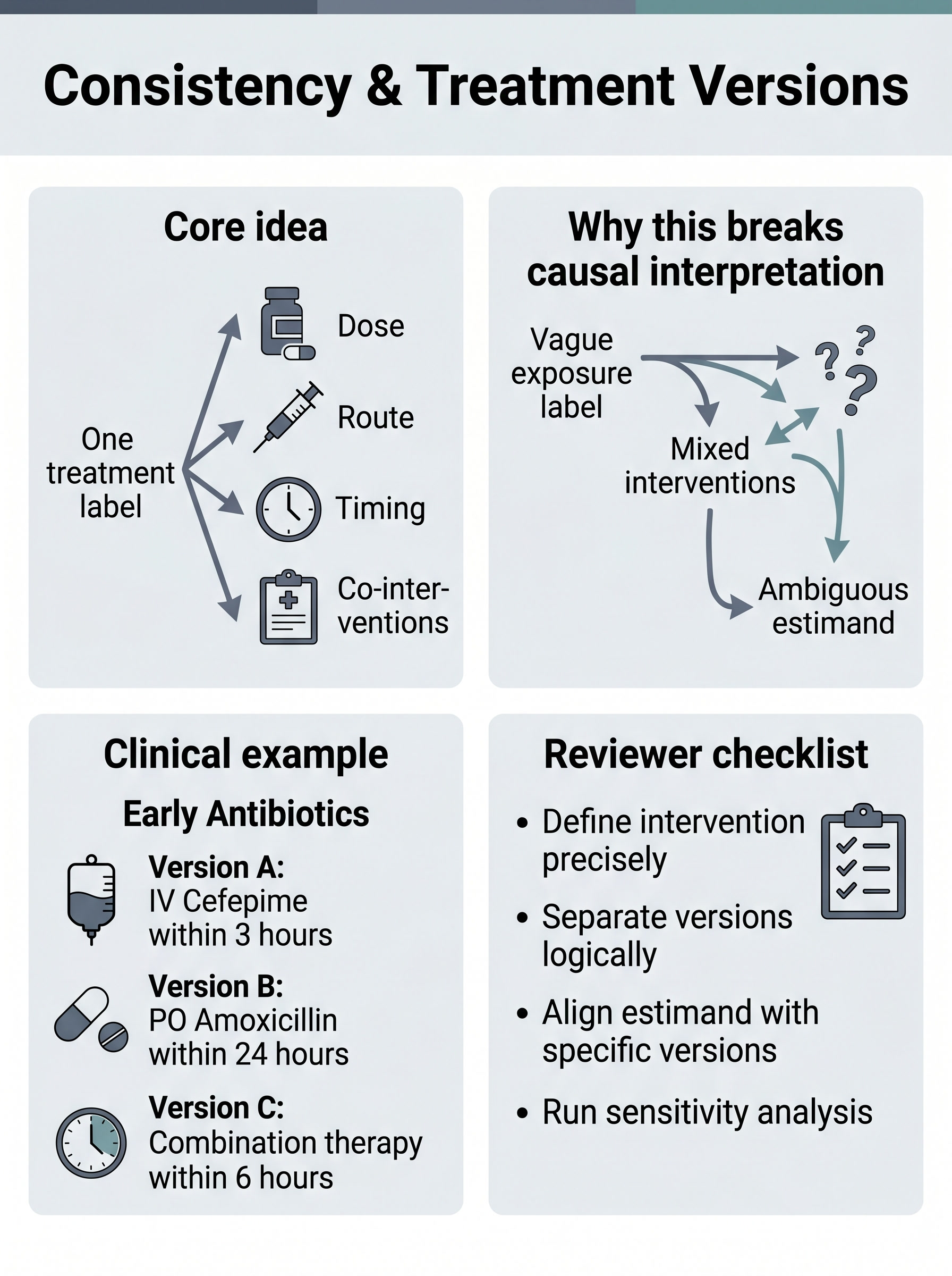
Consistency and Treatment Versions in Clinical Research
A visual guide to the causal assumption people invoke with one sentence and violate with an exposure label. Covers treatment-version heterogeneity, vague intervention definitions, clinically distinct dosing and timing strategies, and the reporting checks that keep "treated" from meaning six different things at once.
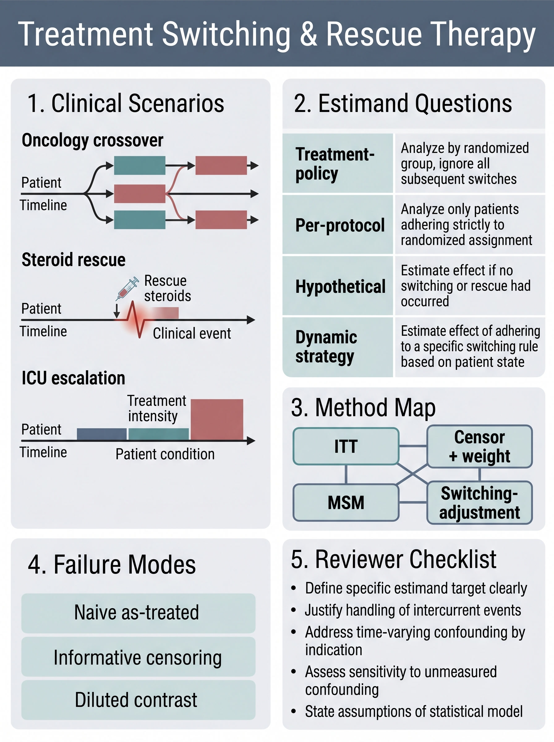
Treatment Switching and Rescue Therapy in Clinical Causal Inference
A visual guide to the post-baseline mess that turns one treatment comparison into three different estimands. Covers crossover, rescue medication, treatment-policy versus per-protocol questions, informative censoring, and when marginal structural models earn their keep.
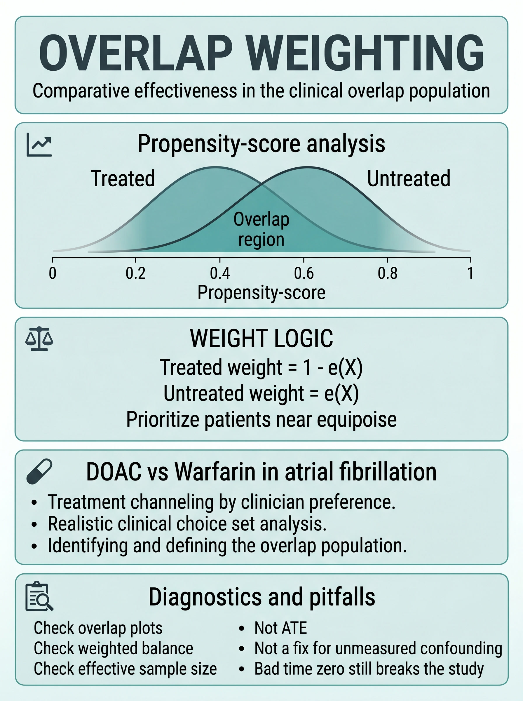
Overlap Weighting in Clinical Research
A visual guide to the propensity-score weighting strategy that stops asking the tails to do the middle's job. Covers the overlap population, why weights favor clinical equipoise rather than near-deterministic treatment choices, how it differs from ATE-style IPW, and the diagnostics that keep a stable estimate from becoming a vague claim.
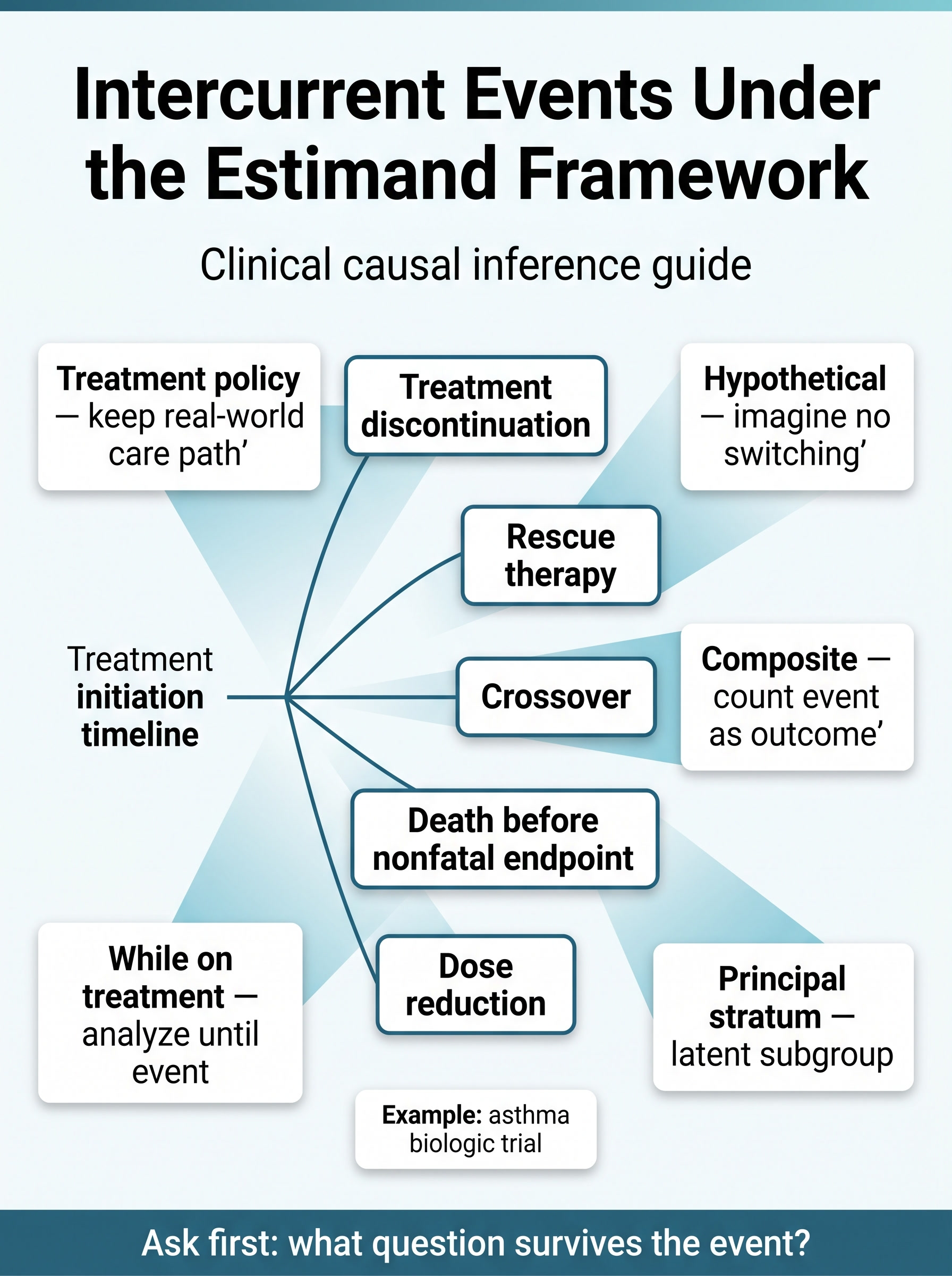
Intercurrent Events Under the Estimand Framework in Clinical Research
A visual guide to the post-baseline events that quietly rewrite a treatment question. Covers treatment-policy, hypothetical, composite, while-on-treatment, and principal-stratum strategies, with clinical framing for rescue therapy, discontinuation, crossover, and death before nonfatal endpoints.
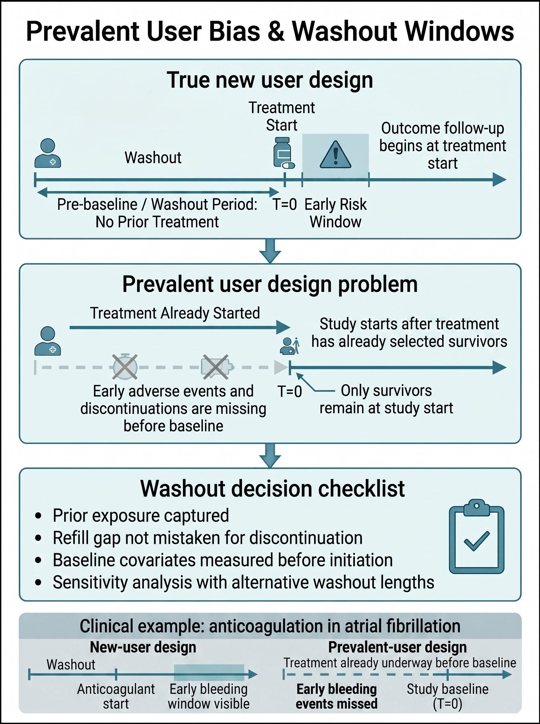
Prevalent User Bias and Washout Windows in Clinical Research
A visual guide to the design mistake that lets treatment history rewrite baseline before the study even begins. Covers why ongoing users look deceptively sturdy, how washout windows make initiation effects more believable, and the reviewer checks that separate a new-user design from refill-gap folklore.
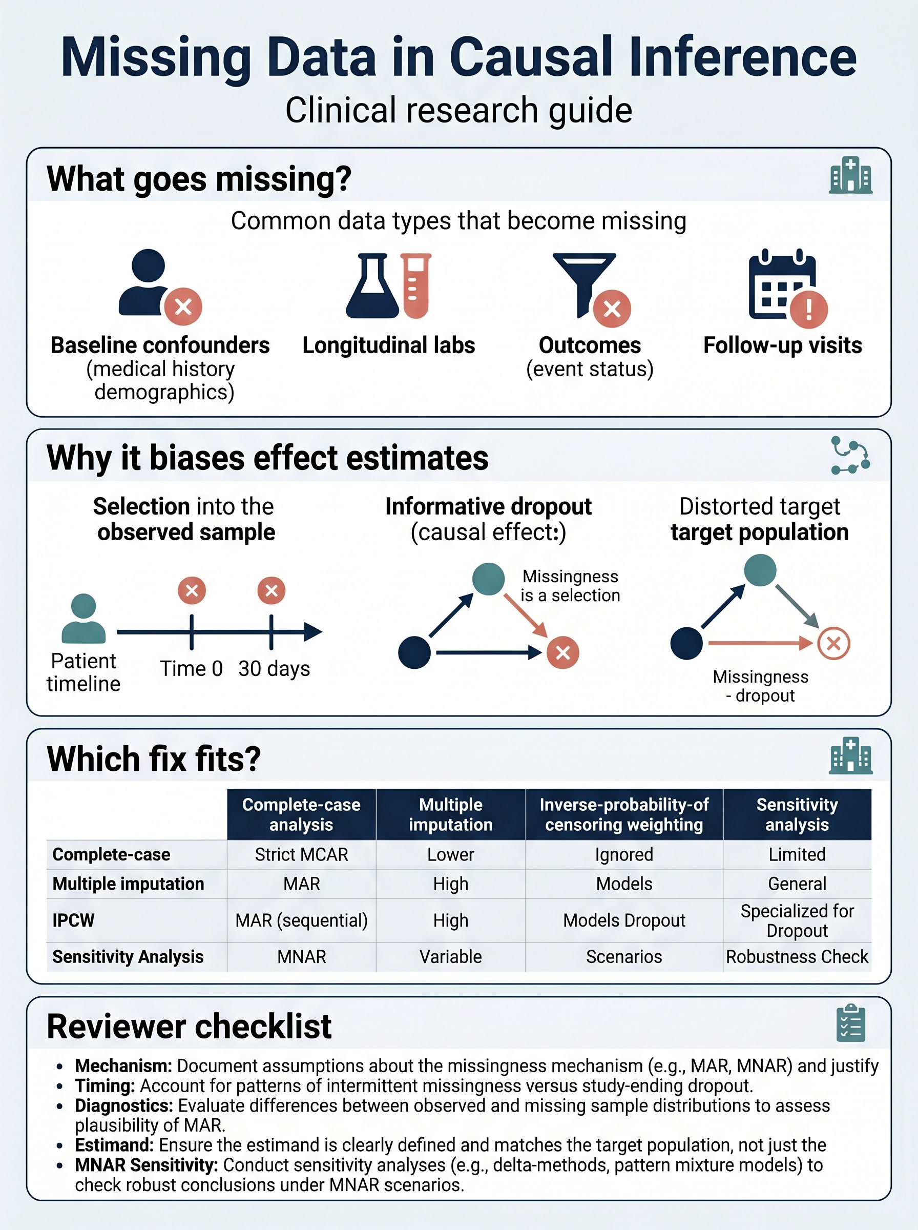
Missing Data in Causal Inference for Clinical Research
A visual guide to the moment missing data stops being housekeeping and starts becoming selection. Covers missing confounders, informative dropout, when multiple imputation fits, when censoring weights fit better, and the reviewer checks that keep an estimand from shrinking to the patients easiest to observe.
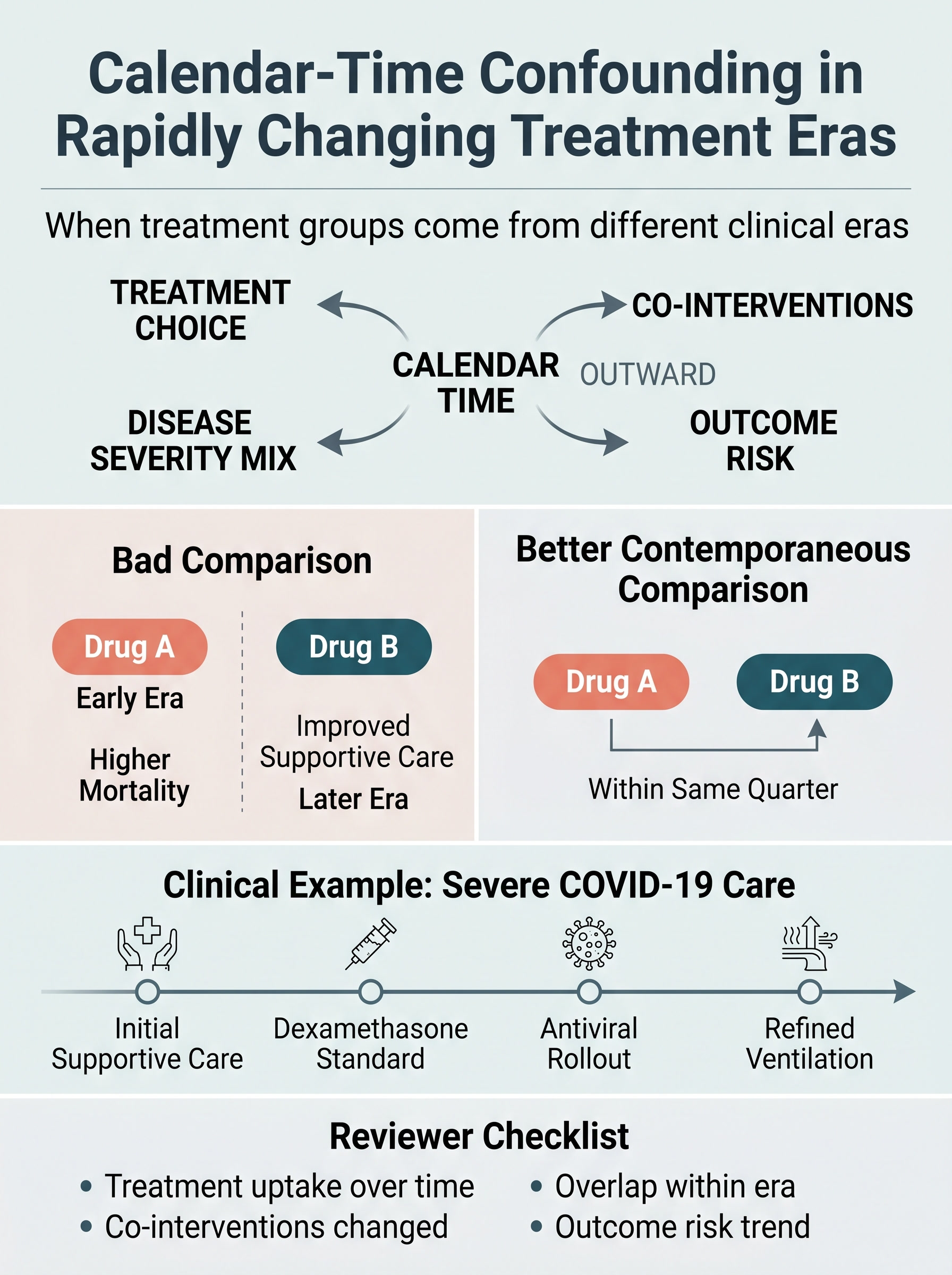
Calendar-Time Confounding in Rapidly Changing Treatment Eras
A visual guide to the treatment comparison that quietly becomes a comparison between different versions of medicine. Covers secular drift, contemporaneous comparators, evolving supportive care, and the reviewer checks that separate therapy effects from historical timing effects.
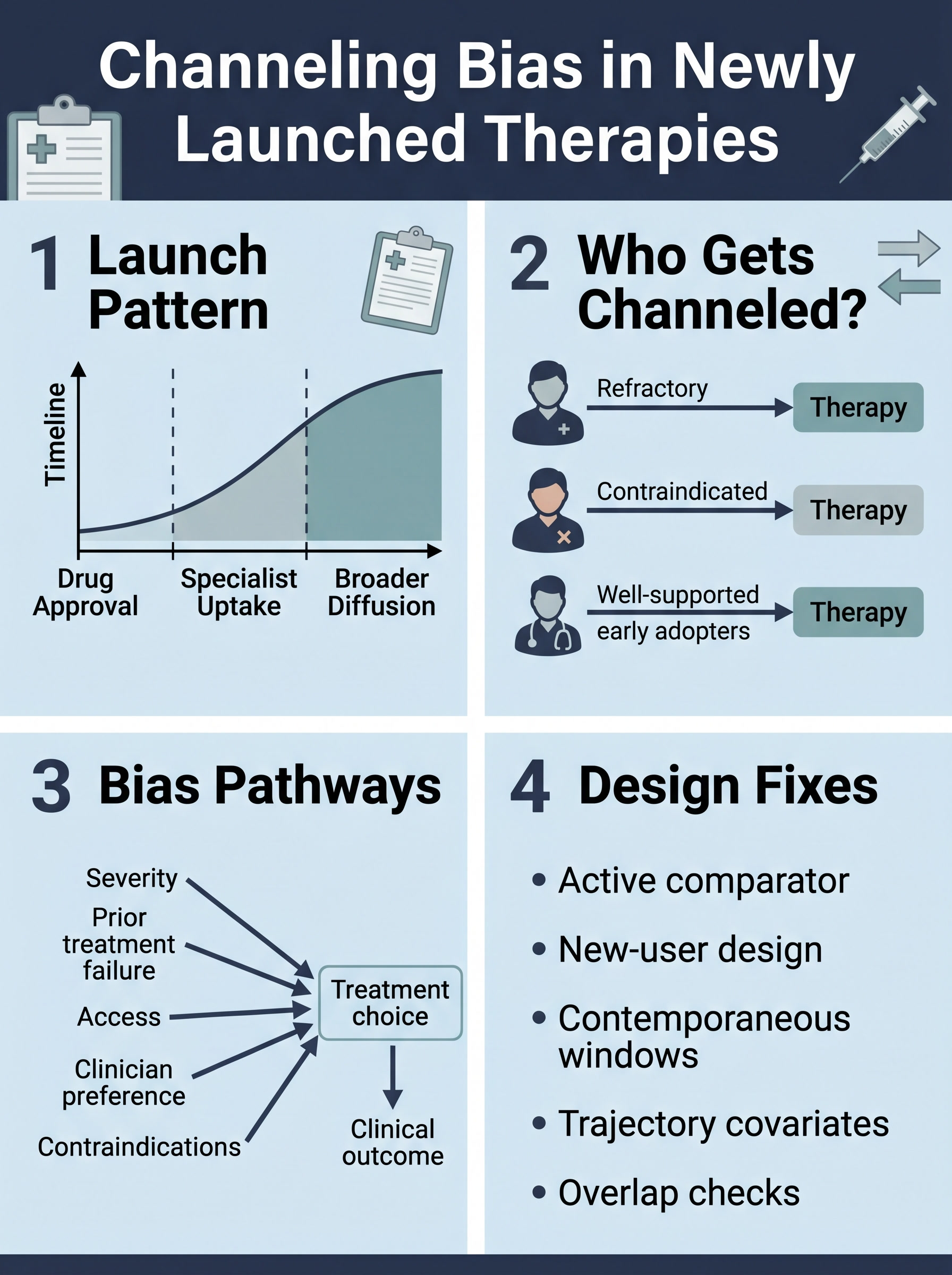
Channeling Bias in Newly Launched Therapies
A visual guide to the adoption pattern that becomes a treatment effect if you are not careful. Covers refractory patients, contraindication-driven routing, selective early adopters, and the design checks that separate prescribing behavior from drug performance.
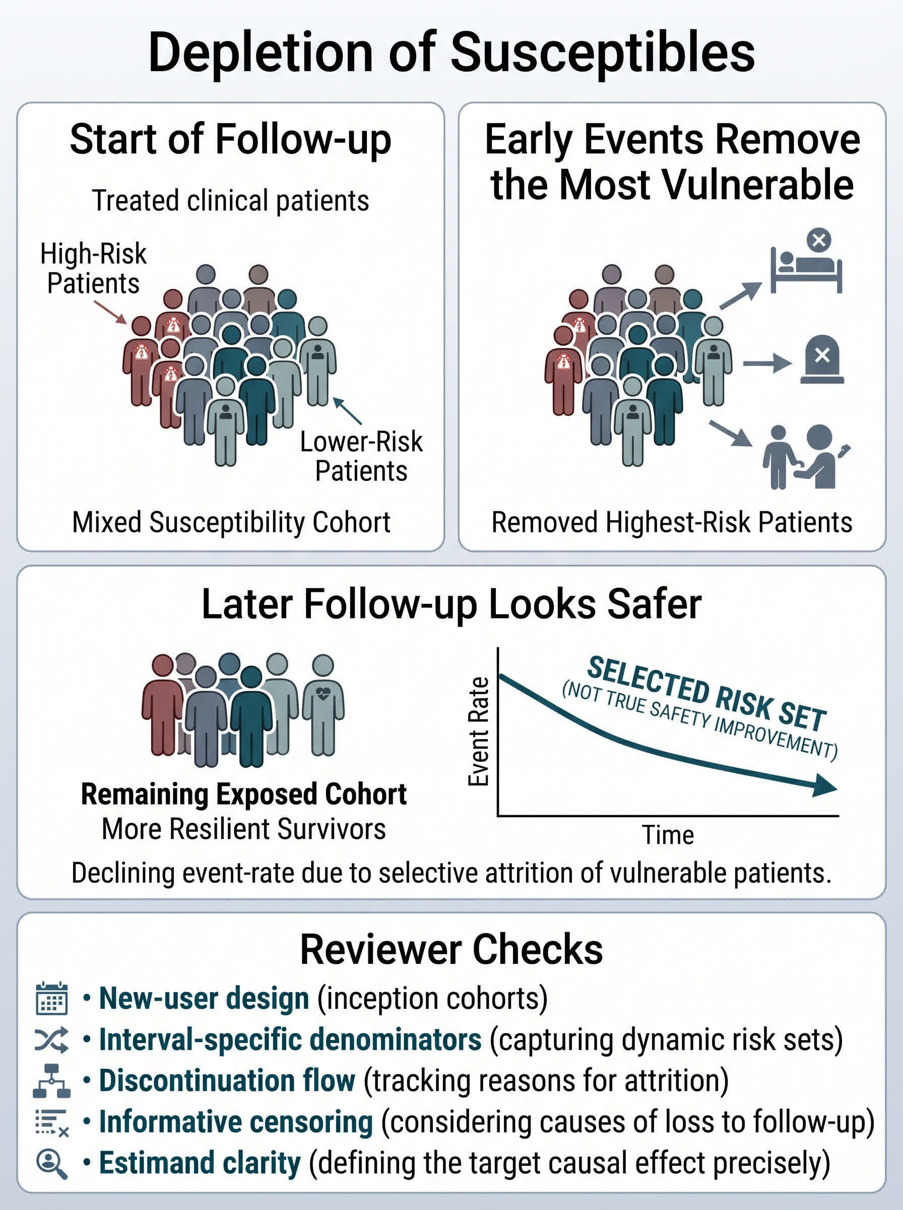
Depletion of Susceptibles in Clinical Research
A visual guide to the moment later follow-up looks safer because the patients most vulnerable to harm already left the risk set. Covers early toxicity, selective attrition, survivor-enriched exposure windows, and the reviewer checks that keep persistence from masquerading as protection.
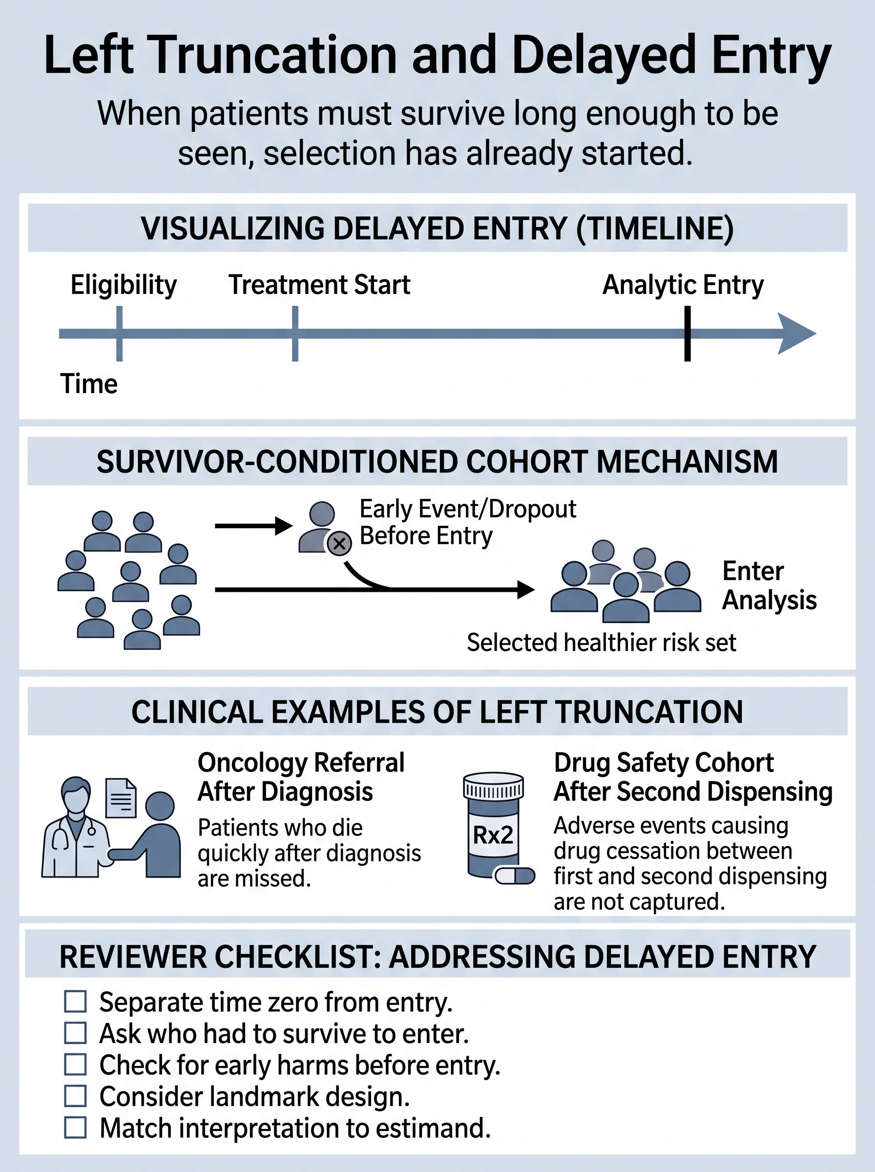
Left Truncation and Delayed Entry in Clinical Research
A visual guide to the moment a cohort becomes observable only after patients already had to survive, stay event-free, or remain in care long enough to enter the dataset. Covers misaligned time zero, survivor-conditioned risk sets, landmark alternatives, and the review questions that keep delayed entry from masquerading as treatment benefit.
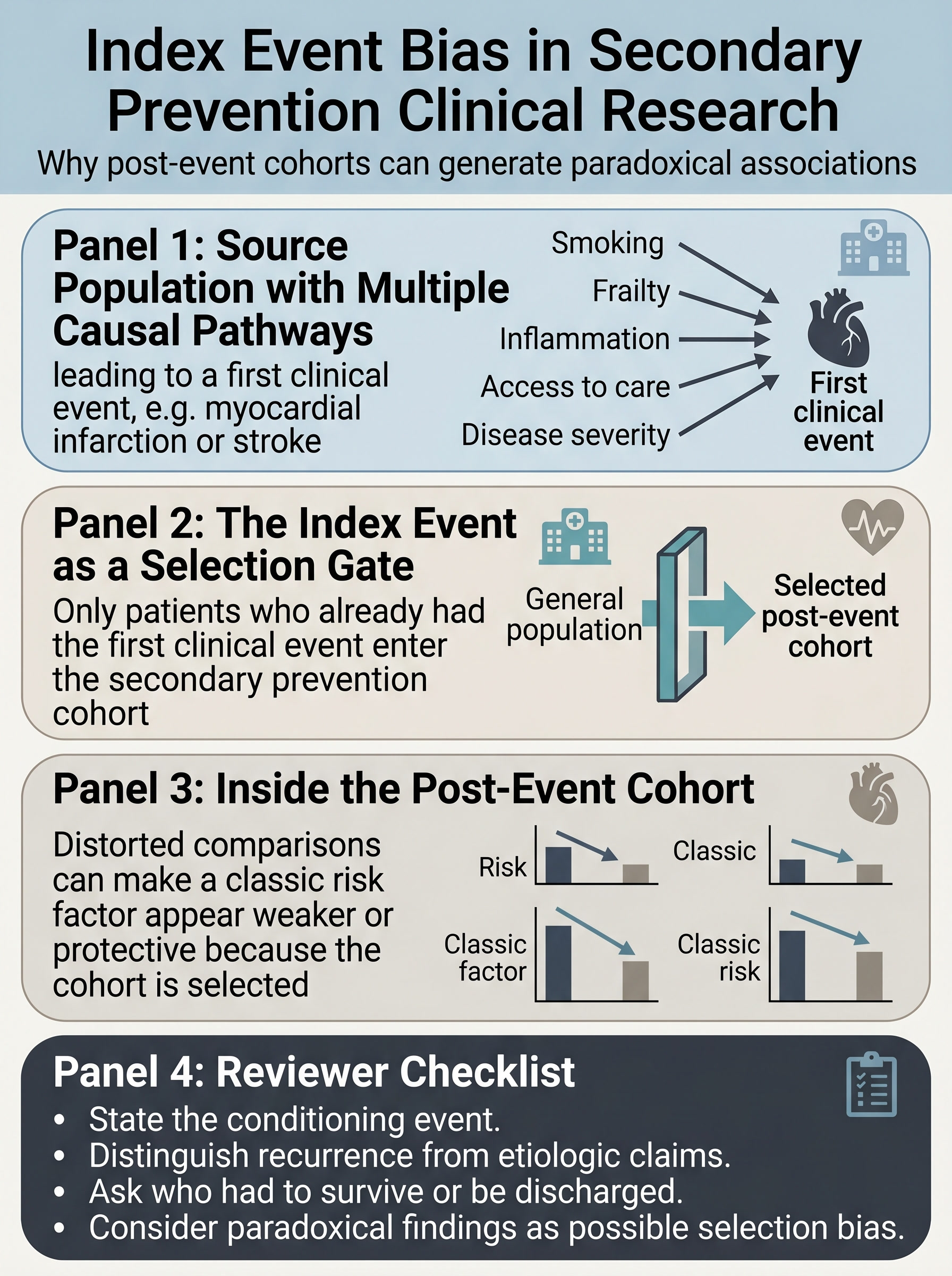
Index Event Bias in Secondary Prevention Clinical Research
A visual guide to the selection problem that starts the moment a cohort is defined by already having had the first event. Covers paradoxical post-event associations, conditional interpretation, secondary prevention cohorts, and the reviewer checks that keep recurrence analyses from drifting into broad etiologic claims.
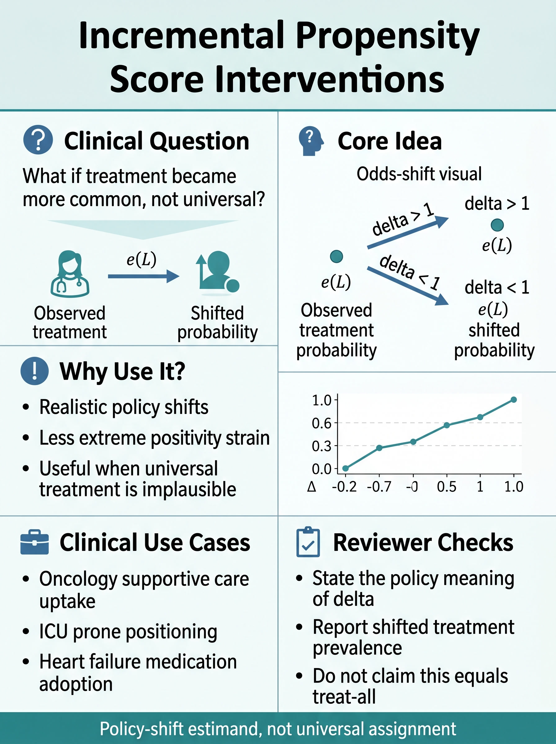
Incremental Propensity Score Interventions in Clinical Research
A visual guide to policy-shift estimands for settings where treat-all contrasts are clinically implausible or poorly supported by overlap. Covers odds-shift interventions, why they help when positivity is strained, realistic uptake questions, and the reviewer checks that keep an advanced method tied to a real clinical decision.
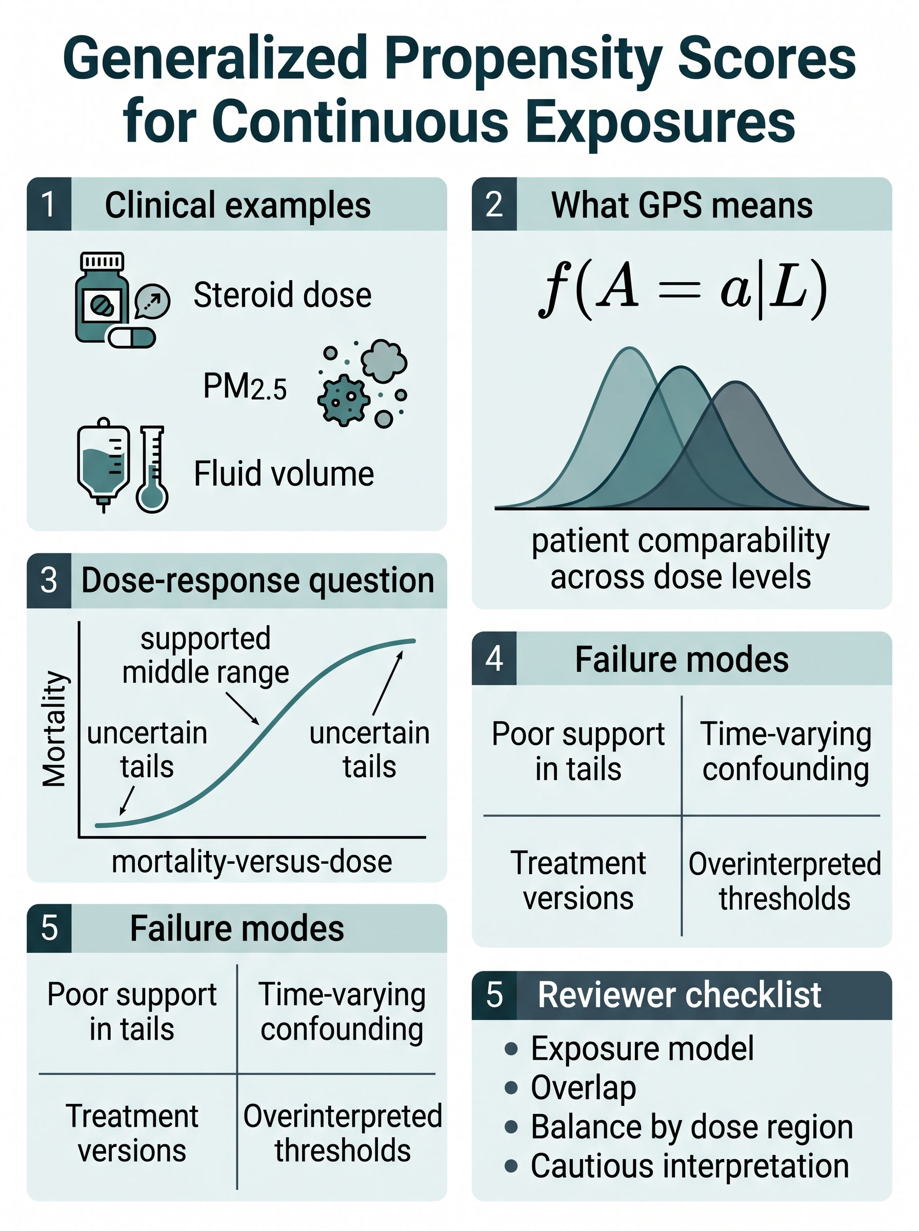
Generalized Propensity Scores for Continuous Exposures in Clinical Research
A visual guide to dose-response causal questions when exposure is measured on a continuum rather than as a simple treated-versus-untreated choice. Covers conditional exposure density, overlap across dose regions, tail instability, treatment versions, and the reviewer checks that keep a smooth curve from outrunning the data.
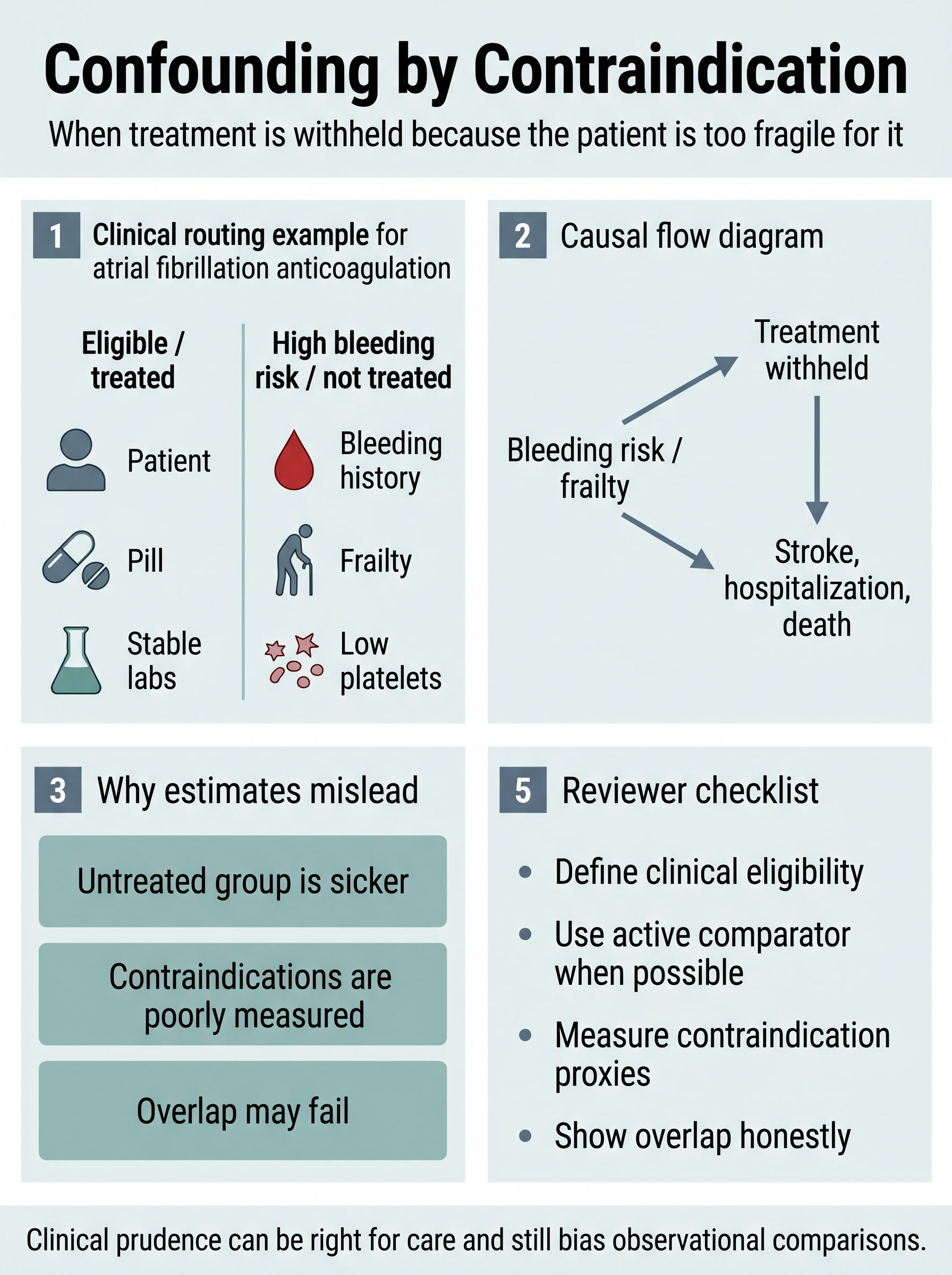
Confounding by Contraindication in Clinical Research
A visual guide to the bias that appears when treatment is withheld from the frailest or riskiest patients for good clinical reasons. Covers anticoagulation and bleeding-risk routing, why untreated groups are often prognostically different before follow-up starts, overlap failure, and the design checks that keep clinical prudence from masquerading as treatment effect.
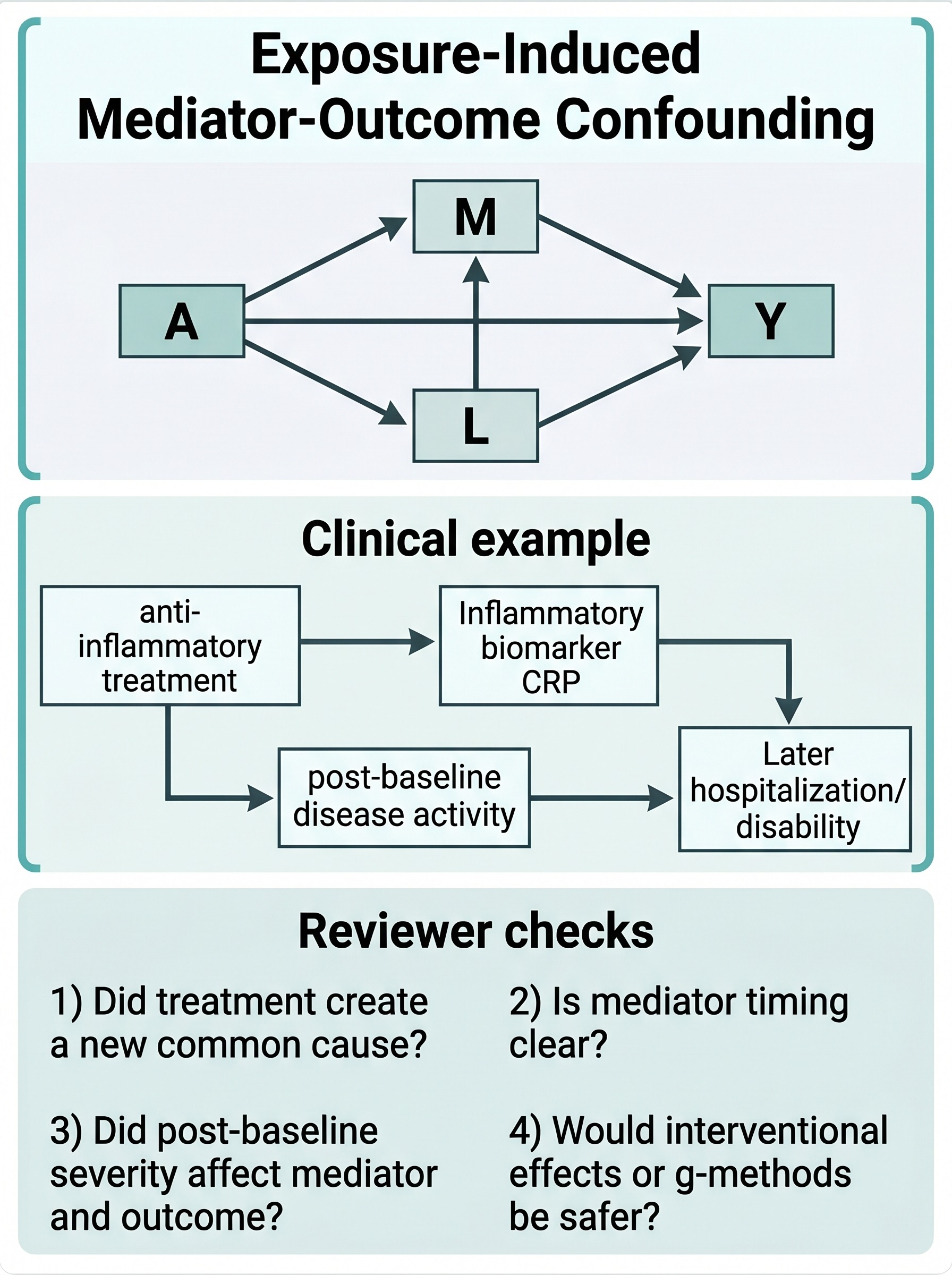
Exposure-Induced Mediator-Outcome Confounding in Clinical Mediation Studies
A visual guide to the mediation failure mode that appears when treatment changes a post-baseline variable that then affects both the mediator and the outcome. Covers anti-inflammatory treatment and disease-activity trajectories, why naive adjustment can misidentify direct and indirect effects, and when interventional effects or g-methods are safer than a standard natural-effects decomposition.
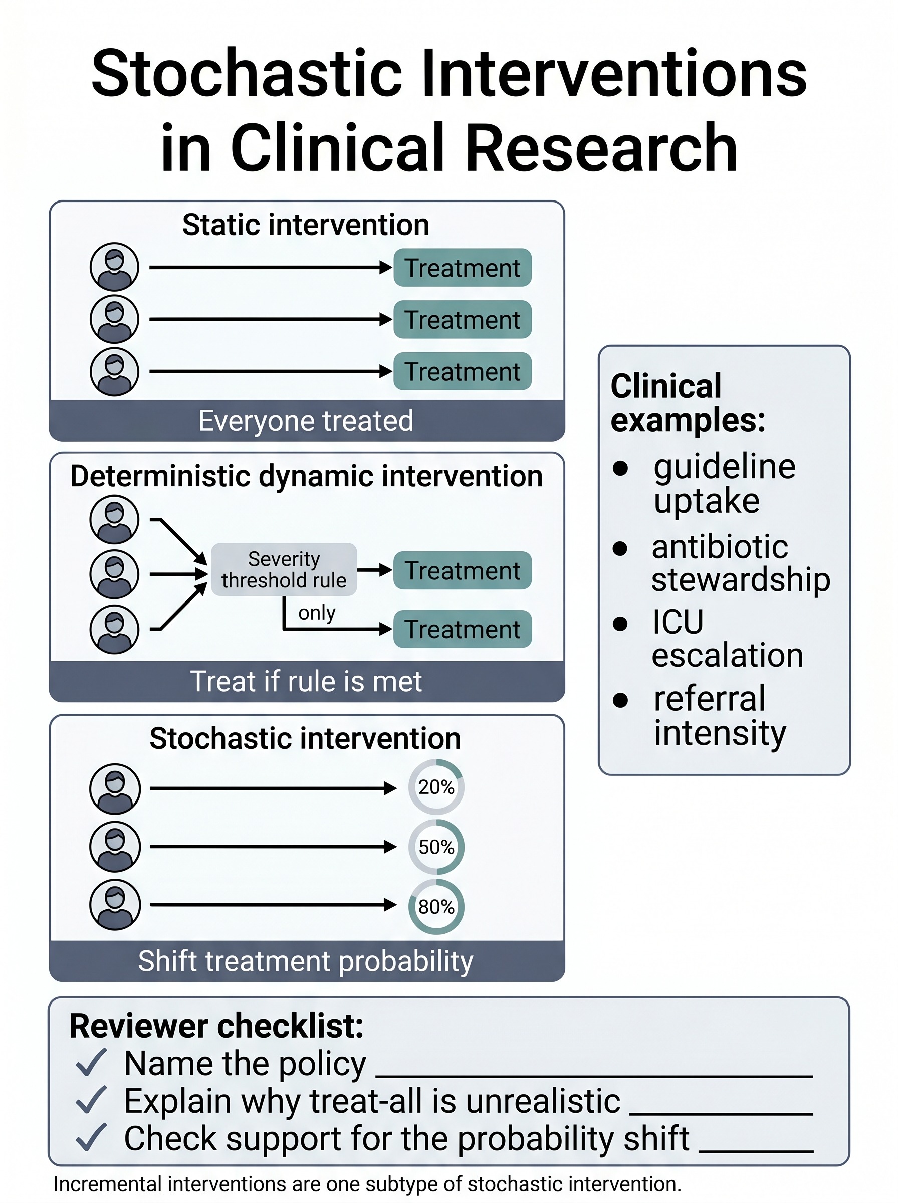
Stochastic Interventions in Clinical Research
A visual guide to probability-shifting causal policies for studies where real implementation changes treatment uptake rather than forcing universal treatment. Covers the difference between static, deterministic dynamic, and stochastic interventions, why stewardship and guideline-uptake questions often fit this estimand better, and how to keep a probability-shift effect from being misread as a treat-all contrast.
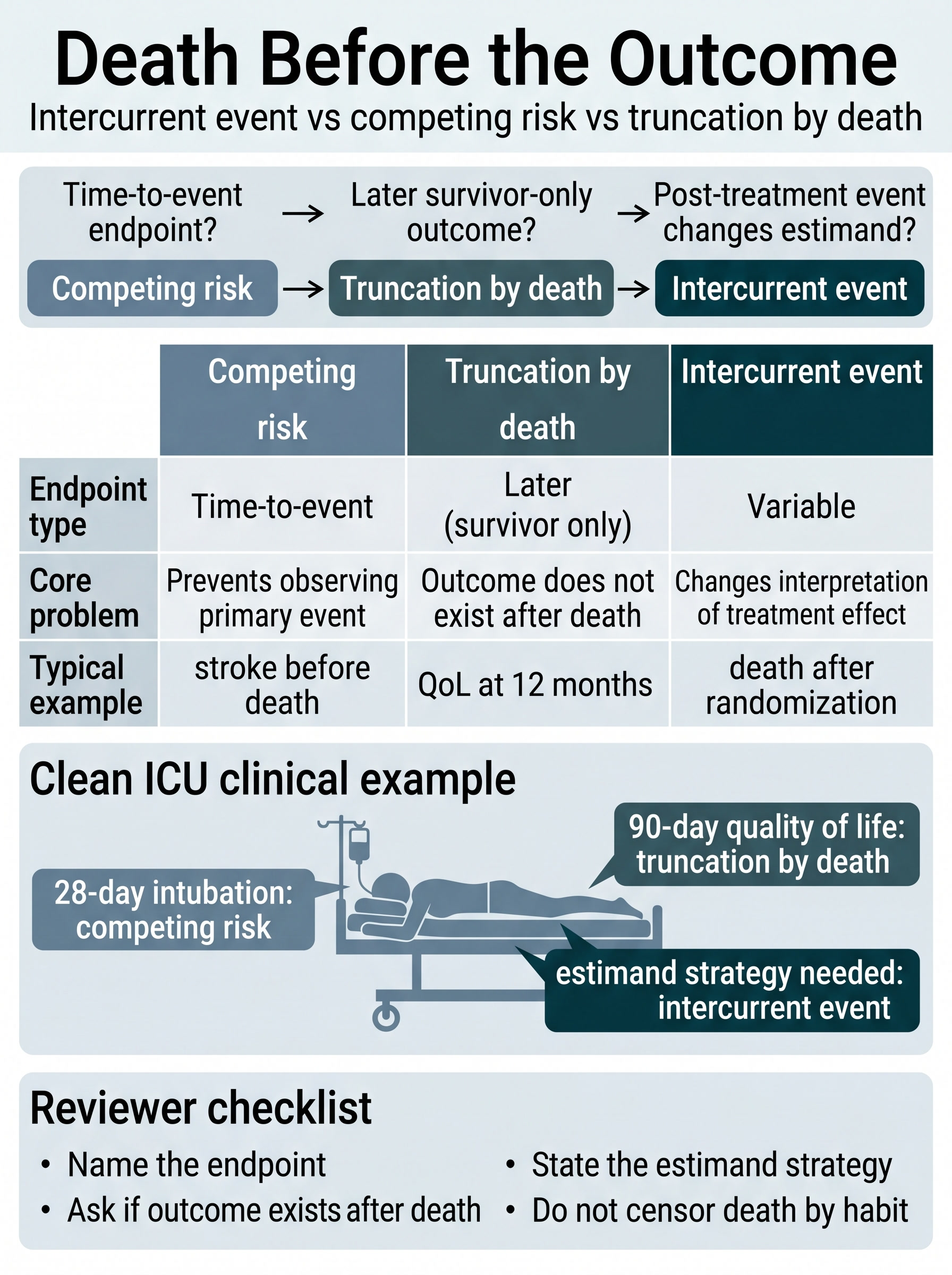
Death Before the Outcome: Intercurrent Event vs Competing Risk vs Truncation by Death
A visual comparison guide to the three analytic meanings death can take before an endpoint is observed. Covers when death blocks a time-to-event outcome, when it makes a later survivor-only outcome undefined, when it forces an estimand strategy, and how to stop those three problems from being blurred into one vague methods sentence.
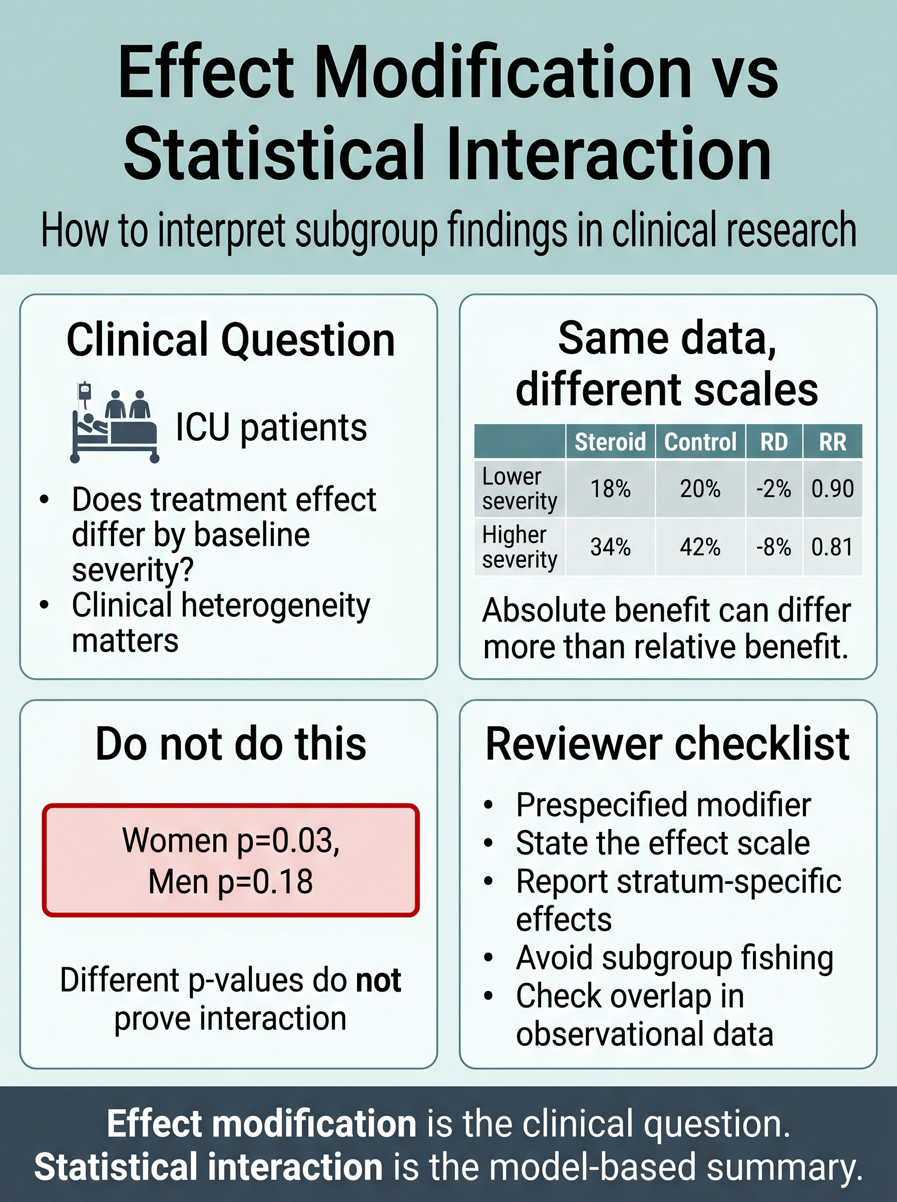
Effect Modification vs Statistical Interaction in Clinical Research
A visual guide to the difference between clinical heterogeneity of treatment effect and the model-based interaction terms used to summarize it. Covers subgroup p-value traps, scale dependence, baseline-severity examples, and the reviewer checks that keep treatment-effect heterogeneity from collapsing into post hoc storytelling.
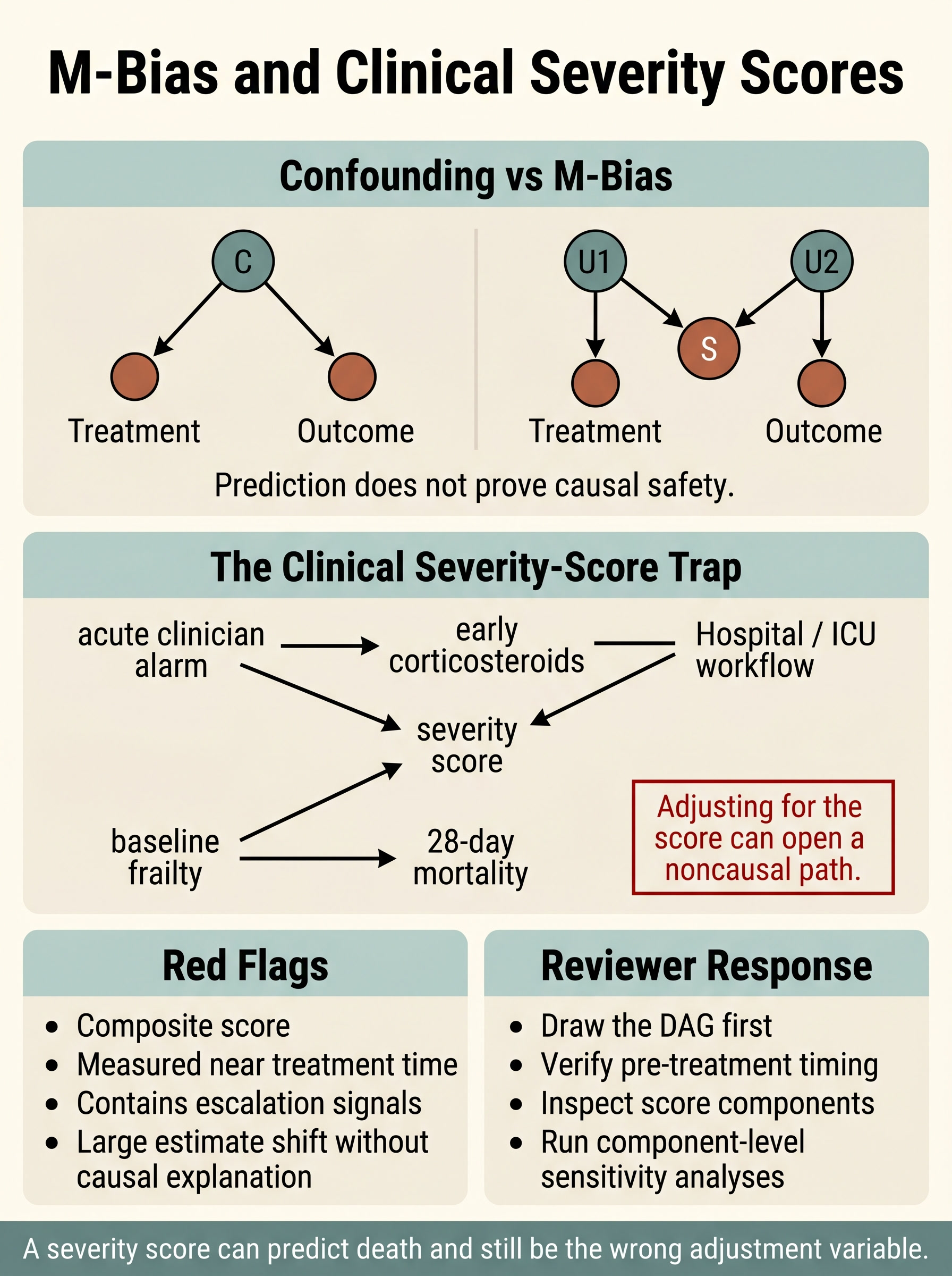
M-Bias and Clinical Severity Scores
A visual guide to one of the easiest adjustment mistakes to hide behind a validated score. Covers the difference between true confounding and collider-based M-bias, why severity composites can be causally unsafe, and the reviewer checks that keep “adjusted for severity” from masquerading as identification strategy.
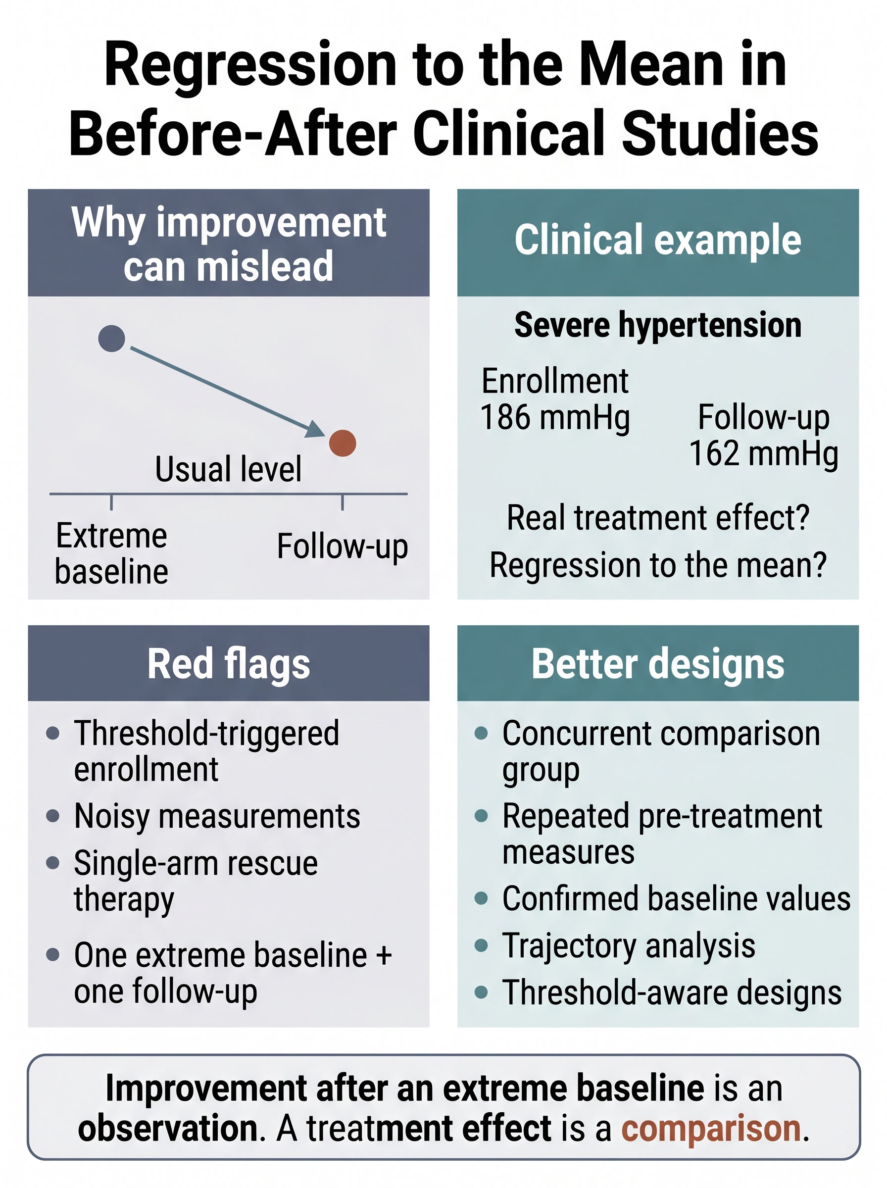
Regression to the Mean in Before-After Clinical Studies
A visual guide to why uncontrolled improvement after an extreme baseline can look like treatment benefit even when part of the change was expected all along. Covers threshold-triggered enrollment, noisy measurements, single-arm rescue therapy, and the design checks that keep before-after results from being oversold as causal evidence.
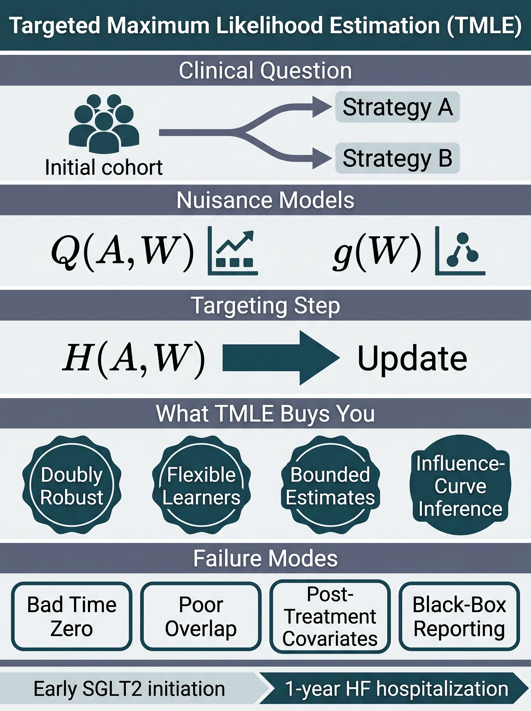
Targeted Maximum Likelihood Estimation in Clinical Research
A visual guide to when TMLE earns its complexity in observational clinical studies. Covers the estimand-first workflow, why targeting is different from generic machine-learning adjustment, how TMLE compares with g-computation, IPW, and AIPW, and the reviewer checks that catch overlap, design, and reporting failures before the estimate gets oversold.
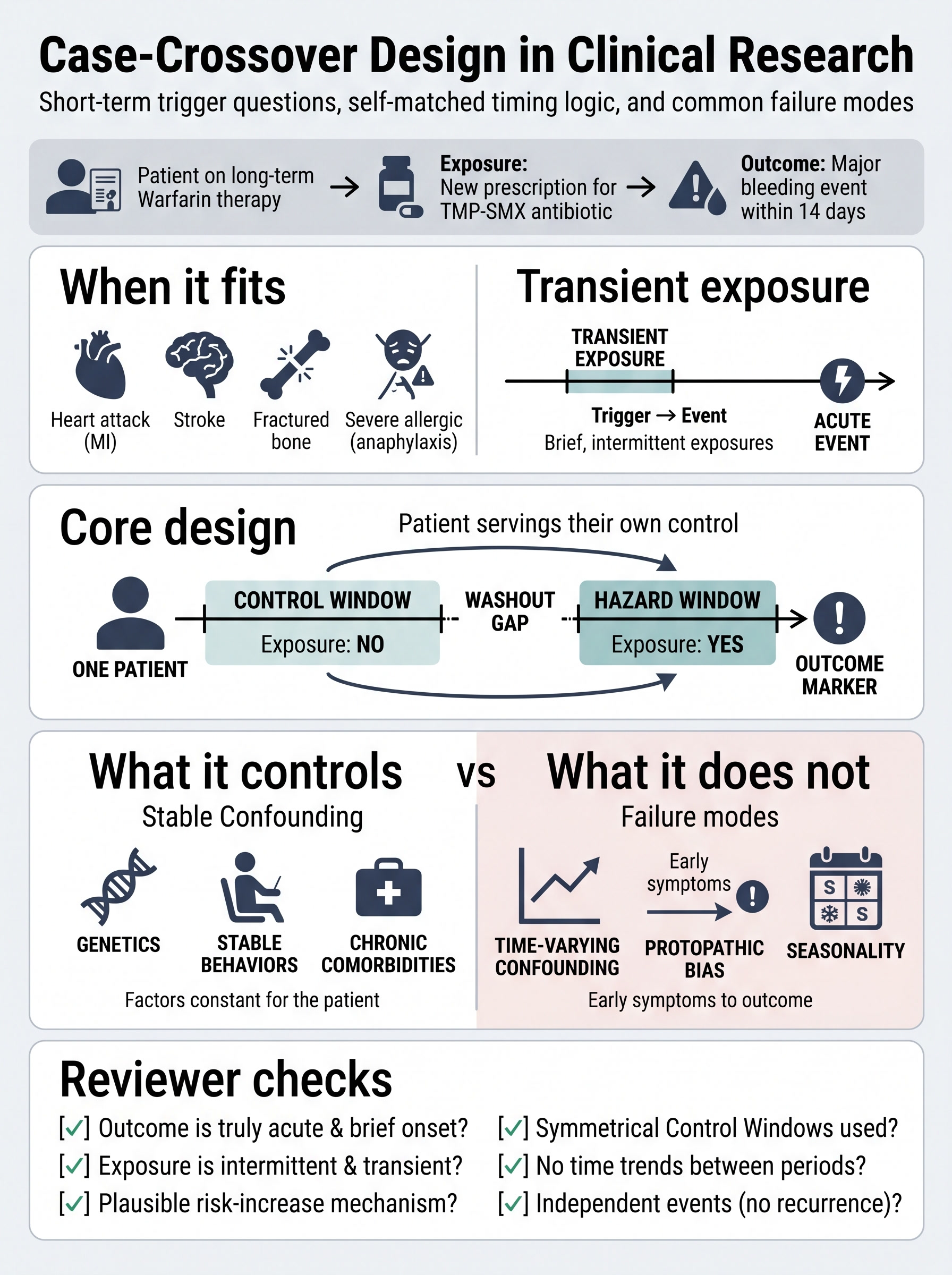
Case-Crossover Design in Clinical Research
A visual guide to the self-matched design for short-term trigger questions. Covers hazard and control windows, washout gaps, why stable confounding is reduced but time-varying confounding is not, and the reviewer checks that separate a real acute-trigger study from a chronic-treatment question wearing the wrong design.
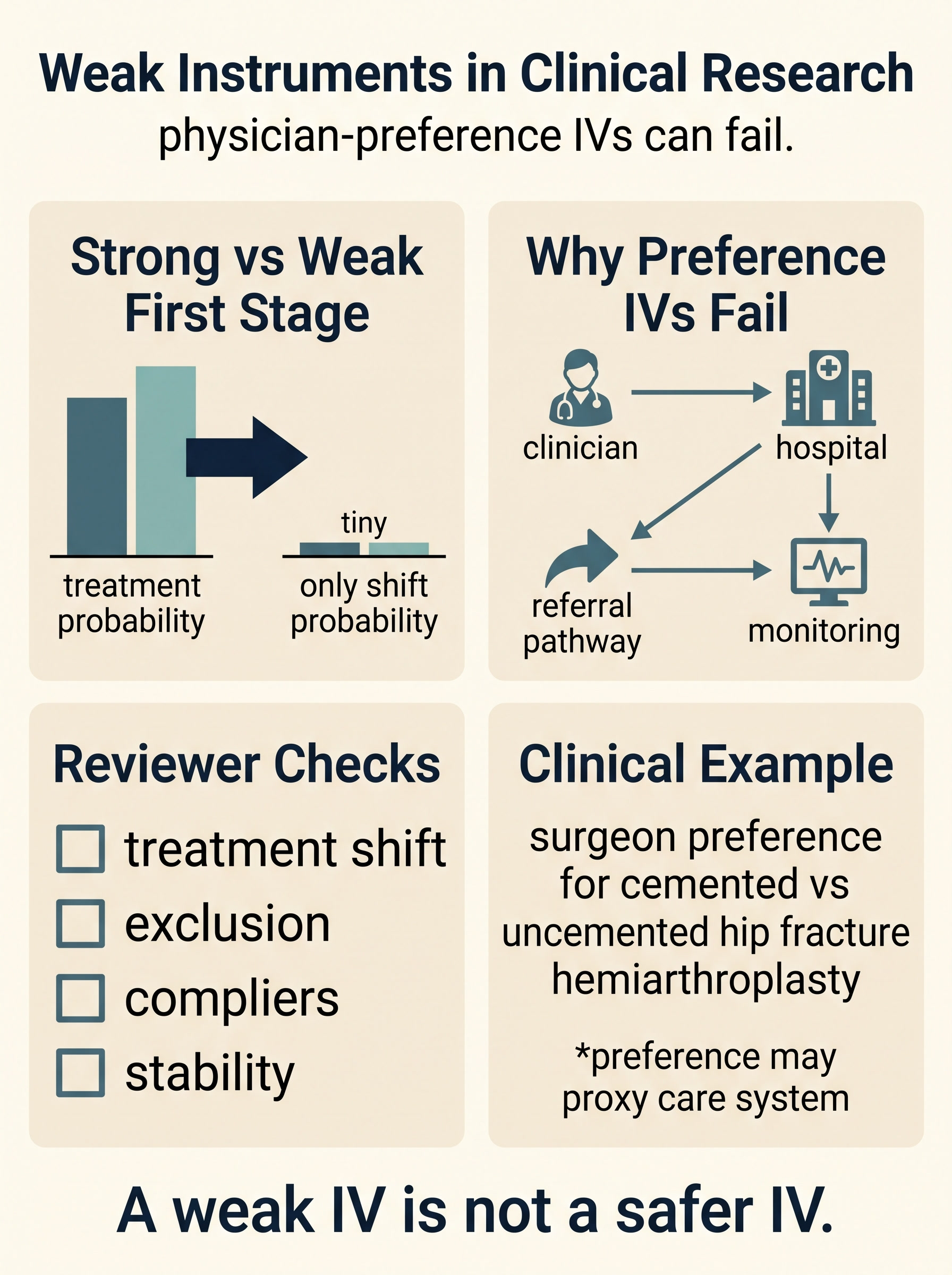
Weak Instruments and Physician-Preference IVs in Clinical Research
A reviewer-focused guide to first-stage weakness, why physician- and hospital-preference instruments often proxy broader care systems, how local IV interpretation can drift, and the checks that should come before anyone claims unmeasured confounding is solved.
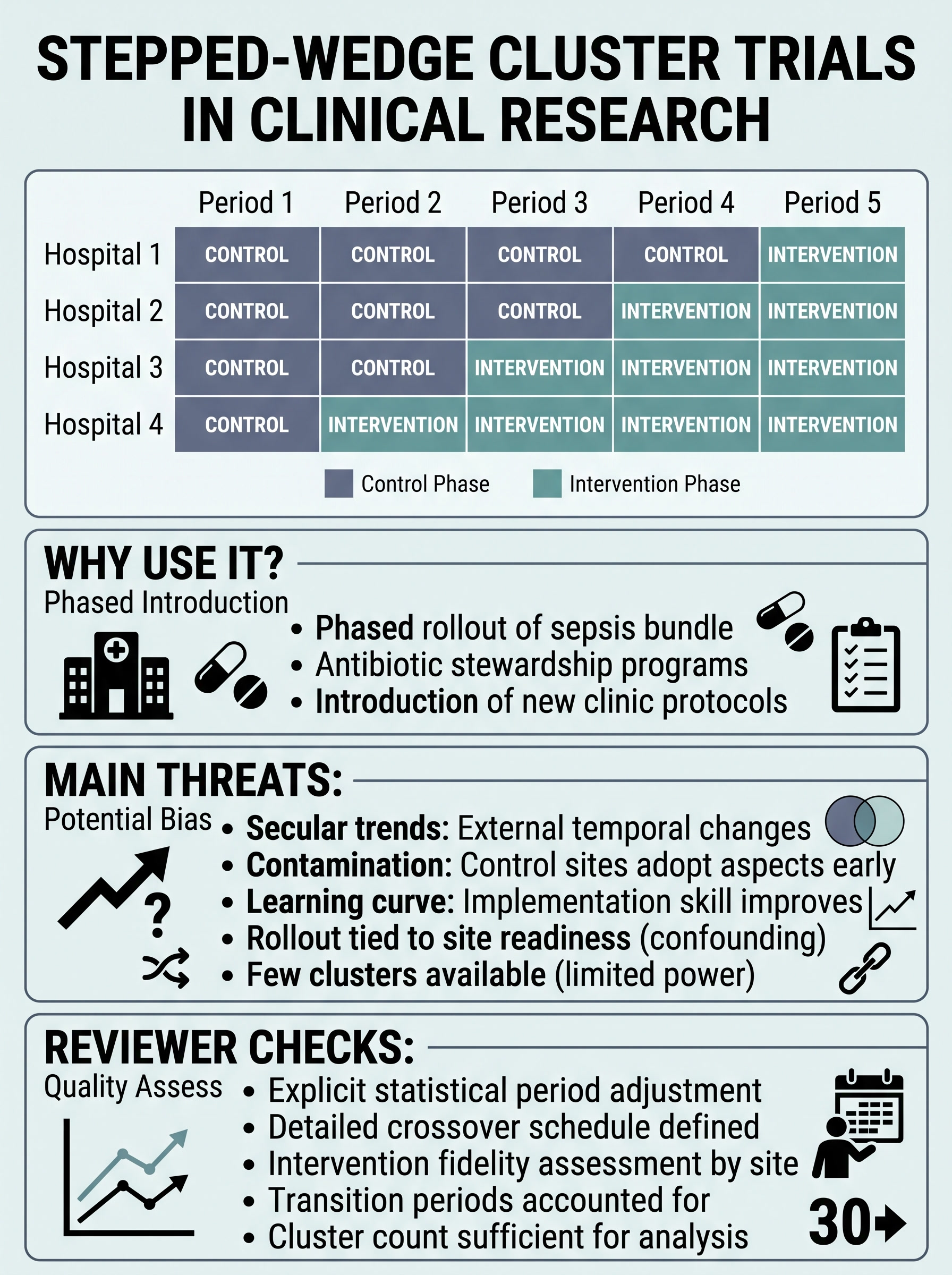
Stepped-Wedge Cluster Trials in Clinical Research
A rollout-focused guide to when stepped-wedge designs are actually useful, why calendar time is the central threat, and the reviewer checks that separate a defensible phased implementation trial from a dressed-up before-after study.
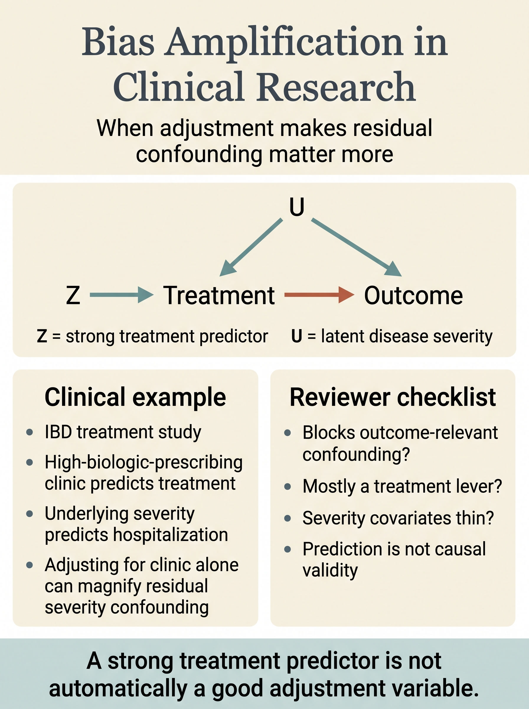
Bias Amplification in Clinical Research
A clinically grounded guide to when adjustment worsens residual confounding, why strong treatment predictors are not automatically good covariates, and the reviewer checks that separate causal control from treatment-prediction theater.
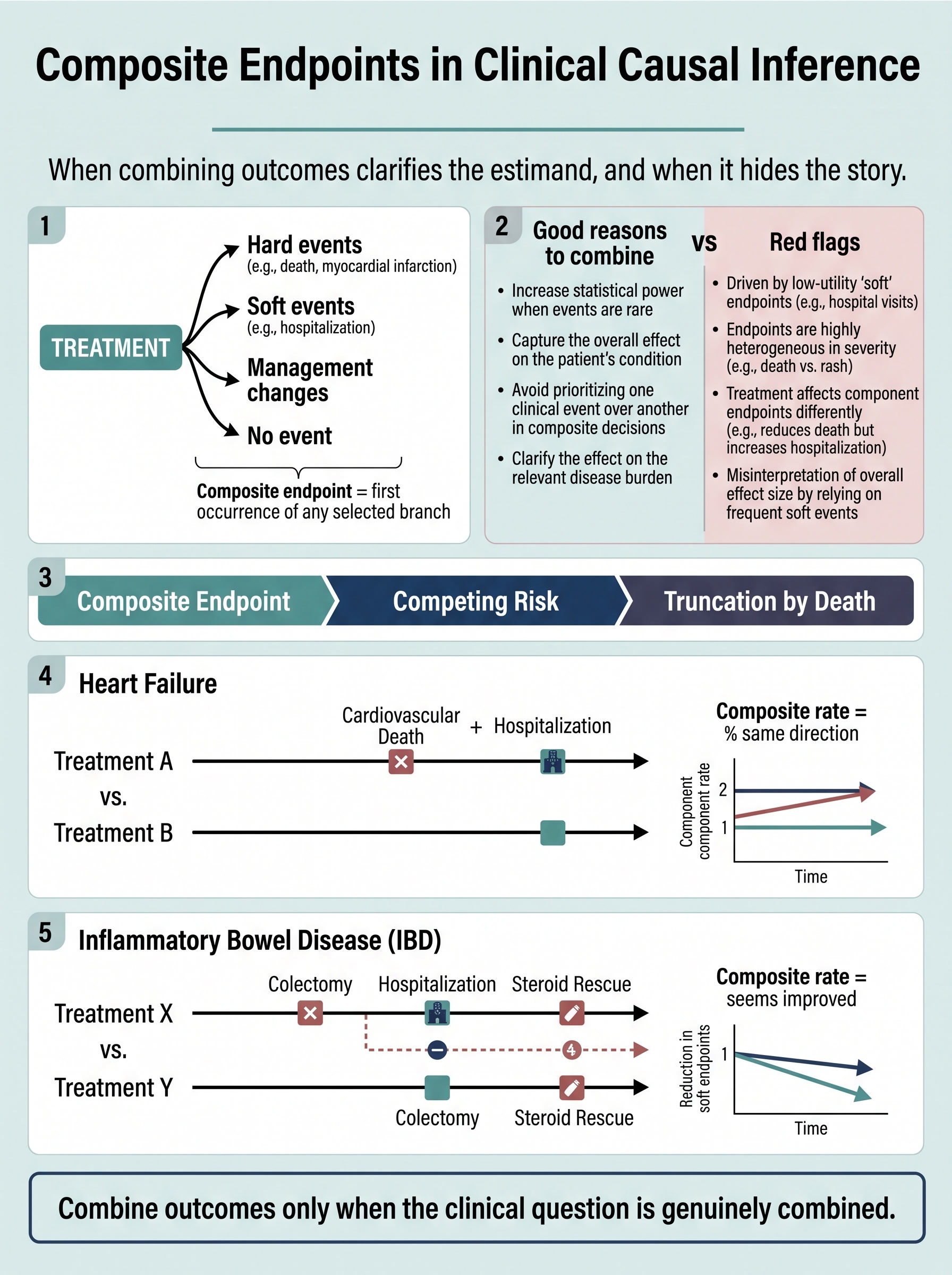
Composite Endpoints in Clinical Causal Inference
A clinically grounded guide to when combining outcomes clarifies the estimand, when soft components overpower hard ones, and the reviewer checks that stop a statistically convenient composite from rewriting the clinical question.
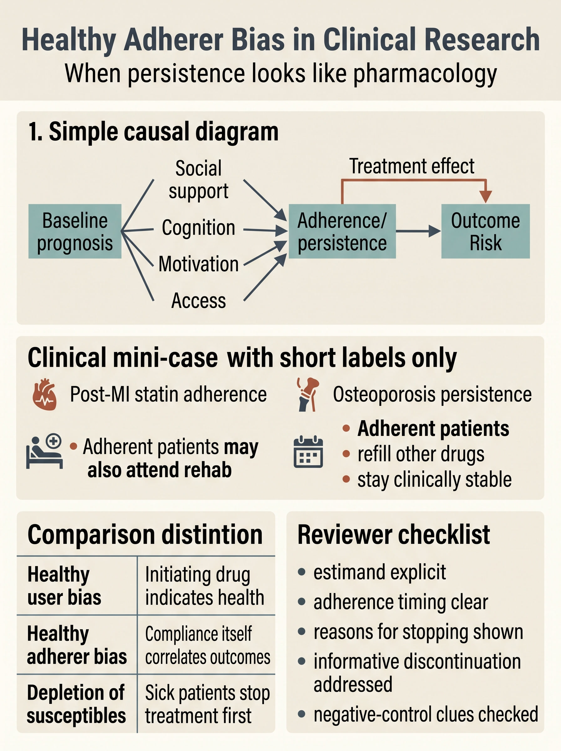
Healthy Adherer Bias in Clinical Research
A clinically grounded guide to when persistence starts to look like pharmacology, how adherence behavior gets tangled with prognosis and support, and the reviewer checks that keep refill discipline from masquerading as treatment effect.
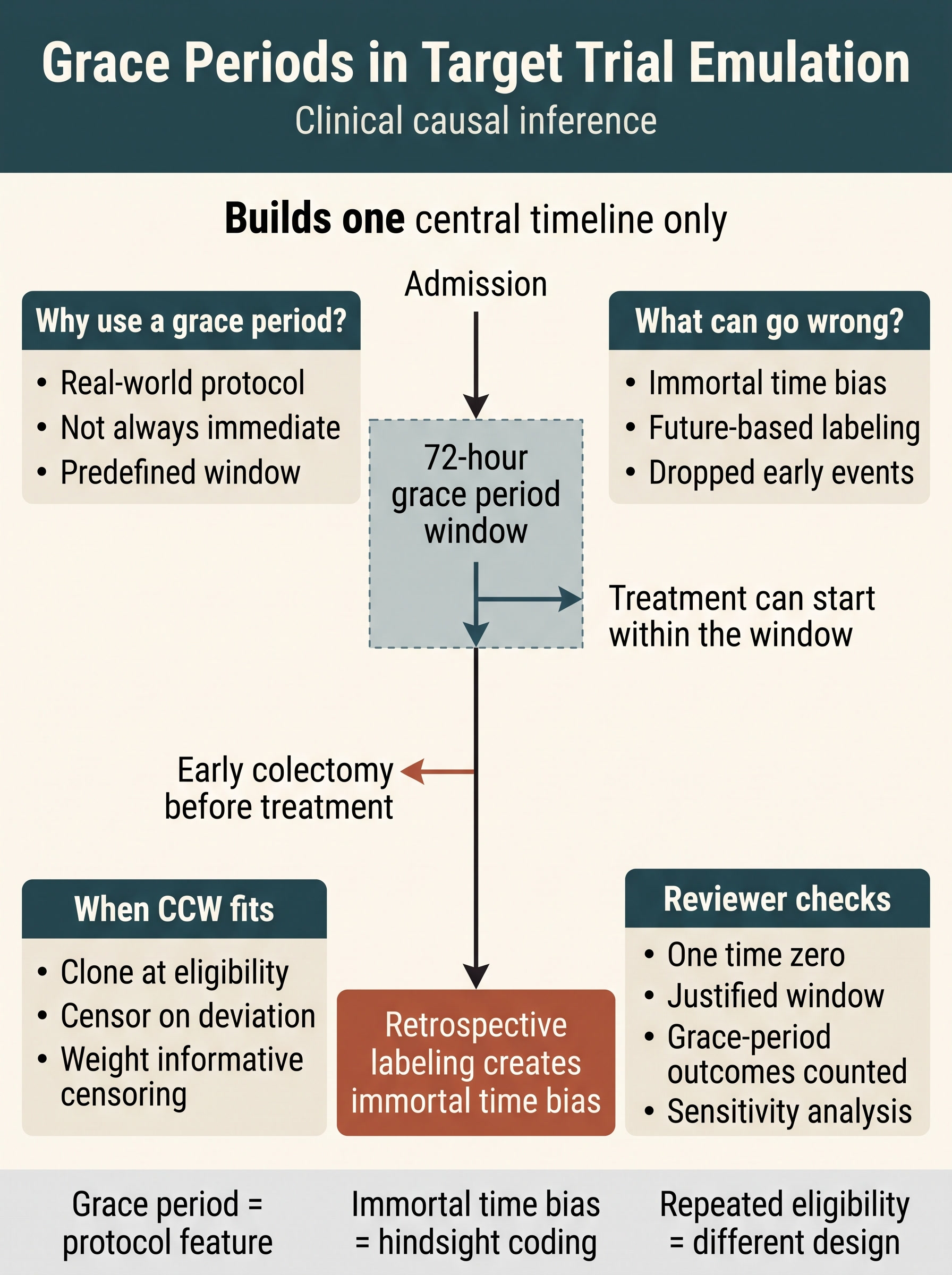
Grace Periods in Target Trial Emulation
A clinically grounded guide to when delayed initiation windows belong in the protocol, how hindsight exposure coding turns them into immortal time bias, and the reviewer checks that keep assignment windows aligned with a real target trial.
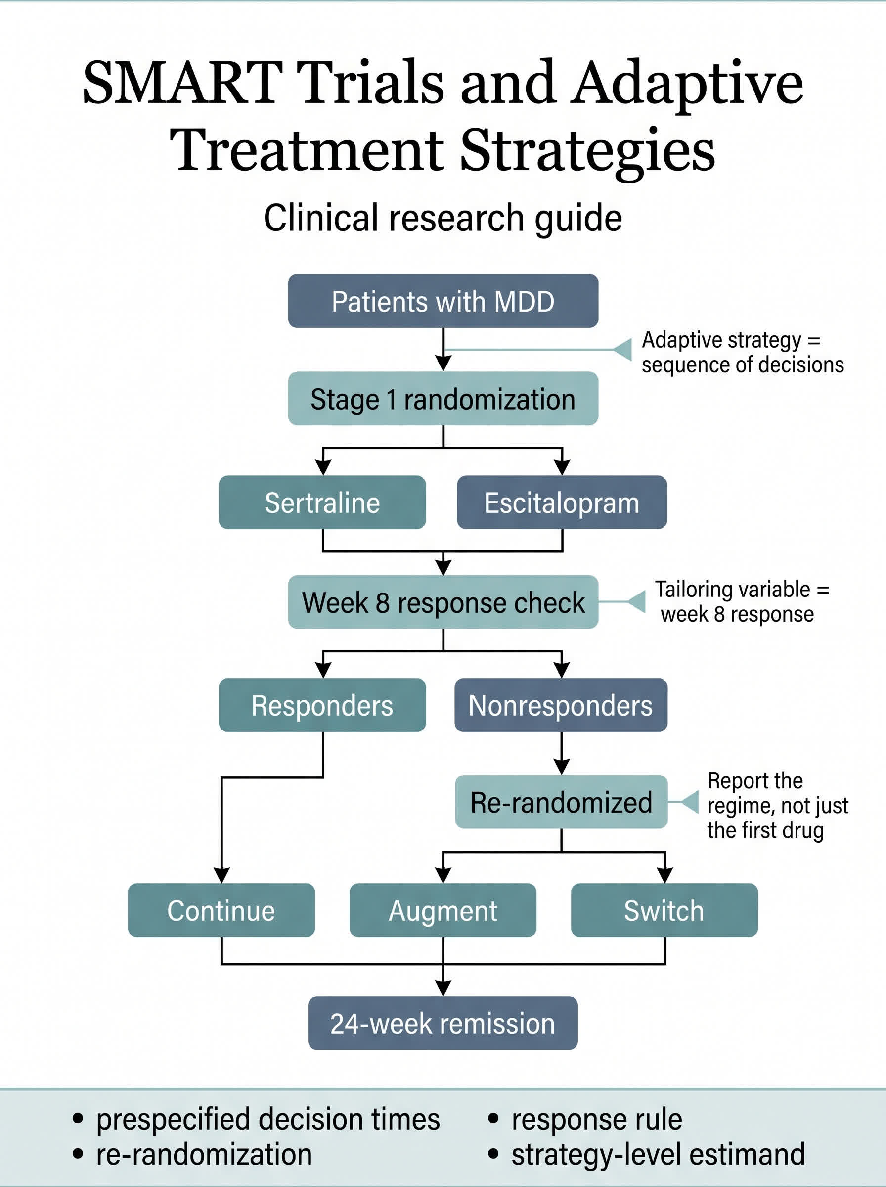
SMART Trials and Adaptive Treatment Strategies
A clinically grounded guide to when a treatment question is really a sequence of decisions, how SMART trials embed response-guided treatment regimes, and the reviewer checks that keep stage-wise randomization from being misread as a simple baseline drug comparison.
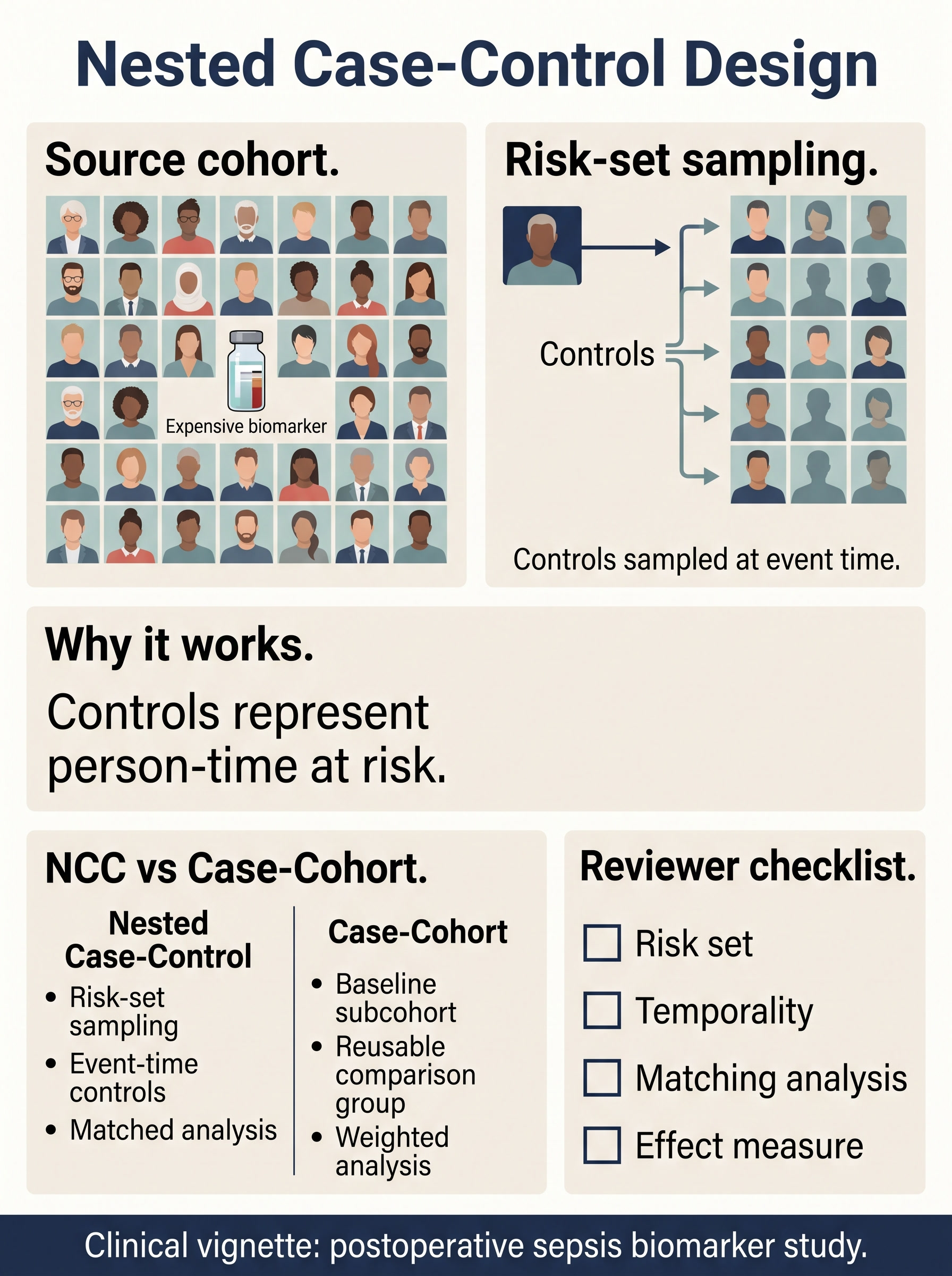
Nested Case-Control Design in Clinical Research
A clinically grounded guide to when expensive biomarker or chart-validated exposure data justify sampling inside a cohort, how risk-set control selection preserves the event-time comparison, and the reviewer checks that keep fake nesting from being mistaken for a real sampled-cohort design.
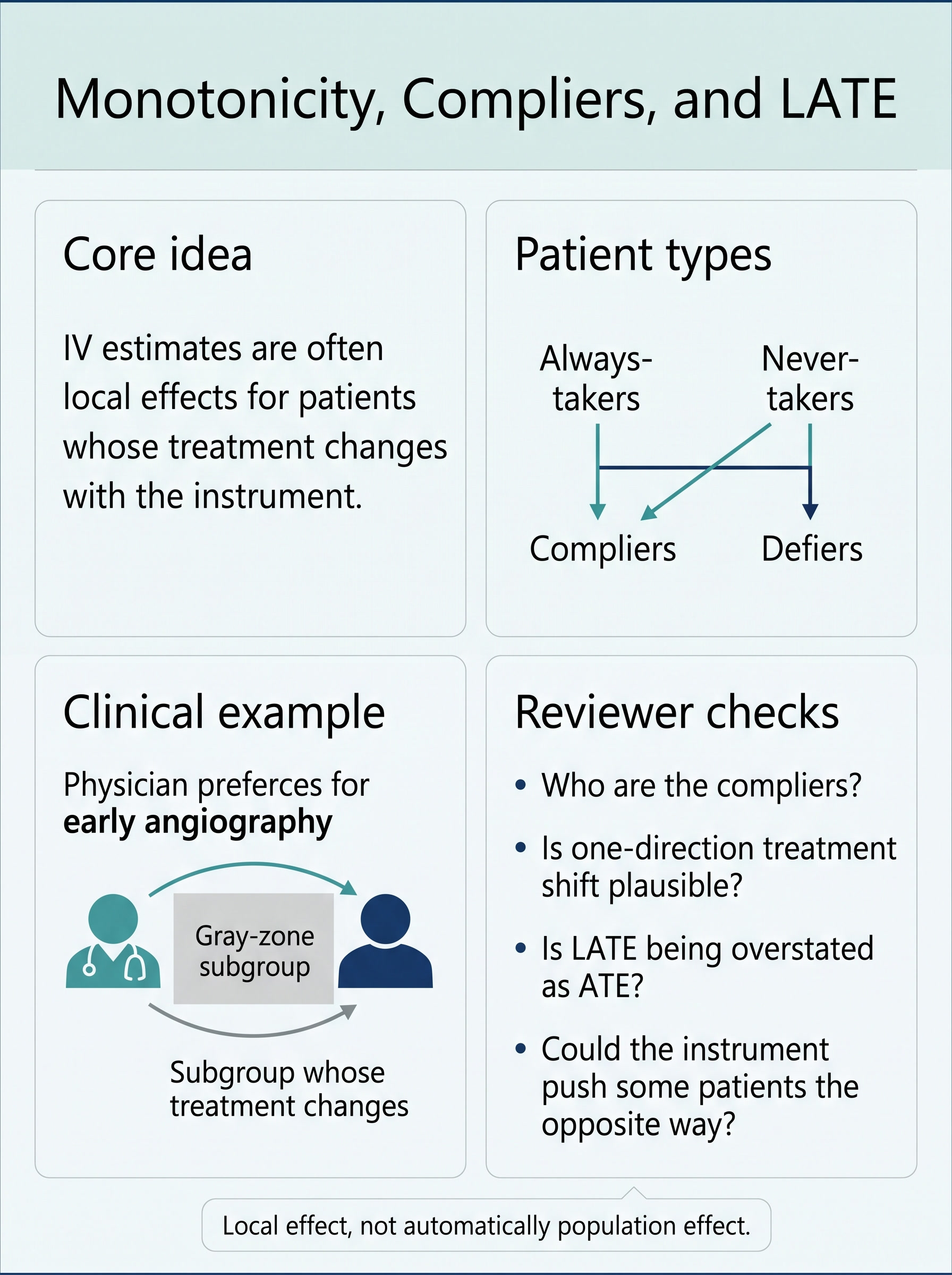
Monotonicity, Compliers, and LATE in Clinical IV Research
A clinically grounded guide to why most instrumental-variable estimates are local effects for compliers, how monotonicity becomes a real claim about treatment decisions moving in one direction, and the reviewer checks that keep LATE from being overstated as a population ATE.
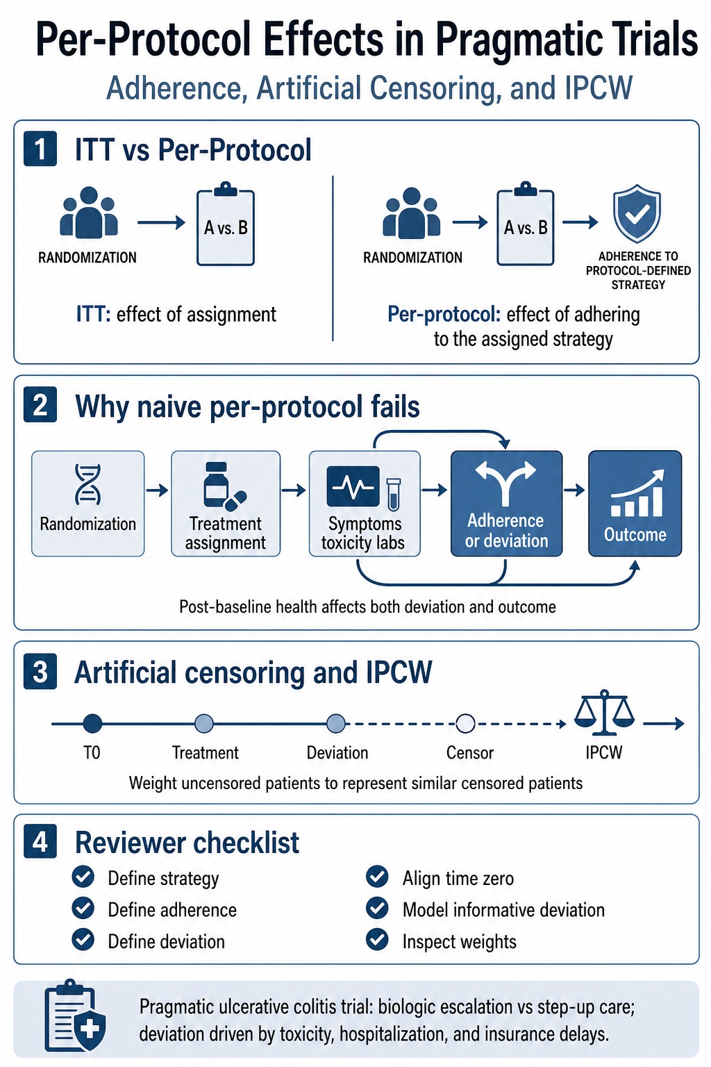
Per-Protocol Effects in Pragmatic Trials
A clinically grounded guide to why per-protocol analyses in real-world trials become adherence and informative-deviation problems, when artificial censoring and IPCW enter, and the reviewer checks that keep randomization from being overstated after protocol drift begins.
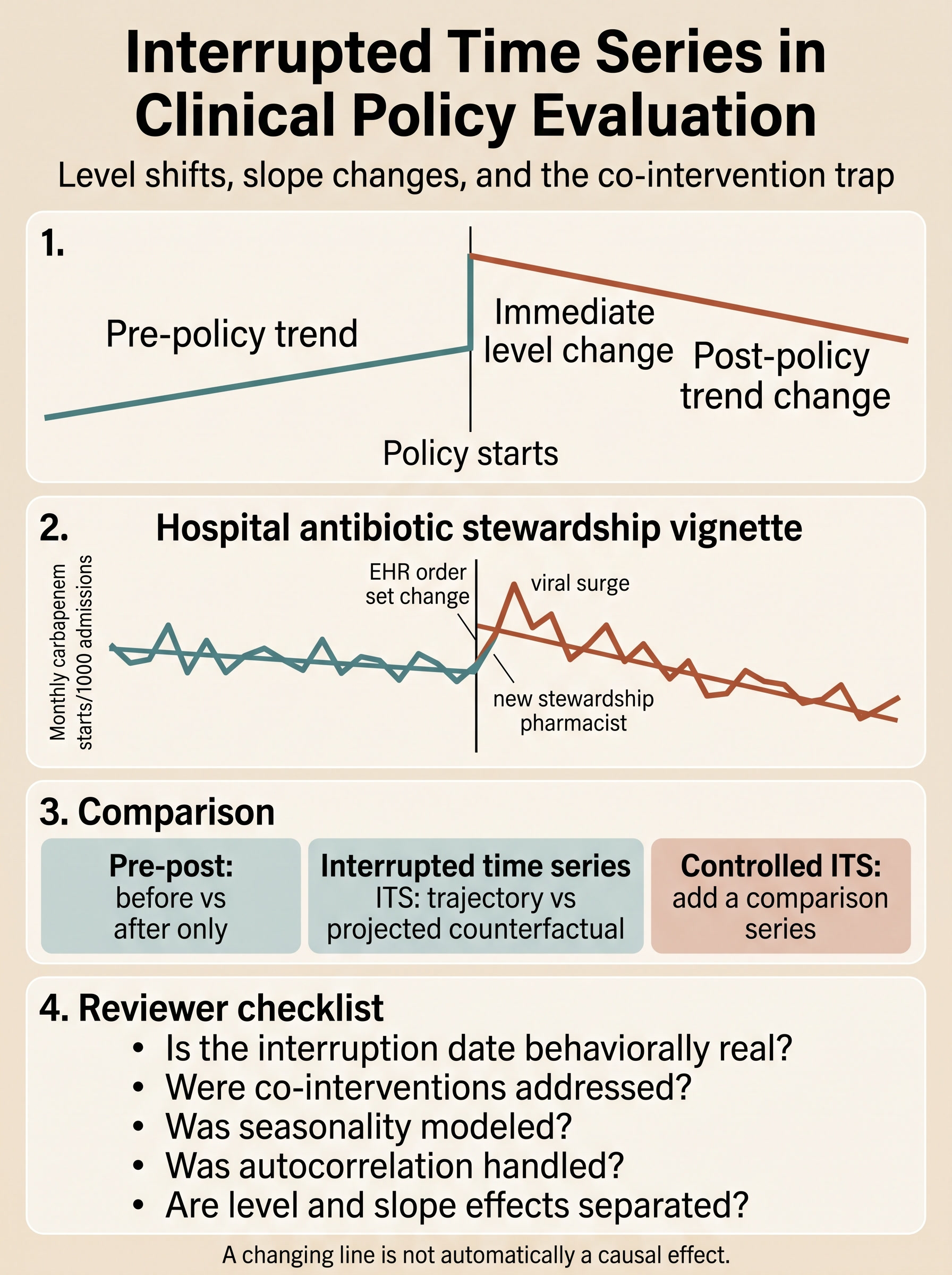
Interrupted Time Series in Clinical Policy Evaluation
A clinically grounded guide to how interrupted time series separates immediate level shifts from post-policy trend changes, why co-interventions and coding shocks can counterfeit causal stories, and the reviewer checks that make single-series policy evaluations more credible.
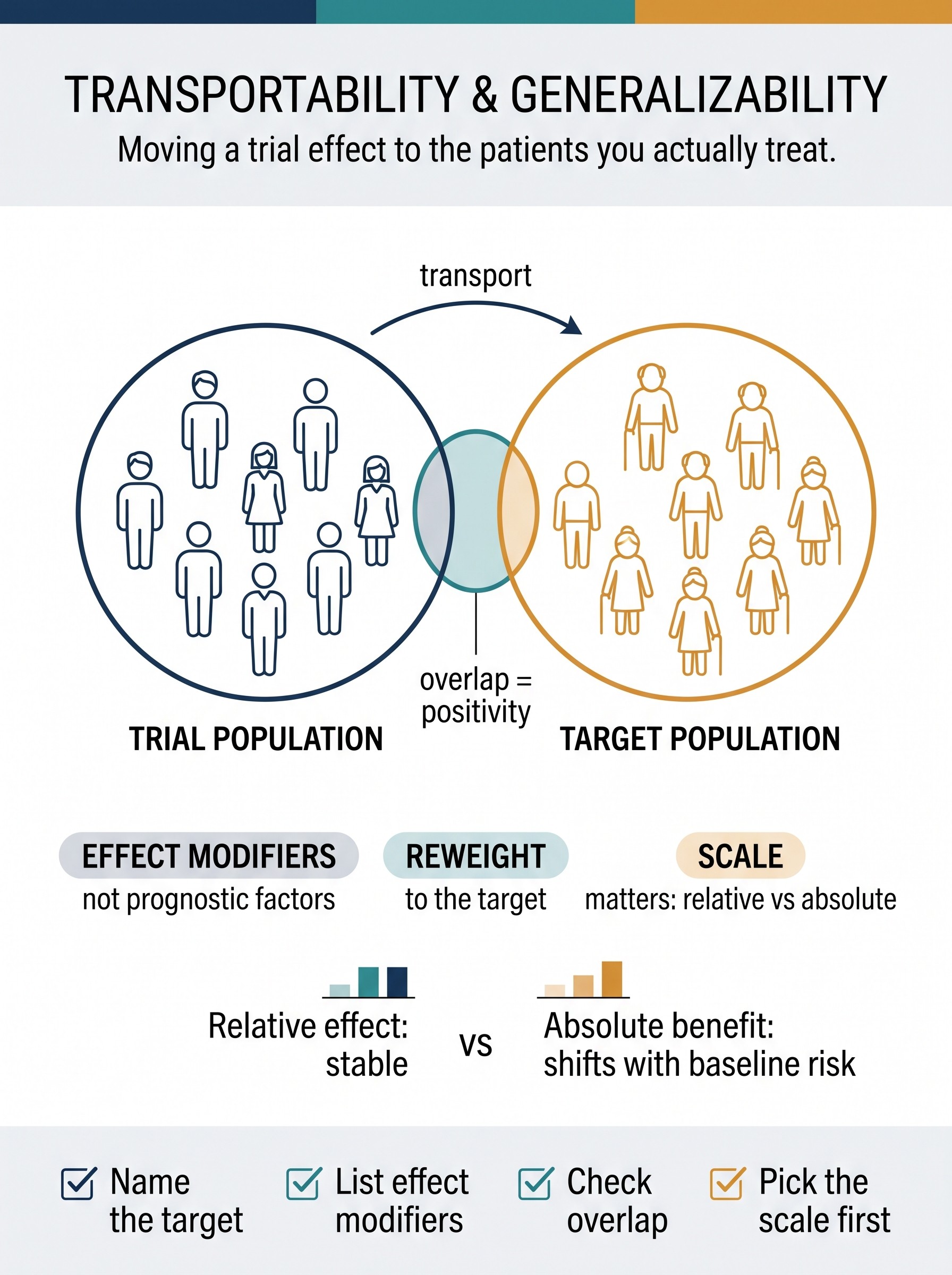
Transportability and Generalizability
A clinically grounded guide to why internal validity does not license the leap from "in this trial" to "in patients like ours," why the load-bearing quantities are effect modifiers rather than prognostic factors, how positivity of participation and scale (relative vs absolute) decide whether an effect actually transports, and the reviewer checks that separate a borrowed external claim from an earned one.
Can this trial travel?
Randomization protects the comparison inside the trial. Change the target population and watch why that does not automatically identify the effect in patients like yours.
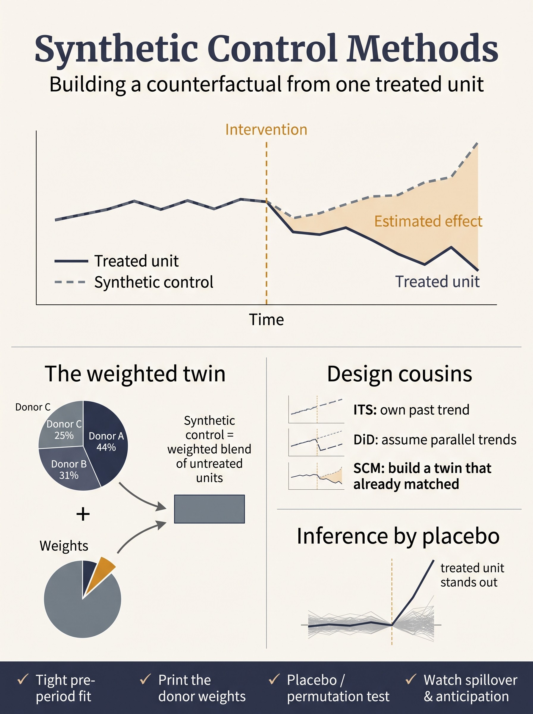
Synthetic Control Methods
A clinically grounded guide to building a counterfactual when a policy or program hits a single unit — how synthetic control assembles a weighted twin from untreated donors that provably tracked the treated unit before the intervention, why the credibility lives in placebo and permutation inference rather than the visible gap, and the reviewer checks (pre-period fit, donor weights, spillover, anticipation) that separate an earned effect from a drawn one.
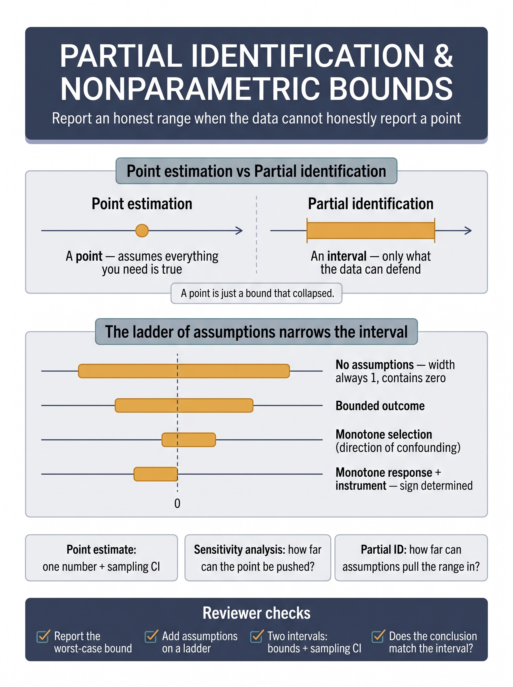
Partial Identification and Nonparametric Bounds
When the assumptions needed to name a single number aren't credible, don't invent the number — bound it. This guide shows how partial identification reports the full range of effects consistent with defensible assumptions instead of a fragile point: the humbling no-assumptions worst-case bound (width 1, always contains zero), the ladder of assumptions that narrows the interval one credible rung at a time (bounded outcome, monotone selection, monotone response, IV bounds), and how this differs from sensitivity analysis and IV point estimation. The antidote to false precision built on an undefended identifying assumption.
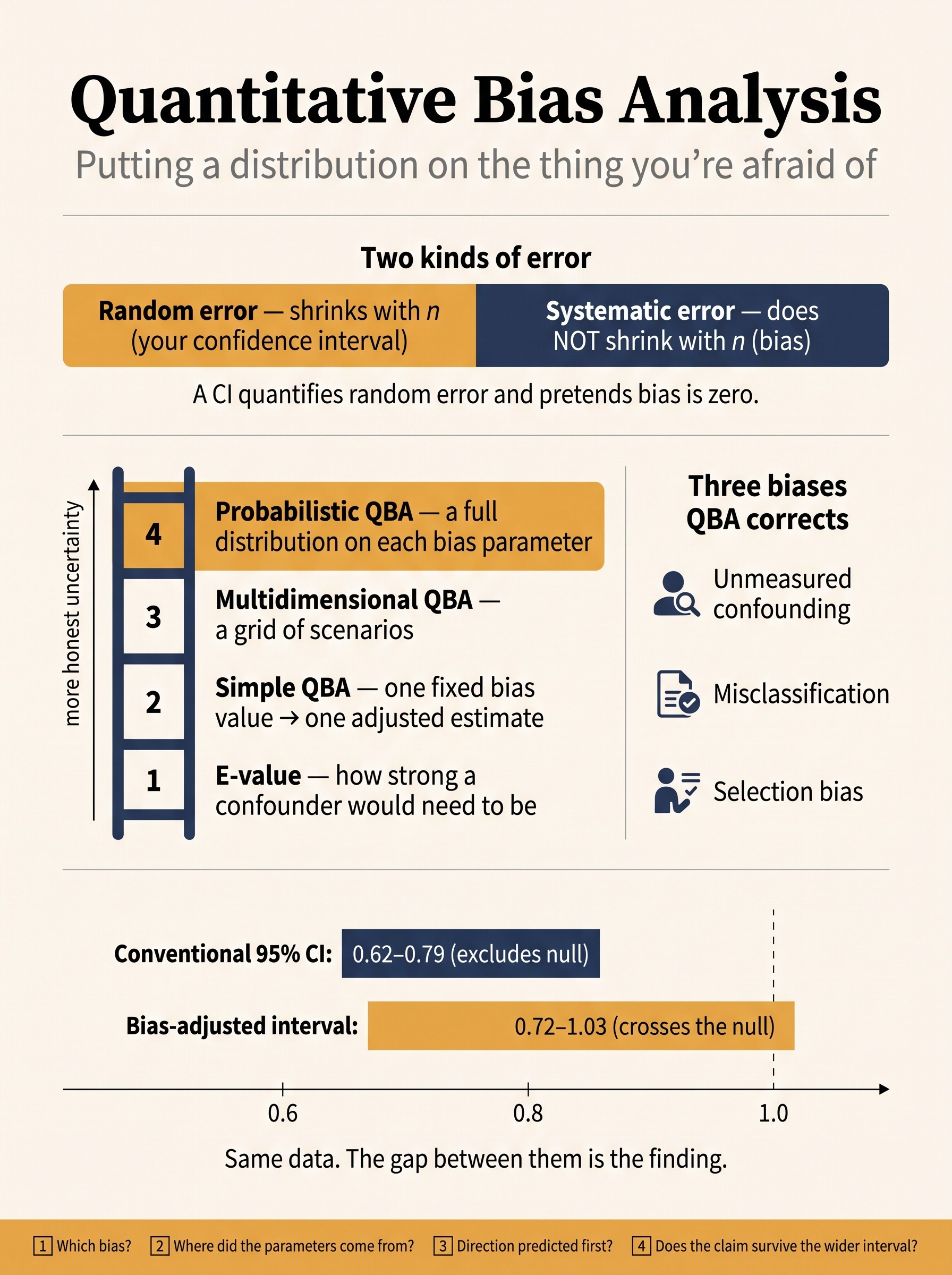
Quantitative Bias Analysis
A confidence interval measures random error and quietly pretends systematic error is zero — which is why a study of two million patients can have a razor-thin CI around a badly biased number. This guide shows how quantitative bias analysis replaces the Discussion-section sentence "residual confounding cannot be excluded" with an actual interval: put an explicit, argued distribution on the bias — unmeasured confounding, misclassification, or selection — and propagate it through so the reported uncertainty finally includes the errors you lose sleep over. Covers the ladder from E-value to probabilistic Monte Carlo QBA, the six-step workflow, a worked anticoagulant-and-dementia vignette where the effect shifts back across the null, and a reviewer's checklist. The antidote to a "significant" result that rests entirely on the assumption of zero bias.
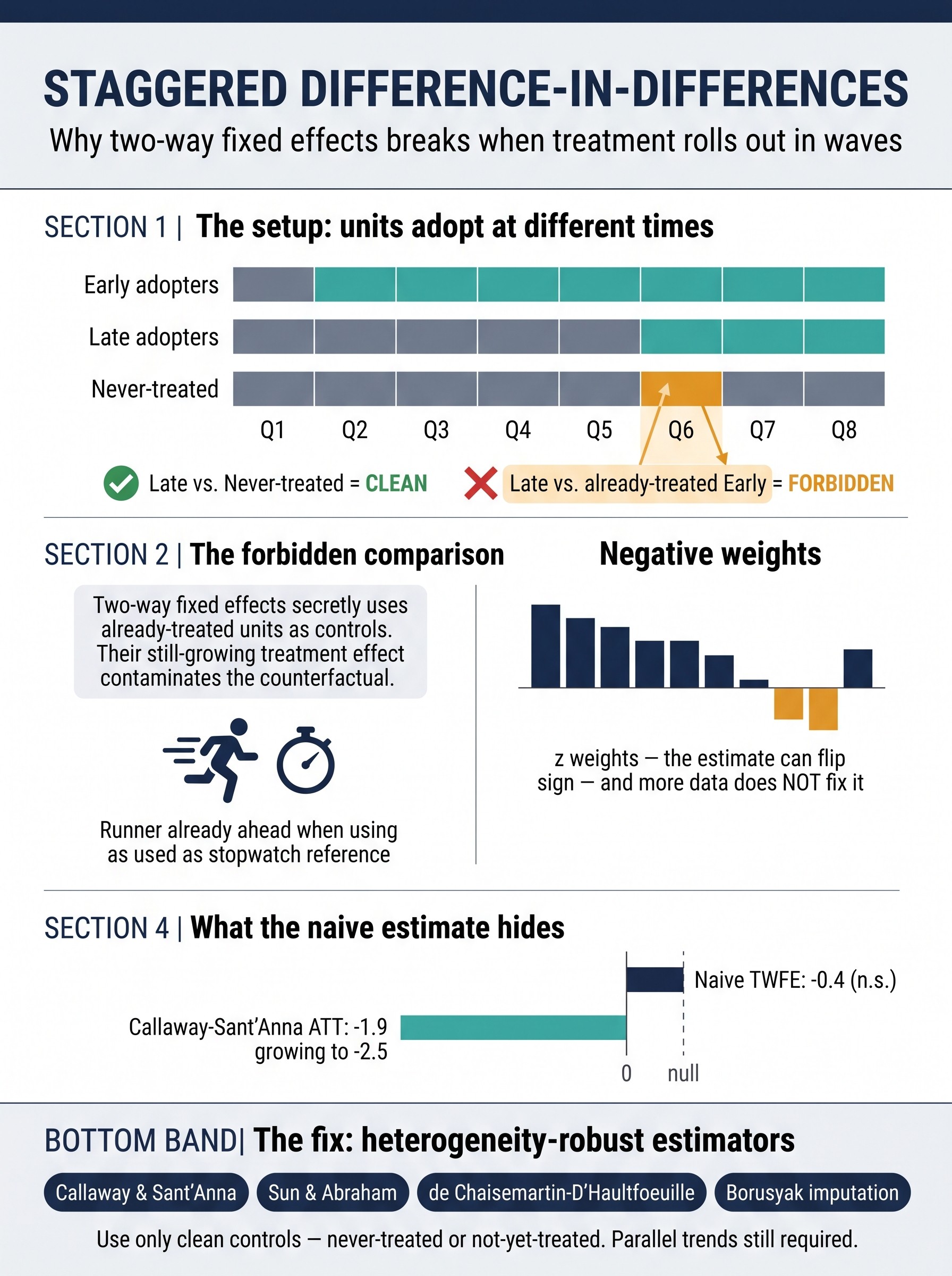
Staggered Difference-in-Differences
Real interventions rarely switch on everywhere at once — hospitals adopt a protocol in different quarters, states expand a policy in different years, a stepped-wedge trial crosses clusters on a schedule. Feed that staggered data to the standard two-way fixed-effects regression and it does something invisible and damaging: it uses already-treated units as controls for later-treated ones. That "forbidden comparison" lets a still-growing treatment effect leak into the counterfactual, producing negative weights that can shrink, inflate, or even flip the sign of your estimate — and more data does not fix it. This guide shows why the single β is not the ATT, how the Goodman-Bacon decomposition exposes the contamination, and the modern heterogeneity-robust estimators (Callaway–Sant'Anna, Sun–Abraham, de Chaisemartin–D'Haultfœuille, imputation) that rebuild the analysis on clean controls only. Includes a worked ICU early-mobility vignette where a real benefit is buried as "not significant," the stepped-wedge connection, and a reviewer's checklist.
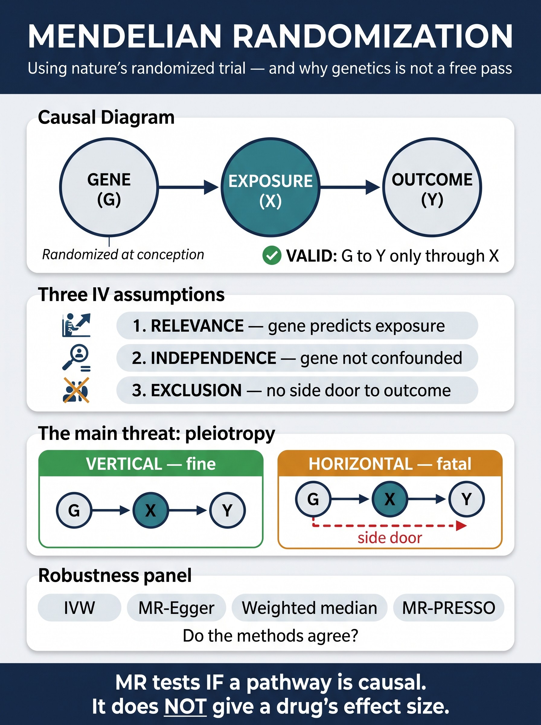
Mendelian Randomization
Higher HDL tracks with less heart disease; higher CRP with more; higher vitamin D with less of everything — and a distressing share of these associations are not causal. Mendelian randomization borrows the logic of a randomized trial from the one experiment nature already ran: meiosis. Because alleles are dealt at random at conception, a variant that raises a lifelong exposure acts like a treatment assignment, giving a confounding-resistant, reverse-causation-proof estimate of what that exposure actually does. This guide translates the three instrumental-variable assumptions into genetic terms, then spends its energy on the one that eats most MR studies — horizontal pleiotropy, the variant's side door to the outcome — and the robustness panel (IVW, MR-Egger, weighted median, MR-PRESSO) built to survive it. Includes the HDL and CRP cautionary tales where MR overturned the observational story before the trials read out, two-sample and winner's-curse hazards, weak-instrument and population-stratification traps, why an MR estimate is a lifelong effect and not a drug's effect size, and a STROBE-MR-aligned reviewer's checklist.
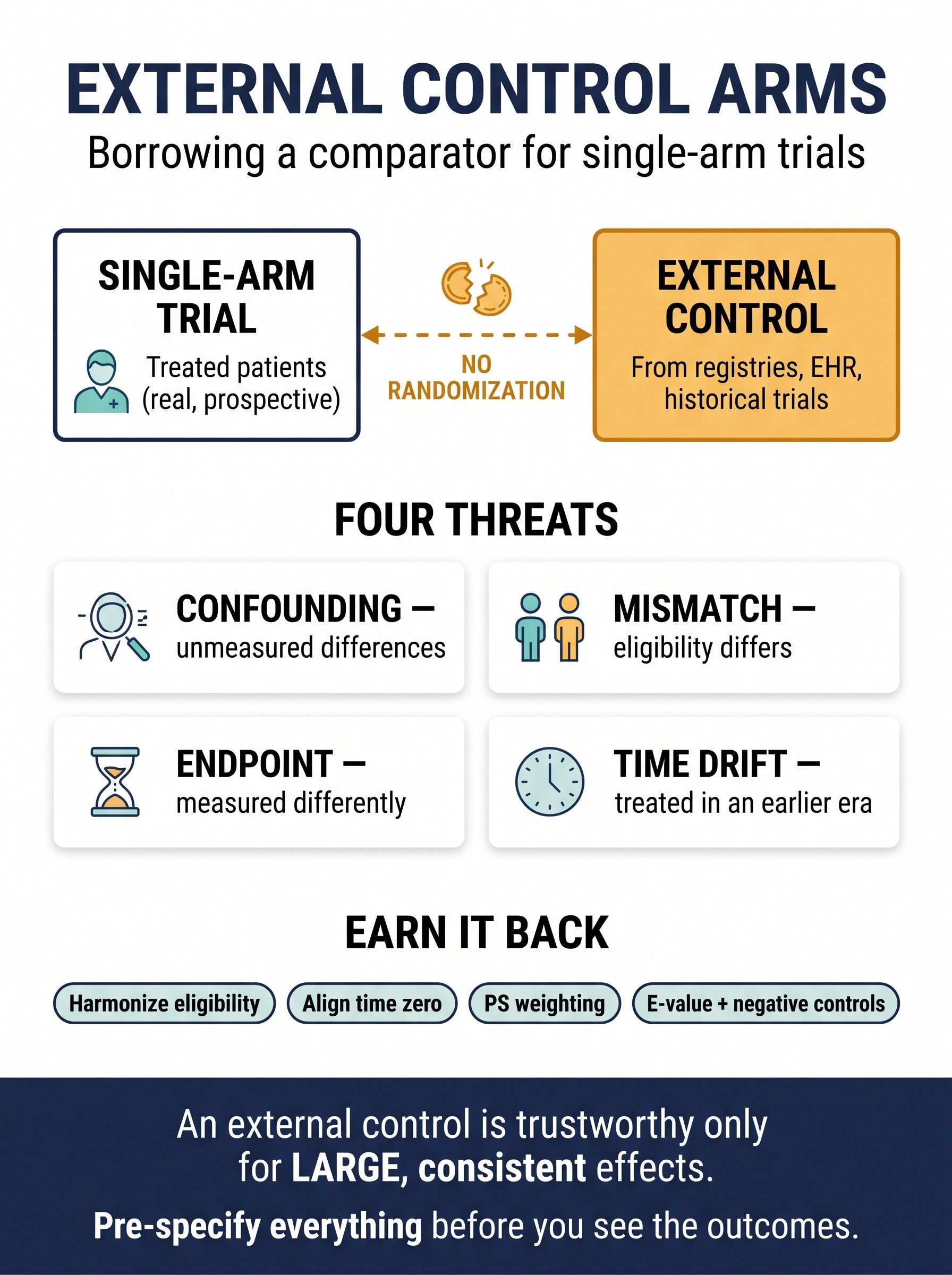
External Control Arms
When randomization is impossible — a rare disease, a dramatic effect, an accelerated-approval pathway — a single-arm trial supplies the treated patients and borrows its comparator from outside: a registry, an EHR, a historical trial. That borrowed control is a causal-inference problem in a trial costume, because no coin was ever flipped between the two groups. This guide is the patient-level sibling of the synthetic-control and target-trial guides, and it walks the four threats that decide whether the comparison survives — unmeasured confounding, eligibility mismatch, non-comparable endpoints, and calendar time drift — noting that nearly all of them push the same way: toward flattering the drug. It covers eligibility harmonization, time-zero alignment (and the immortal-time trap it prevents), propensity weighting for the treated effect, positivity/overlap, and Bayesian dynamic borrowing for hybrid designs; then the falsification toolkit an external control has to lean on — E-values, negative-control outcomes, tipping-point and multiple-source analyses — closing on the 2026 regulatory frame and a worked OS-vs-PFS vignette showing why the same hazard ratio means very different things depending on the endpoint. Includes 12 pitfalls and a pre-specification-first reviewer's checklist.
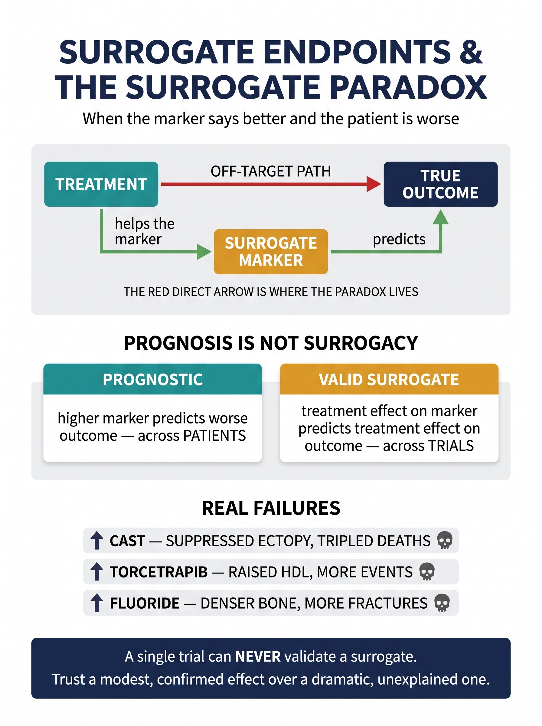
Surrogate Endpoints & the Surrogate Paradox
Almost every fast drug approval rides on a surrogate — HbA1c for complications, LDL for infarction, tumor shrinkage for survival — a cheap, quick marker standing in for the slow outcome patients actually feel. But a surrogate is a causal promise: that the treatment's road to the outcome runs through the marker. When the drug has a second road — an off-target harm the marker never sees — you get the surrogate paradox: the marker improves and the patient gets worse. CAST suppressed ventricular ectopy and tripled deaths; torcetrapib raised HDL and killed more people; fluoride made bone denser and more fragile. This guide separates the two questions everyone conflates — is a marker prognostic (predicts outcome across patients) versus a valid surrogate (its treatment effect predicts the treatment effect on the outcome across trials) — and shows why a single study can never validate a surrogate. It walks the Prentice criteria and the fatal full-mediation condition, the meta-analytic trial-level R², principal surrogacy's link to principal stratification, why proportion-of-effect-explained is fragile, and a worked CKD/proteinuria vignette. Closes with the accelerated-approval frame, eight common mistakes, and a pre-specification-first reviewer's checklist.
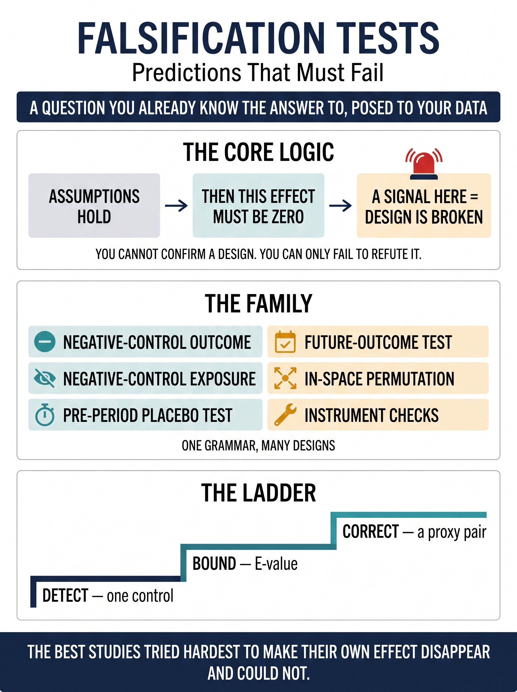
Falsification Tests: The Design Family
Every observational claim rests on assumptions you cannot verify — no unmeasured confounding, parallel trends, a valid instrument. You can't prove them, but you can often derive a consequence that must hold if they're true, and check it. When that prediction is a mandatory zero — an effect on an outcome the drug can't cause, a "benefit" in the period before treatment began, a signal in a unit that was never treated — you've built a falsification test: a question you already know the answer to, posed to your data. A signal where none is allowed is a smoke alarm for a broken design. This guide teaches the family as one grammar rather than five disconnected tricks: negative-control outcomes and exposures, pre-period/parallel-trends placebo tests in difference-in-differences and interrupted time series, in-space permutation in synthetic control, future-outcome and anticipation checks, and the falsification tests built into instruments and Mendelian randomization. It shows the ladder from detect (one control) to bound (E-value) to correct (a proxy pair, via proximal causal inference), the logic trap that a passed test is necessary but never sufficient, why power and precision — not p-values — decide whether a "clean" control means anything, a worked healthy-user vignette, eight common mistakes, and a pre-specification-first reviewer's checklist.
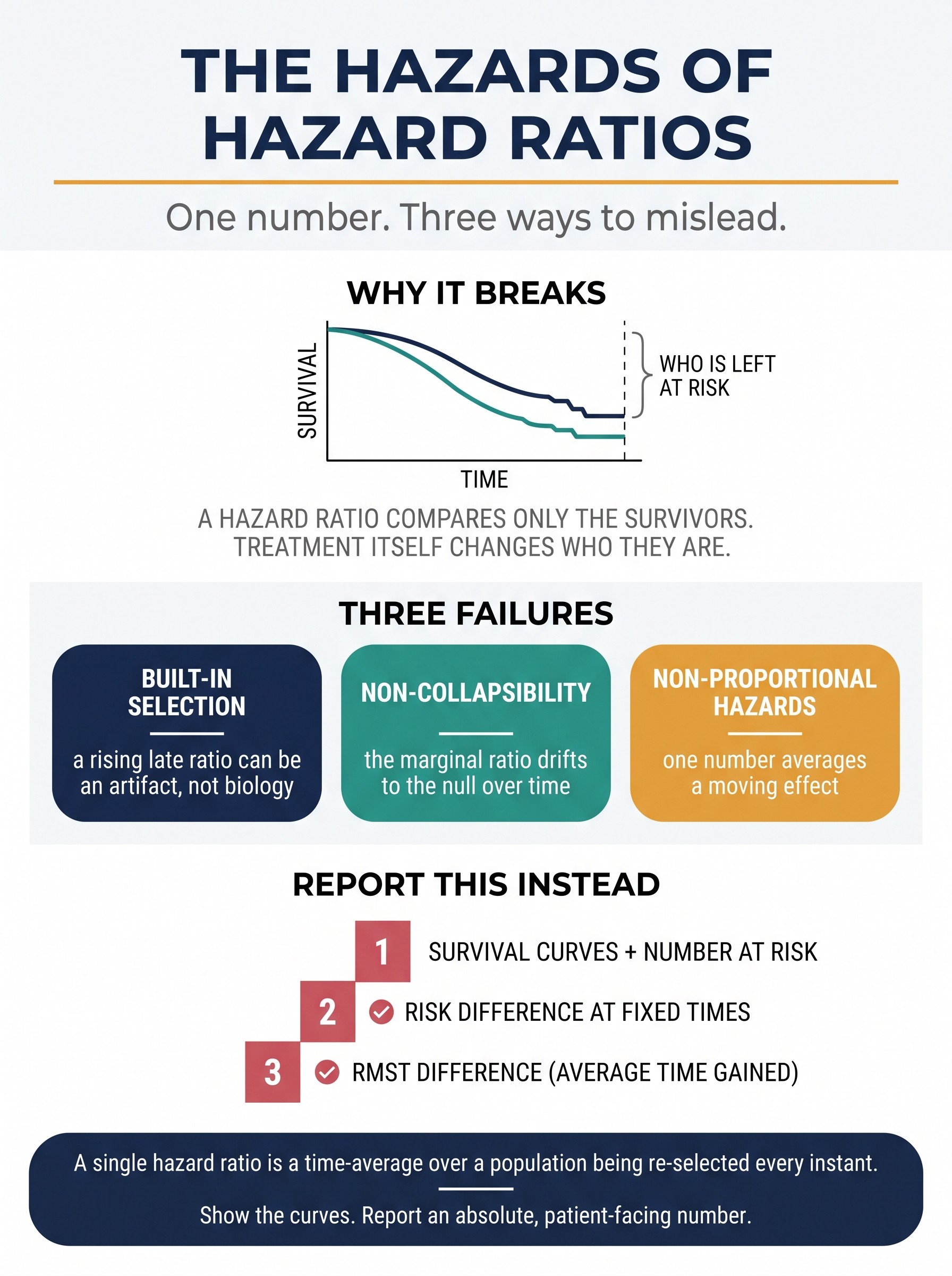
The Hazards of Hazard Ratios
The hazard ratio is the most-reported number in clinical survival research and one of the least understood. It compares instantaneous event rates among the people still at risk — so the moment a treatment changes who survives, it stops comparing the two groups you randomized and starts comparing two differently-selected subsets. This holds even in a perfect randomized trial. The guide separates three failures usually collapsed into one tidy number with a confidence interval: built-in selection (a rising late hazard ratio can be an artifact of who is left, not biology), non-collapsibility (the marginal ratio drifts toward the null over follow-up from frailty depletion alone), and non-proportional hazards (a single Cox estimate is a time-average whose weights depend on trial duration — so the same drug can report different ratios in trials of different length). It explains why a non-significant proportional-hazards test is the wrong reassurance, and what to report instead: survival curves with a number-at-risk table, absolute risk differences at pre-specified clinical times, and the restricted mean survival time (RMST) difference — a collapsible, assumption-light, patient-facing "average time gained." Includes a worked delayed-effect immuno-oncology vignette, eight common mistakes, and a curve-first reviewer's checklist.
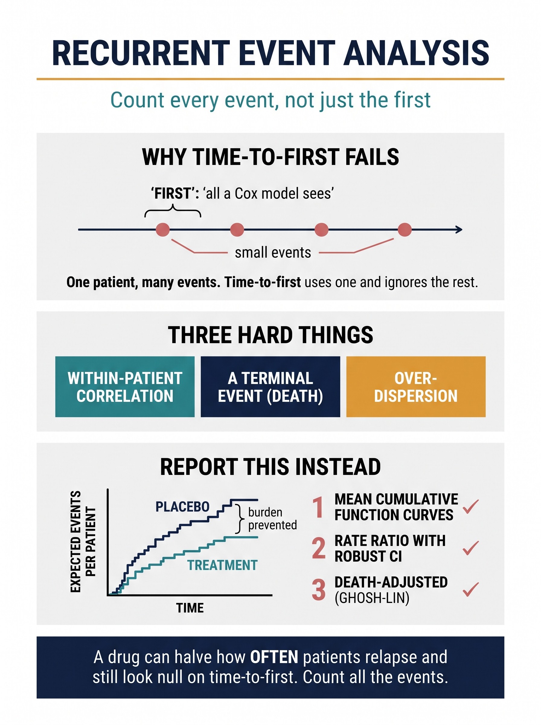
Recurrent Event Analysis
In many chronic diseases the burden is the repetition — heart-failure hospitalizations, COPD exacerbations, seizures, gout flares, bleeds. The reflex analysis, time-to-first-event, answers a smaller question and throws away everything after the first event: a drug that halves how often patients are hospitalized but doesn't delay the first one can look completely null in a Cox model. This guide teaches the recurrent-event family as one decision — state the estimand, then choose the model that targets it without lying about death. It separates the three things that make recurrent data hard: within-patient correlation (a variance problem, cheaply fixed with robust standard errors), a terminal event (death informatively stops the counting process — a more lethal arm accrues fewer events simply by leaving, and plain rate models flatter it), and over-dispersion (a few frequent-flyers). It maps the model menu to the question each one answers — Andersen–Gill and LWYY for burden, PWP for whether the effect wanes across successive events, negative-binomial for exacerbation counts, and Ghosh–Lin mean-cumulative-function or joint frailty models when death must be handled honestly — and closes on what to report: MCF curves by arm, a rate ratio with a robust interval, an absolute burden contrast, and an explicit death-accounting. Includes a worked heart-failure vignette where the same data read "no benefit" or "a third fewer hospitalizations" depending only on whether you count one event or all of them, eight common mistakes, and a burden-first reviewer's checklist.
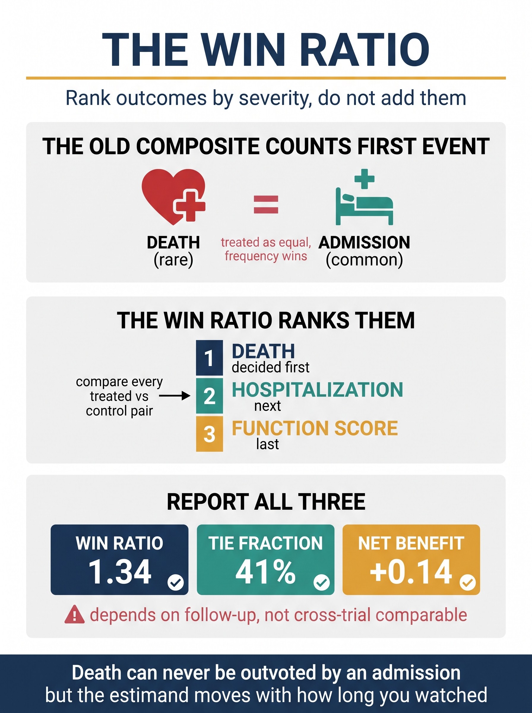
The Win Ratio
A standard composite endpoint adds outcomes and counts whichever fires first — which lets a common, mild event (a hospitalization) outvote a rare, fatal one (a death), because most first events are the least severe. The win ratio refuses that: it ranks outcomes by clinical priority and, across every treated-vs-control pair of patients, decides each pair at the highest level of the hierarchy that can separate them — death first, so it can never be outvoted by an admission. This guide teaches the win ratio as a genuine fix for the composite's severity blindness, then spends equal time on the price it charges. It separates the family (win ratio, which discards ties; win odds and Buyse's net benefit, which don't) and names the three hard things: the win ratio is not a hazard or rate or probability and its estimand moves with follow-up (more time makes more deaths adjudicable; unequal censoring manufactures ties, not information, so two trials of the same drug are not comparable); the hierarchy is a researcher degree of freedom that must be pre-specified by severity; and a recurrent event at a hierarchy level re-imports the first-vs-count-vs-burden choice. Includes a worked heart-failure vignette where a "not significant" time-to-first composite becomes a significant win ratio on the same patients, why the tie fraction and component breakdown must be reported alongside the ratio, eight ways the number misleads, and a reviewer's checklist.
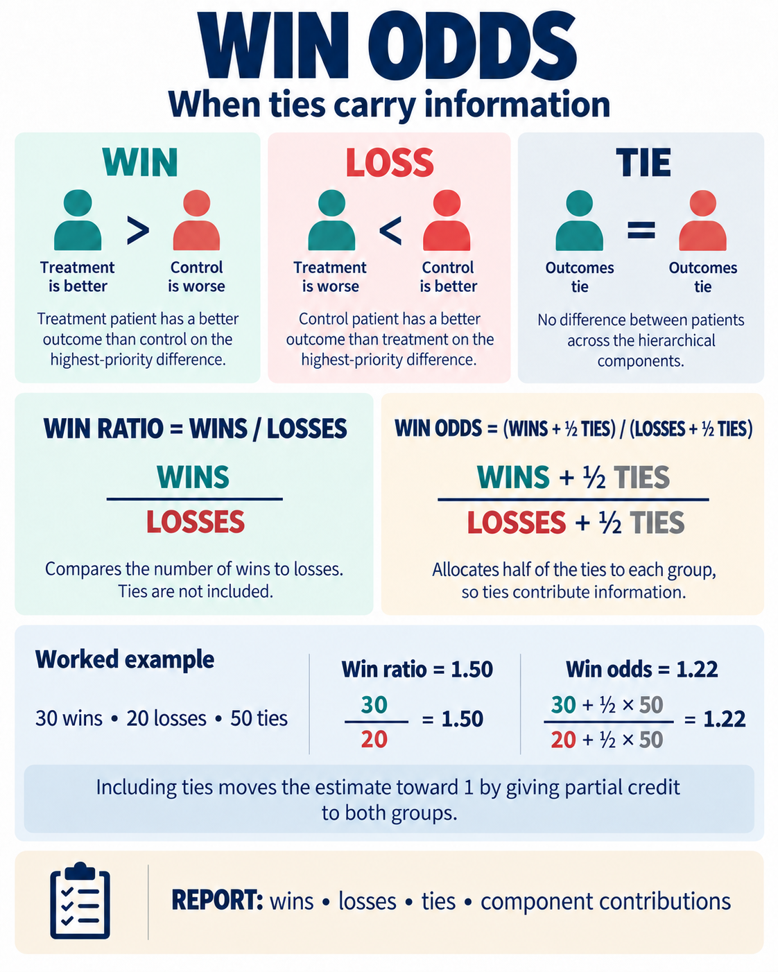
Win Odds: When Ties Matter
The win ratio gives ties no place in its point estimate: it divides treatment wins by treatment losses. That is easy to miss when most patient pairs are tied, because a striking ratio can then rest on a small decisive fraction of the data. Win odds keeps the same clinically prioritized pairwise comparison but allocates half of every tie to each group: (wins + ½ ties) / (losses + ½ ties). In a worked example with 30 wins, 20 losses, and 50 ties, the win ratio is 1.50 while the win odds is 1.22. The difference is not a contradiction; it shows exactly how much the headline depends on discarding ties. Win odds is still not a risk, hazard, or patient-level probability, and adding ties does not rescue a poorly chosen hierarchy, an arbitrary threshold, or unequal follow-up. This guide teaches the estimand through one equation and one audit: report wins, losses, and ties; show which outcome components resolved comparisons; pre-specify the hierarchy and thresholds; and explain censoring and follow-up by arm. A reviewer should ask whether the chosen statistic answers the clinical question, then inspect the tie fraction before interpreting its distance from 1.
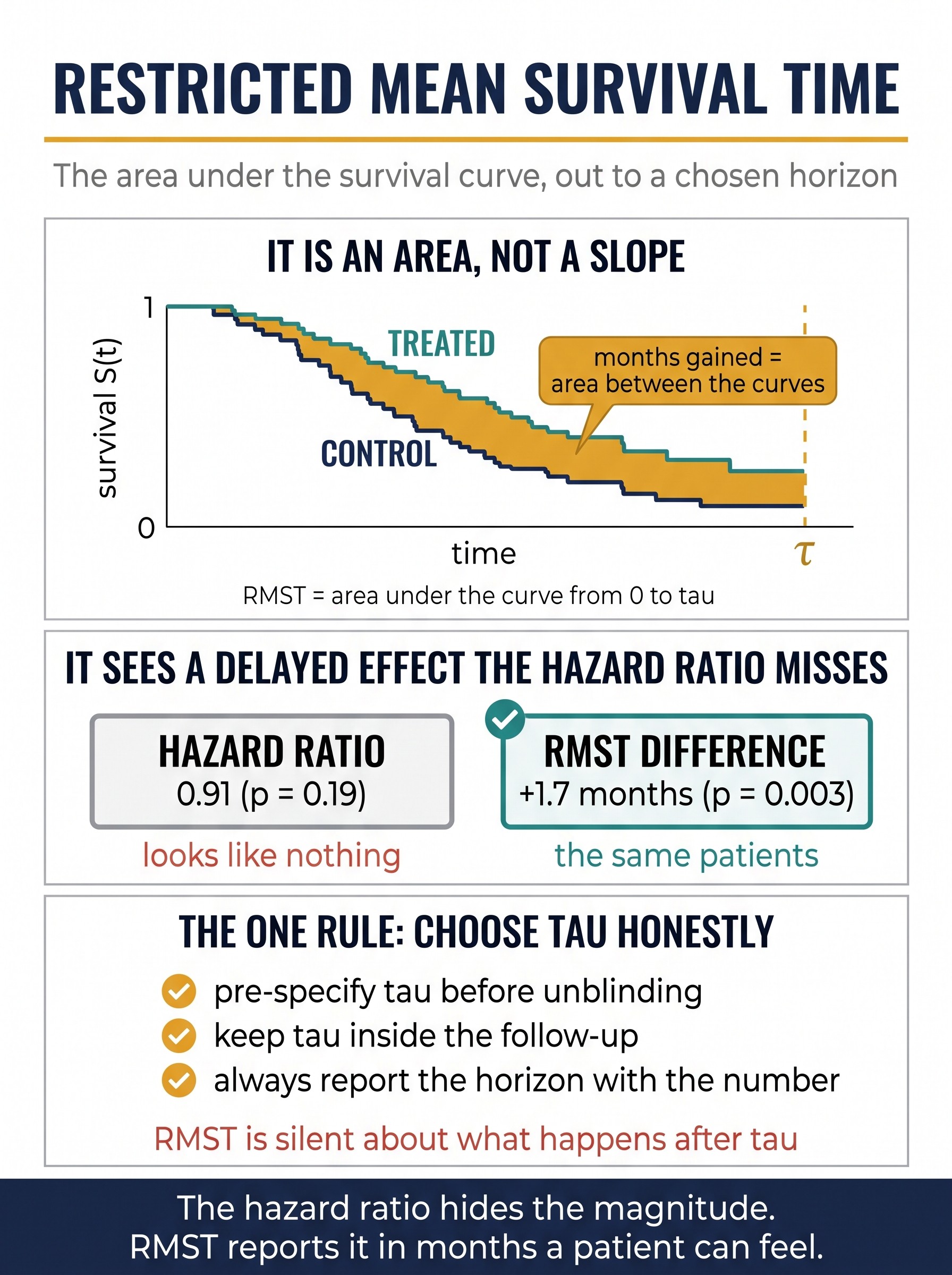
Restricted Mean Survival Time
The hazard ratio tells you how much faster events happen but never how much time that buys a patient, and under a delayed or waning effect a single Cox estimate is a duration-weighted average that can hide a real benefit entirely. Restricted mean survival time (RMST) answers the question a patient actually asks — "how much longer, event-free, over the next few years?" — by measuring the area under the survival curve out to a pre-specified horizon τ. The treatment effect is simply the area between the two curves: a number of months gained, on an absolute scale, with a confidence interval. This guide teaches RMST as the concrete repair for the hazard ratio's three failures (it needs no proportional-hazards assumption, it is collapsible, and it is already in patient-facing units), then spends equal time on its one honest price: RMST is an estimand indexed by τ — you must pre-specify the horizon, keep it inside the follow-up so the tail isn't extrapolated, report it with every number, and accept that RMST is silent about what happens after τ. It separates RMST from its confusable neighbors — the median (one quantile), milestone survival (one snapshot that discards timing), and the win ratio (Guide 80, which ranks multiple outcomes rather than integrating one on an absolute time scale) — with a worked delayed-effect immuno-oncology vignette where a "non-significant" hazard ratio becomes a clear RMST gain on the same patients, eight ways the analysis misleads, and a reviewer's checklist. The close of the survival cluster: the survival estimand you report is a choice, not a default.
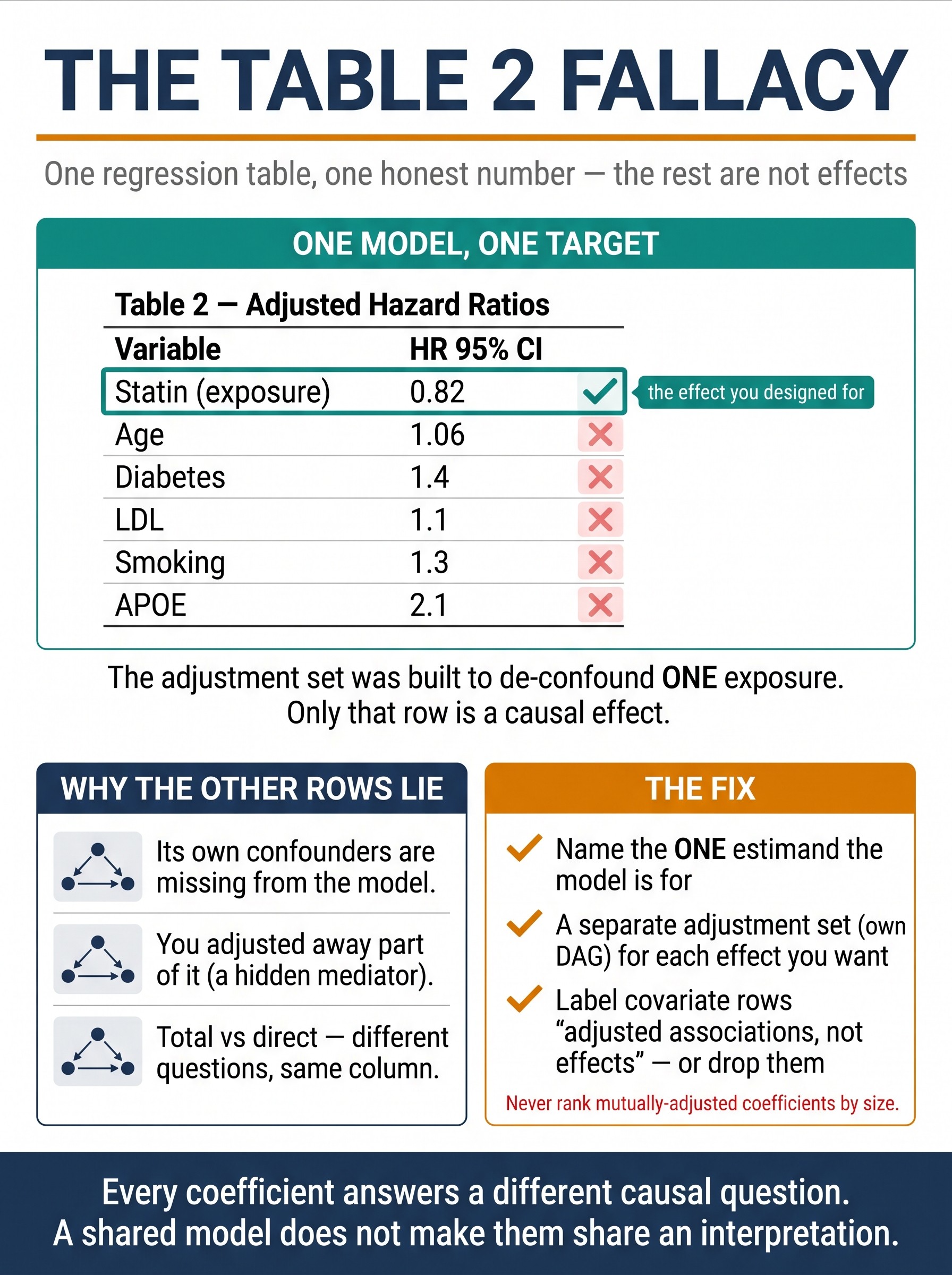
The Table 2 Fallacy
A multivariable model is fit to estimate one exposure effect, and its adjustment set is chosen to de-confound that one exposure — yet the results table prints a coefficient for every covariate, and readers dutifully interpret each row as "the effect of that variable." That is the Table 2 fallacy (Westreich & Greenland, 2013): presenting mutually adjusted estimates from a single model as if they were all causal effects of the same kind. The exposure row may be a valid total effect; the covariate rows are, at best, direct effects holding the exposure fixed, and at worst confounded, over-adjusted, or collider-biased — because the model was never designed to identify them. This guide dissects the three failures behind it: a covariate's own confounders are usually absent from a model built for a different exposure; conditioning on a shared downstream variable silently adjusts away part of a covariate's effect (over-adjustment); and every row is estimated holding the others fixed, so a total effect and a stack of partial direct effects get printed in one column and compared as peers. A worked statin→dementia example shows the same cohort yielding three different "hazard ratios for diabetes" depending only on which model happened to contain it. The fix is a single rule — one model identifies one estimand: design the adjustment set for the exposure you care about, report that effect, and treat every other coefficient as a nuisance-adjusted association (or fit a separate, DAG-derived model for each effect you genuinely want). Includes a where-it-hides field guide, distinctions from DAGs, mediation, and non-collapsibility, and a reviewer's checklist. One idea: a shared regression model does not give its coefficients a shared interpretation.
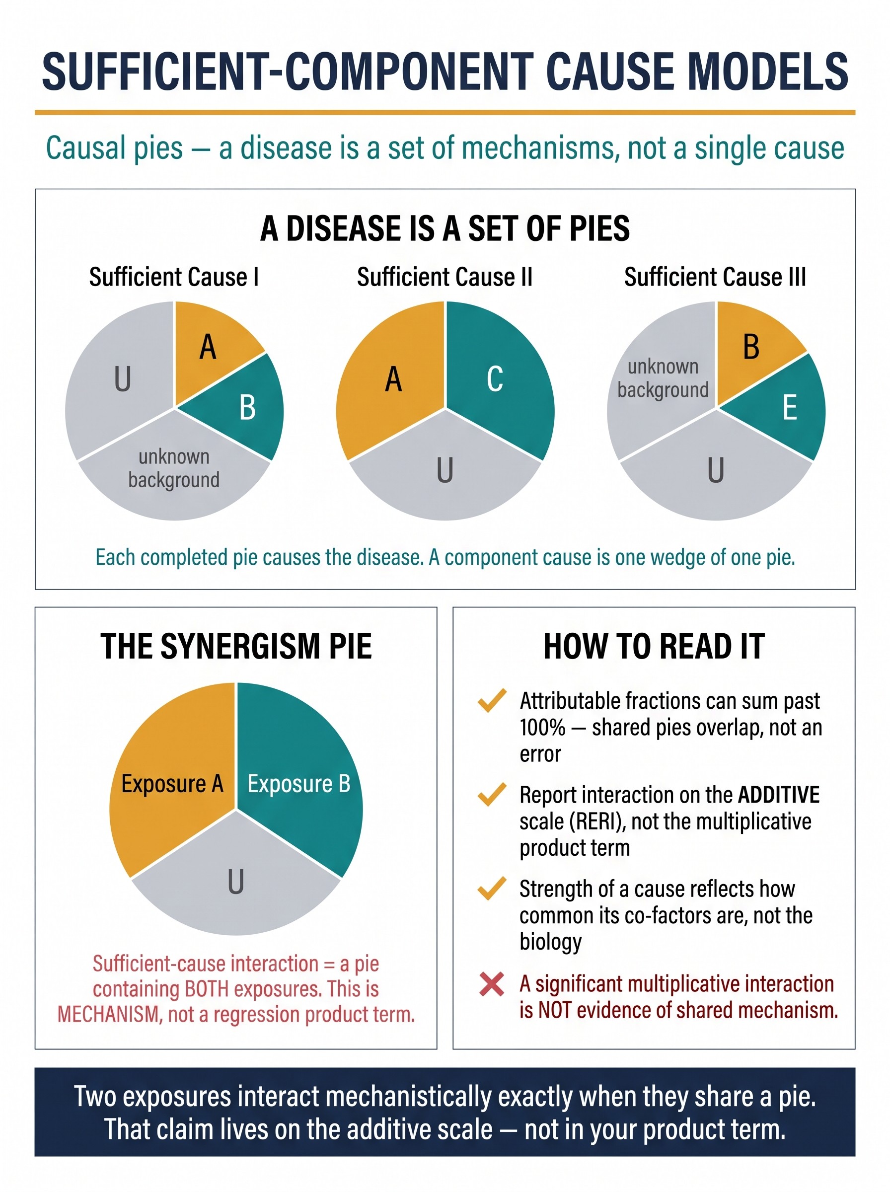
Sufficient-Component Cause Models (Causal Pies)
Almost every guide in this series lives in the potential-outcomes world — define a counterfactual contrast and worry about confounding it. That framework estimates effects but is deliberately silent about mechanism. Rothman's sufficient-component cause model (1976) is the mechanistic complement: no outcome has "a cause"; every case of disease is completed by one of several sufficient causes, and each sufficient cause is a pie made of component causes that must all be present together. So the same disease is produced by different mechanisms in different patients, and several counter-intuitive facts stop being paradoxes: attributable fractions legitimately sum past 100% (a case in a shared pie is prevented by removing any of its slices, so it counts toward each); the strength of a cause is a property of the population, not the biology (a large relative risk means the pie's other slices are common here — the mechanistic root of the transportability problem); and induction/latency become structural (a pie completes only when its last slice falls, and removing a component after completion prevents nothing). The reviewer-relevant payoff is interaction: two exposures show sufficient-cause interaction (synergism) exactly when a single pie contains both — a claim about biology, not about a regression product term. That claim lives on the additive scale (report the RERI / attributable proportion), because departure from additivity, not from multiplicativity, is what maps to shared mechanism; a "significant multiplicative interaction" is neither necessary nor sufficient for synergism. A worked NSAID + H. pylori peptic-ulcer example shows the synergism pie, the overlapping attributable fractions, and why the same NSAID looks more or less dangerous as H. pylori prevalence shifts. Includes the response-type bridge to potential outcomes, VanderWeele's monotonicity conditions for the strong "a pie with both must exist" claim, a where-it-hides field guide, distinctions from effect modification and the Table 2 fallacy, and a reviewer's checklist. One idea: a disease is a set of pies, not a cause — and two exposures interact mechanistically exactly when they share one.
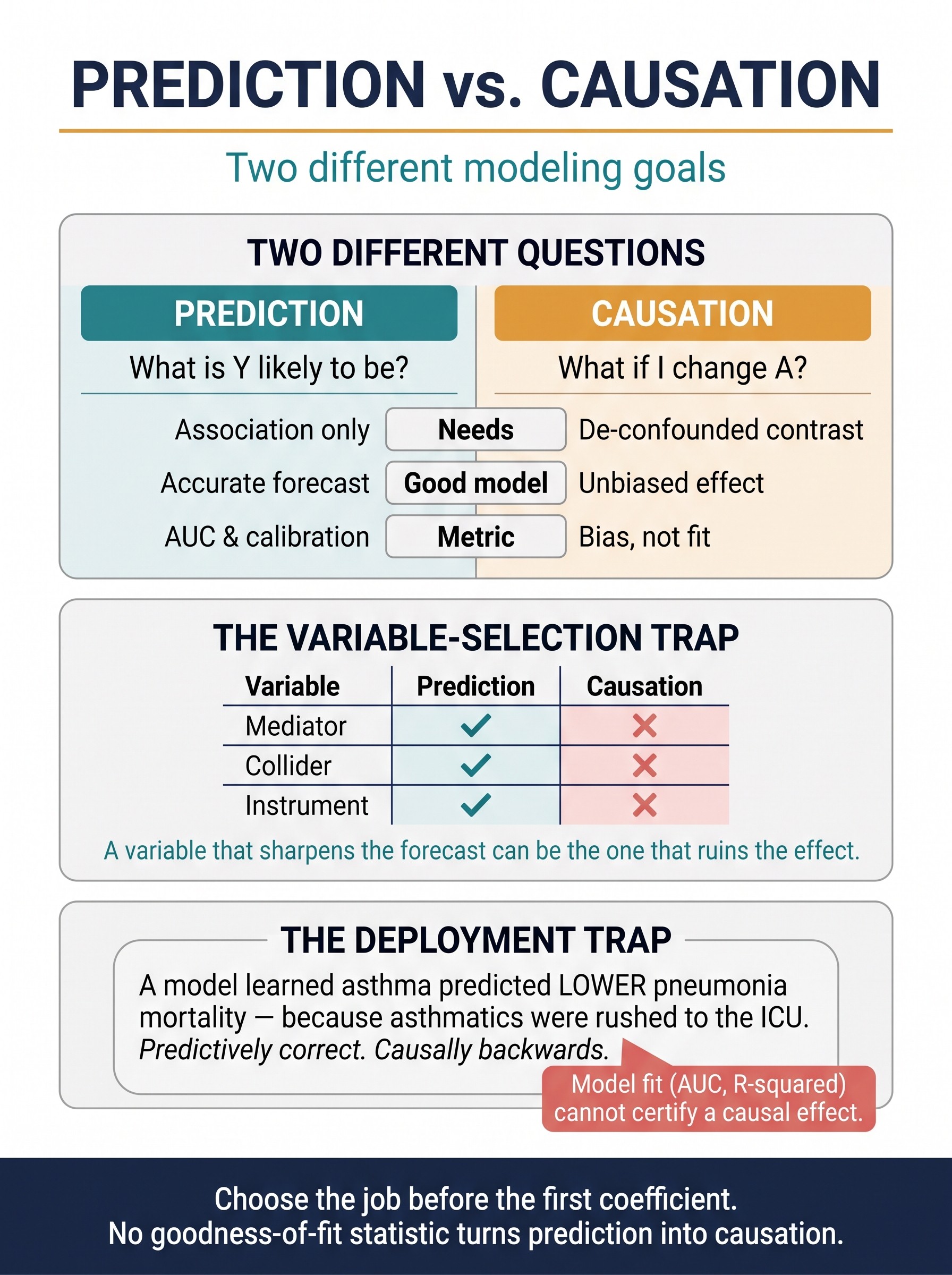
Prediction vs. Causation: Two Different Modeling Goals
A model that predicts an outcome and a model that estimates the effect of changing a treatment are answering two different questions — and almost everything about them differs: the variables you include, the metric that says it worked, and whether you may read an "effect" off a coefficient. Prediction wants an accurate out-of-sample forecast and needs only association; causation wants a de-confounded counterfactual contrast and must avoid adjusting away the very effect it seeks. These goals are orthogonal, and on variable selection they routinely oppose: a mediator, a collider, or a strong instrument can each sharpen the forecast while ruining the causal estimate — so "does it improve the model?" is the wrong question for a causal covariate, and "where does it sit on the DAG?" is the right one. This guide diagnoses why the Table 2 fallacy happens (secondary coefficients came from a model whose whole job was prediction, so none was ever identified as a cause), shows that goodness of fit cannot certify confounding control (AUC 0.9 with a badly confounded effect; a low C-statistic with a perfectly valid one), and flips the propensity score inside out (a highly predictive treatment model is a positivity warning, not a triumph). The deployment trap gets the canonical Caruana pneumonia example — a model learned asthma predicted lower mortality because asthmatics were rushed to the ICU: predictively correct, causally backwards, and lethal if used to decide who goes home. Closes with where the two goals legitimately meet — flexible prediction as a nuisance step inside g-computation, TMLE, and double machine learning — a 6-step rule, a where-it-hides field guide, distinctions from the Table 2 fallacy, bias amplification, and positivity, and a reviewer's checklist. One idea: choose the model's job before the first coefficient — no fit statistic converts one job into the other.
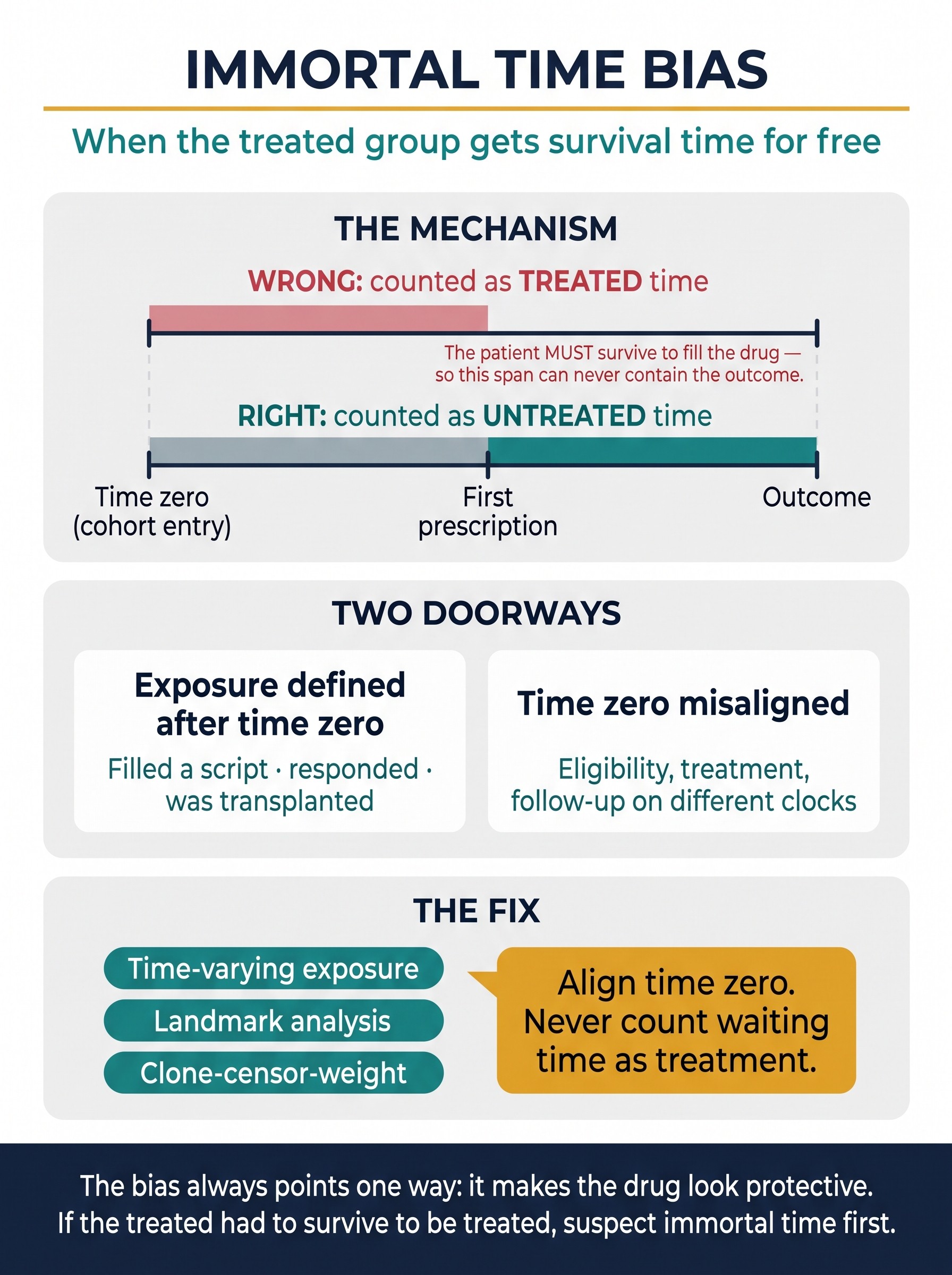
Immortal Time Bias
Immortal time is a stretch of follow-up during which, by construction, the outcome could not have occurred — and the bias is what happens when you hand that stretch to the treated group as if it were treated person-time. To be classified as treated, a patient had to survive long enough to become treated (fill the prescription, respond to therapy, reach transplant), so the interval from time zero to that moment is event-free for free. Count it as treated time and the treatment's event rate falls; the drug looks protective out of pure arithmetic. It is the most common fatal flaw in observational drug-effectiveness studies and it is invisible in the results table — the hazard ratio is clean, the interval tight — so it can only be caught by reading how exposure and start of follow-up were defined. This guide dissects the mechanism (misclassified vs. excluded immortal time, both pointing the same protective way), the two doorways it enters through (exposure defined by a post-baseline event; time-zero misalignment), and three clinical faces — the statins-after-MI cohort (Lévesque, BMJ 2010), the oncology "responders live longer" guarantee-time trap (Anderson's landmark method), and the Oscar-winners illusion that a time-varying reanalysis erased. Then the fix map: time-varying exposure, landmark analysis, clone-censor-weight, and target-trial time-zero alignment (Hernán et al.) — with the sharp distinctions from left truncation, healthy-adherer bias, and prevalent-user bias that keep the diagnosis precise. Includes a six-question detection checklist and a reviewer's checklist. One idea: never count a patient's waiting time as treatment.
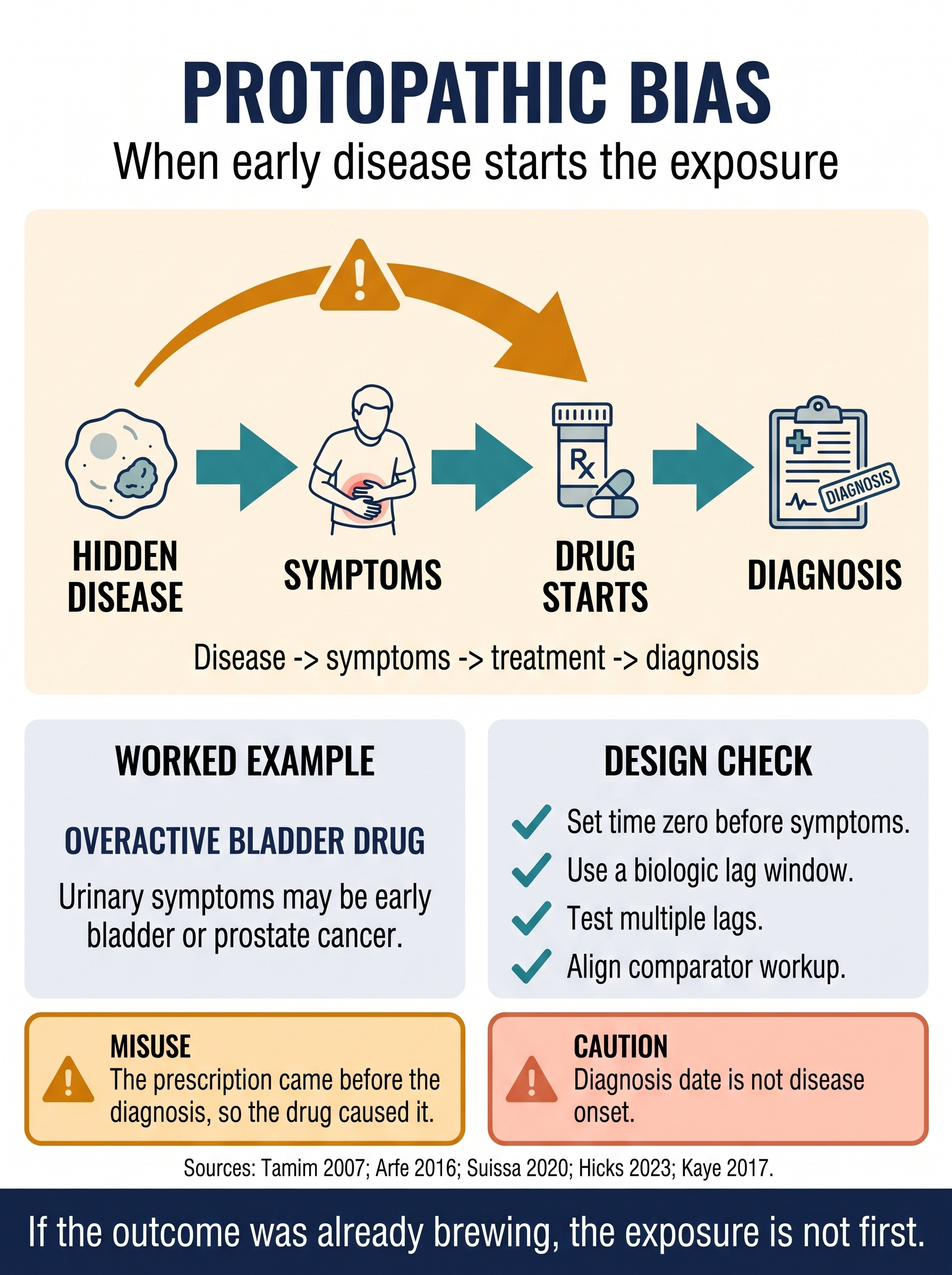
Protopathic Bias: When Early Disease Starts the Exposure
A visual guide to reverse causation in drug-safety and real-world evidence studies. The lesson is chronological: hidden disease can create symptoms, symptoms can trigger treatment, and the later recorded diagnosis can make the drug look falsely causal. Covers symptom-overlap timelines, biologically justified lag windows, comparator workup, and the reviewer checks that stop diagnosis date from being mistaken for disease onset.
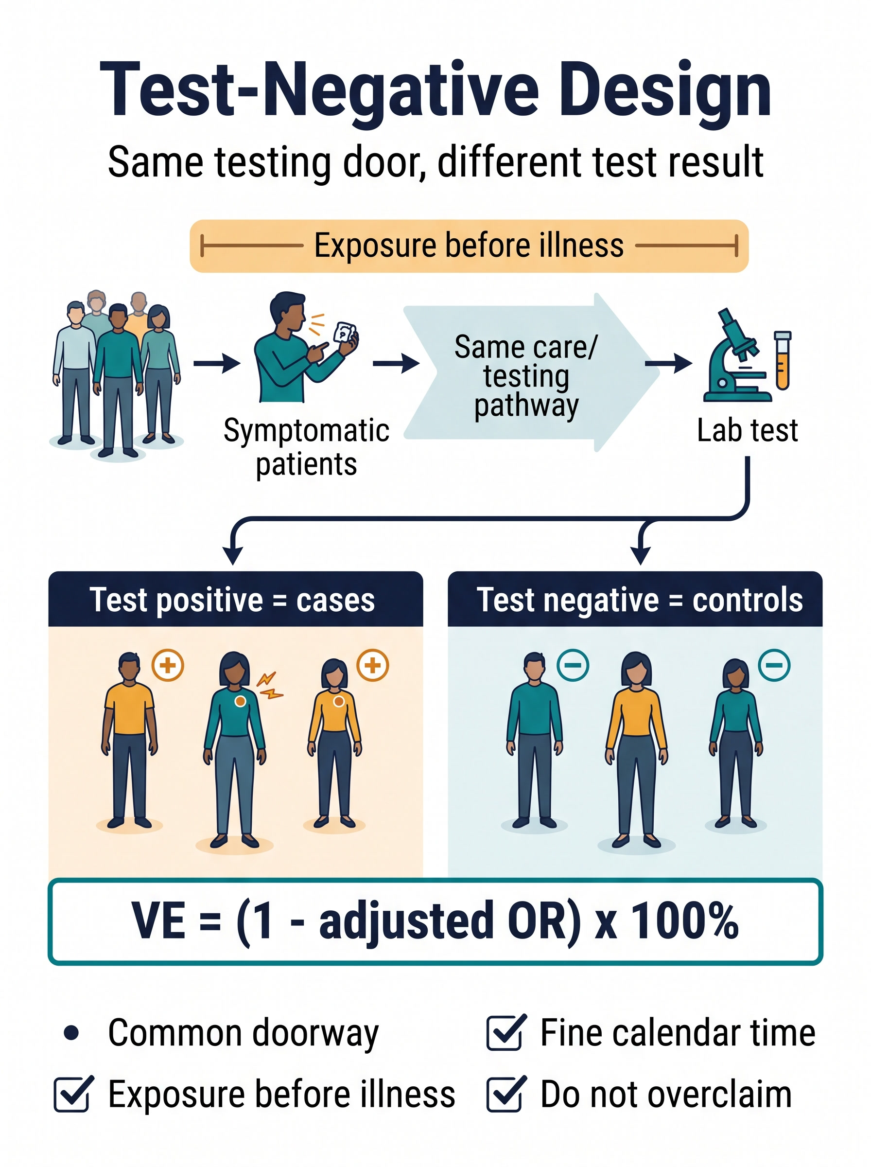
Test-Negative Design: Same Testing Door, Different Test Result
A clinically grounded guide to the case-control design behind many vaccine and antiviral effectiveness studies. The test-negative design does not compare sick patients with healthy controls; it compares patients who entered the same symptomatic care and testing pathway, then split into target-pathogen positive cases and target-pathogen negative controls. That doorway is the design's strength: it can reduce confounding from care-seeking and test access. It is also the design's boundary: the estimand is effectiveness against medically attended, laboratory-confirmed disease among people who got tested, not protection against all infections in the population. This guide maps the sampling logic, the usual VE = (1 - adjusted OR) x 100% analysis, and the assumptions that must be stated before the result is credible: common testing pathway, exposure before illness, valid test classification, fine calendar-time control, pre-exposure confounder adjustment, and a control illness process not strongly changed by the exposure. Includes an influenza/COVID-style clinical vignette, eight failure modes, a launch checklist, and a reviewer checklist for keeping a useful surveillance design from overclaiming.
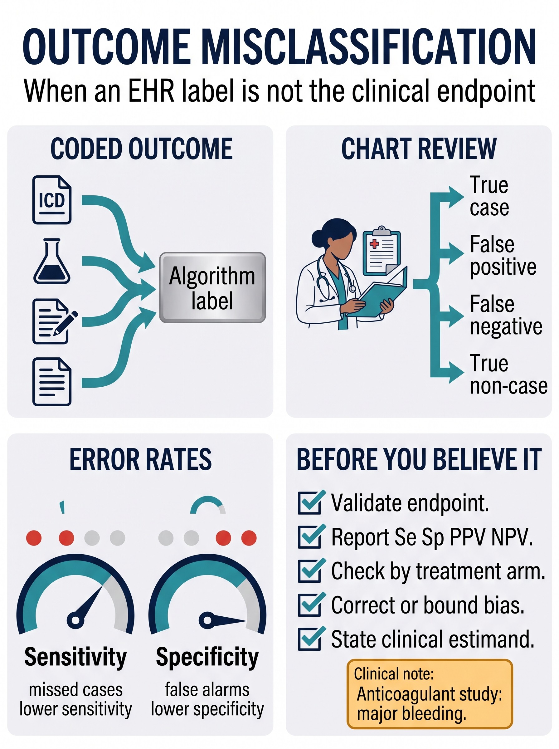
Outcome Misclassification and Validation Substudies
An EHR endpoint is usually not the endpoint; it is a label produced by codes, labs, notes, billing rules, and care patterns. That label becomes dangerous when a causal study treats it as the clinical event itself. This guide teaches the endpoint-validation workflow: define the clinical outcome, validate the algorithm against a credible reference standard, report sensitivity, specificity, PPV, and NPV, then correct, bound, or stress-test the treatment effect under plausible error structures. It distinguishes simple measurement noise from treatment-linked surveillance, where one arm is monitored more closely and the observed endpoint changes because detection changed. Includes an anticoagulant-and-major-bleeding vignette, validation sampling designs, a correction menu, eight ways endpoint validation misleads, and a reviewer checklist. One idea: the EHR label is a smoke alarm, not the fire.
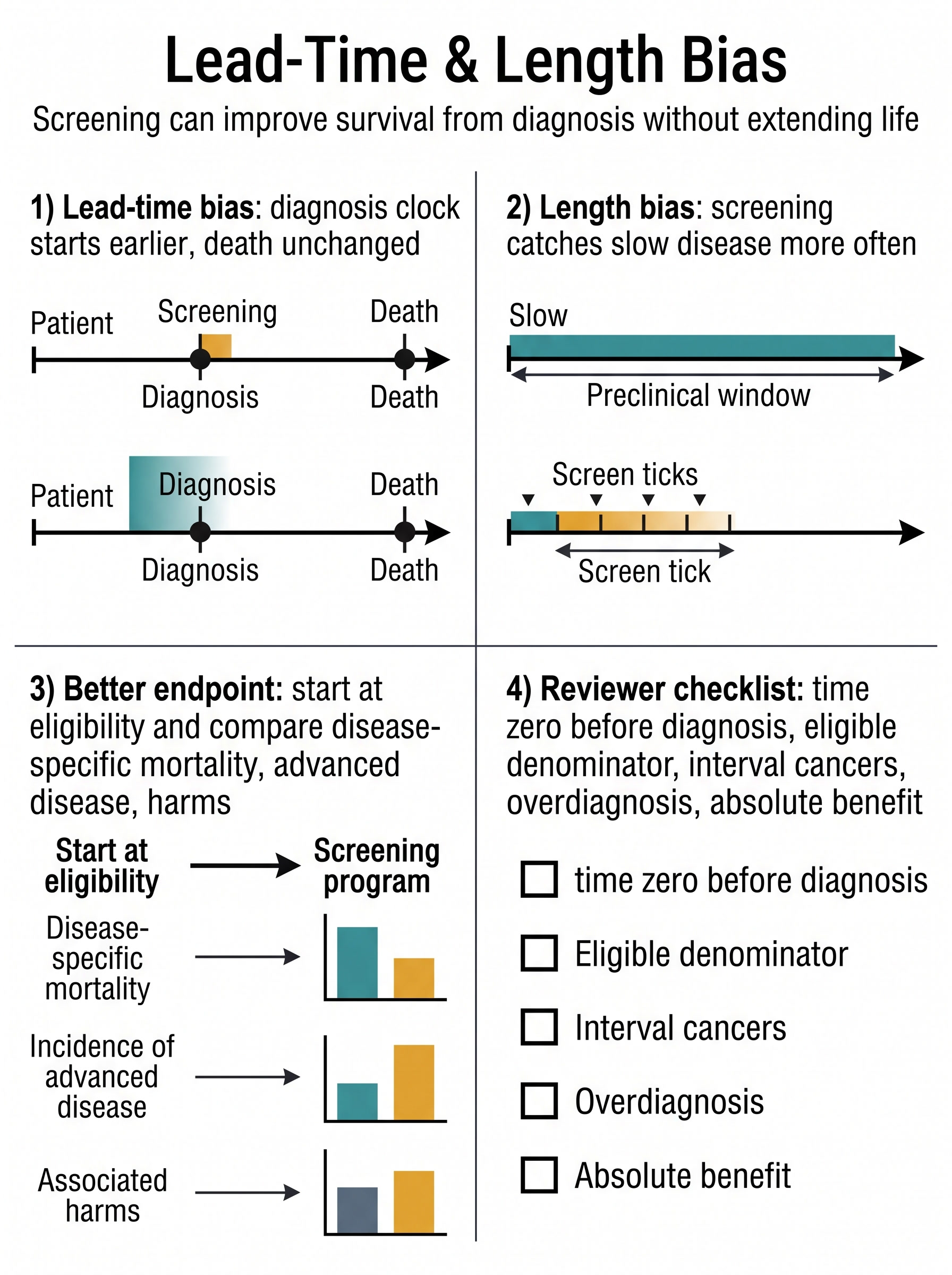
Lead-Time and Length Bias in Screening Studies
A screening program can make survival from diagnosis look better without making patients live longer. This guide separates the two classic traps: lead-time bias, where diagnosis moves earlier but death does not, and length bias, where screening preferentially finds slower disease with a longer detectable window. It shows why screen-detected versus symptom-detected survival is usually a prognosis comparison, not a causal effect of screening, and reframes the target-trial question around eligibility time zero, disease-specific mortality, advanced-stage incidence, interval cancers, overdiagnosis, harms, and absolute benefit. One idea: judge screening by whether the bad ending moves, not by how early the clock starts.
Non-Concurrent Controls in Platform Trials
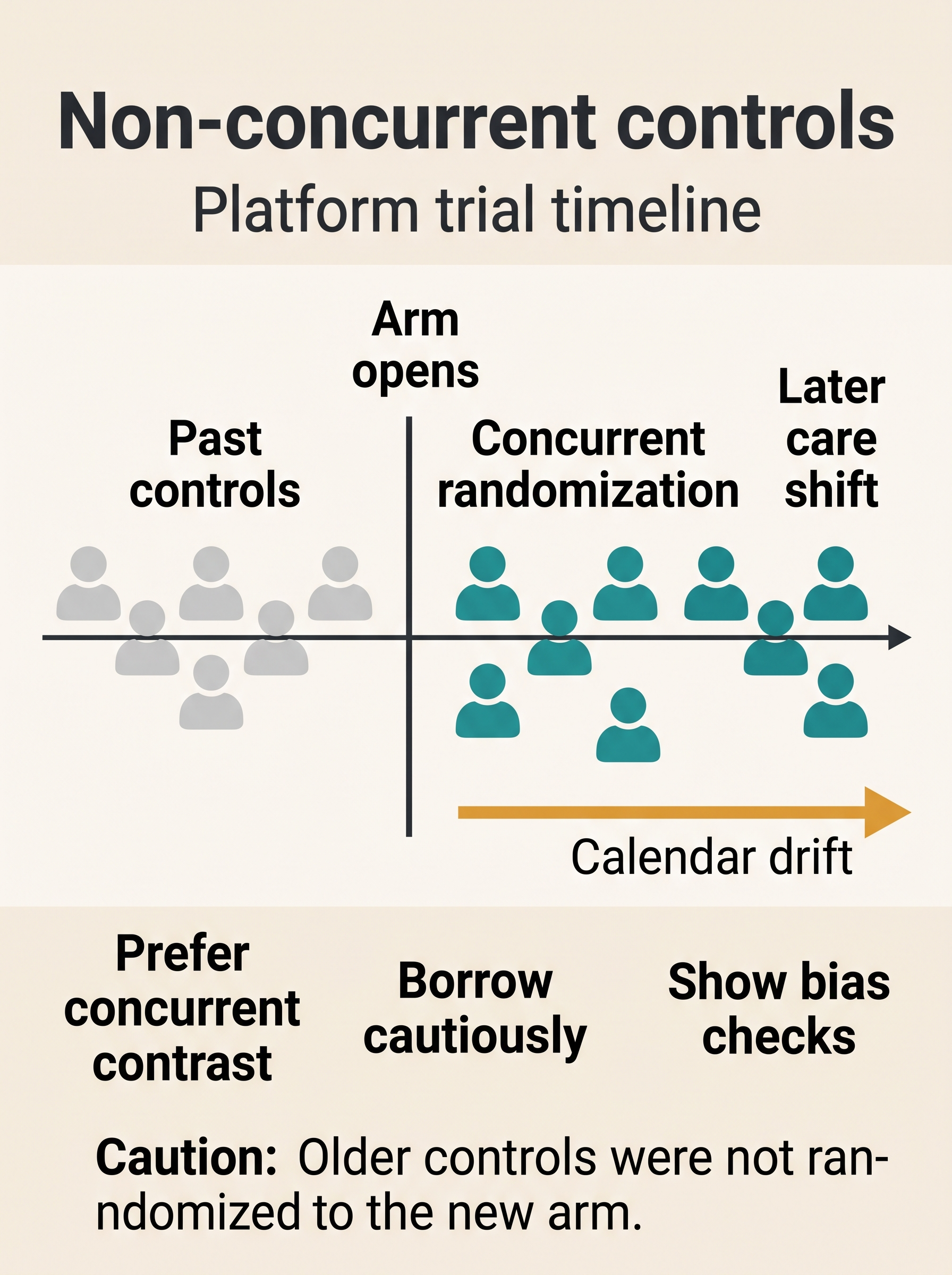
A methods-frontier guide to the control-arm problem created when new treatments enter a platform trial after the shared control has already started. It separates concurrent randomized controls from older non-concurrent controls, shows why borrowing past controls buys assumptions about calendar time, and gives reviewers a practical checklist for estimands, time-zero alignment, cohort drift, model-based borrowing, and sensitivity analyses.
Paper Autopsy: Target Trial Emulation Is Not Just a Label
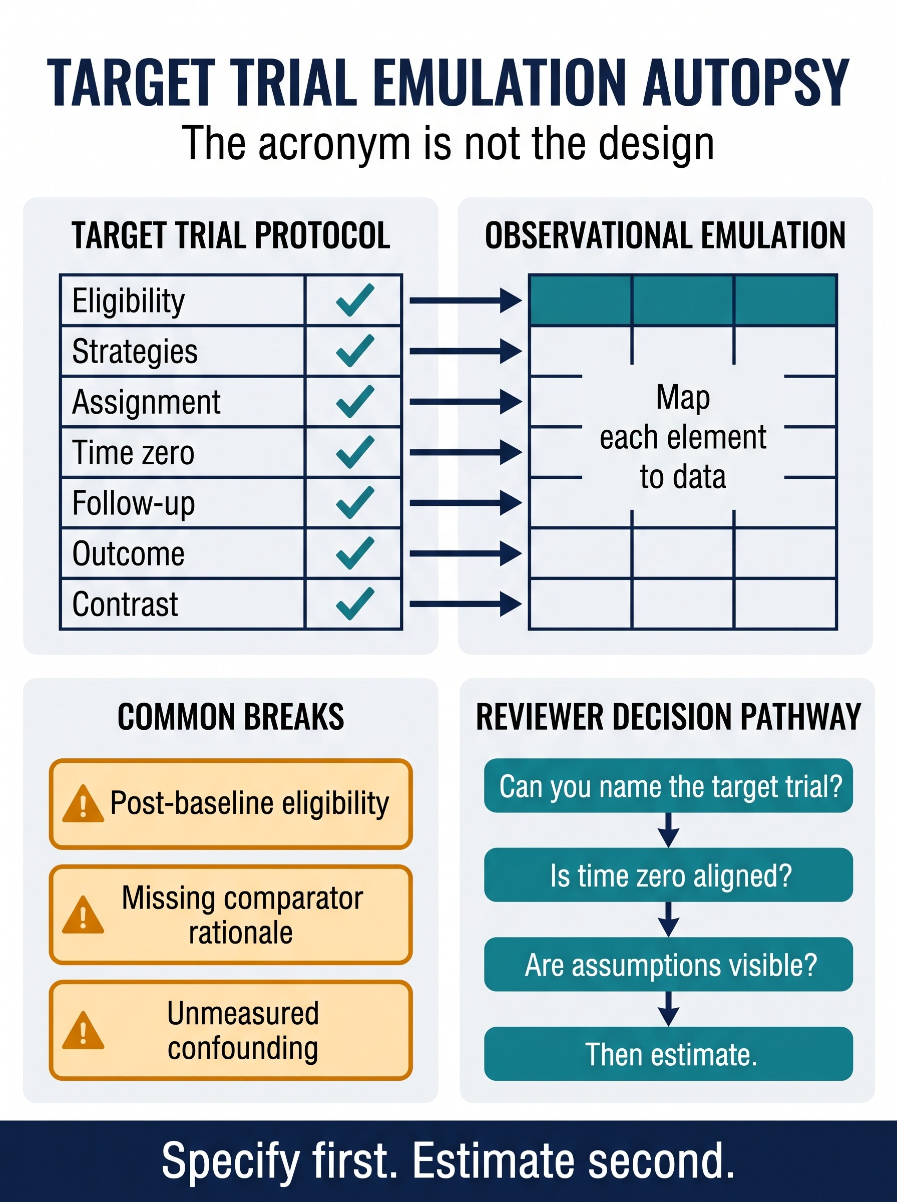
A paper autopsy of Ren et al.'s 2026 JAMA Network Open survey of 237 target trial emulation studies. It teaches what the paper permits and what it cannot prove, then turns the findings into a reviewer workflow: specify the target trial protocol first, map each element to observational data second, and only then choose the estimator.
Need help with study design?
Aqrab is an AI-powered study design consultant that critiques methodology, catches bias, and helps researchers defend design choices.
Try Aqrab — Free →